Confused to choose which method (Flexbox or Grid) for layout designing? Look no further, this blog will clear your confusion with the proof of choosing best one.
The way you represent your content can say a lot more about you and your company. So having properly structured content that beautifies your website could lead to the growth of your company.
To attract our users we have to style our website in such a way that the user can easily able to find all the available content without getting annoyed and that could be achieved with CSS. Here we are going to discuss two major modules in CSS that could define the quality of our website.
Pre-requisites:
- Code editor preferably vs code
- Understanding Basics of HTML and CSS
Here is a solution for one of the head-banging questions for UI developers, that is where to use flex-box and grid columns in style sheets while designing a website. So, let’s get started with flex-box.
CSS Flex-box:
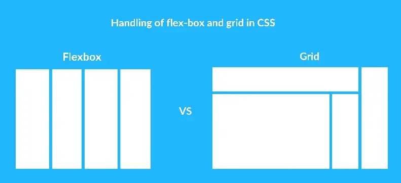
Flex-box is a one-dimensional layout method that’s gonna deal with either rows or columns but not both at a time. The Flex-box module follows the hierarchy of parent and child elements. The main container acts as a parent and the elements that are present in that parent container are gonna take the child’s position.
The parent container takes the flex as a display method and all the child elements are gonna render the properties of flex.
Styling websites is one of the major key roles for front-end developers. The effective way of creating a responsive design is using flex-box why because the properties of flex-box are compatible with all screens-size.
Areas of application:
- For small-scale responsive designs with minimum media queries.
- Flexibility in dimension-control and spacing between the flex-items.
- Re-ordering the flex items is simple.
- Organizing all types of responsive navigation with flex properties.
- Workable form controls.
- Adjustable media-objects.
- Flex has effective results in card layout structuring.
- When you have a content-first design.
- Supports in all browsers
Drawbacks:
- The sole drawback of the flex-box module is that it has a few performance constraints.
- Flex will not work with safari versions from version 3 to 6.
- More browser problems are also on the way.
A quick demonstration of how the flex-box works:
Here is a small demo that how flex works and how the containers are aligning responsive at different screen sizes.
https://www.youtube.com/watch?v=ygsL0wcIPeM&ab_channel=NavyaKosaraju
CSS grid:
CSS grid is a two-dimensional layout method that’s gonna handle both rows and columns. The hierarchy is the same as flex-container.
All we need to do is apply display: grid property to the block elements and define the required number of rows and columns by using grid-template-columns/row properties. The main motive of introducing the grid module is to design complex layouts that may not be possible with flexbox.
Areas of application:
- When you have complex designs and maintainable websites grid layout is preferred over flex.
- When your layout consists of the gap between two block elements, take the grid concept.
- When you need to overlap elements, the grid has an excellent feature with grid-column and row properties.
- When your website design should be planned for the layout-first method, then the grid is the better option.
Drawbacks:
- Not supported in every browser.
- Choosing a grid is a bit difficult for responsive designs.
Here is my source code URL for this experiment https://github.com/kosarajunavya/kosarajunavya.github.io/tree/main/flexVsGrid
A small demo that shows how the grid works:
Here is a small demo that shows how the grid layout works.
https://www.youtube.com/watch?v=-eKV_rbSXWo&ab_channel=NavyaKosaraju
Finally, I just want to conclude that Grid is for layout and flex is for alignment.
Now you have a clear picture of both grid and flex, we always welcome you to share your knowledge about these two major properties in CSS.
Hope you found something interesting in this blog, if you need any clarifications regarding these two properties I am here to help you in the comments section.
FAQ section
Why shouldn’t I use the grid for responsive design?
Most of the front-end developers choose flex for responsive design, you can’t use the grid for responsive design why because the grid doesn’t render in all browsers, and it’s the toughest job for making responsive design.
For what type of elements can I make a flex container?
For all types of block-level elements, you can use display: flex property and their child elements become flex items and render the properties of flex as mentioned.
Can I align flex items in rows and columns?
Yes, you can align the elements either row or column by using flex-direction property but not both at a time.
Is that fine of using flex and grid in CSS frameworks?
Of course, you can use these two modules in the CSS frameworks, they give the same results as in CSS.
 21 likes
 Add to read list

Comments