Flex Properties help create flexible layouts in CSS. Understanding and implementing them involves using properties like flexbox, flex-direction, and align-items
Properties of flexbox
Flexbox is a layout module in CSS that makes it easier to design responsive and flexible layouts for web pages. Here are some of the properties of flexbox include:
You can learn more about CSS flexbox layout
| Property | Syntax | Examples | Output |
| Display flex | display: flex; |
|
|
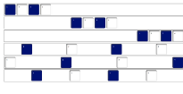
| Flex direction | flex-direction: <values>; |
|
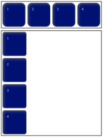 |
| Justify content | justify-content: <values>; |
|
 |
| Flex grow | flex-grow: <number> values; |
|
 |
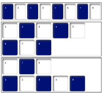
| Flex wrap | flex-wrap: <value>; |
|
 |
| Flex flow | flex-flow: <flex direction | flex wrap>; |
|
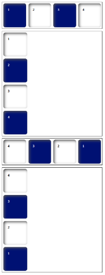 |
| Align self | align-self: <value>; |
|
 |
| flex | flex: <values>; |
|
 |
| Flex shrink | flex-shrink: <number> values; |
|
 |
 21 likes
 Add to read list

Comments