Flexbox and CSS Grid are powerful layout tools in CSS. Flexbox is ideal for one-dimensional layouts while CSS Grid is ideal for two-dimensional layouts.
Flexbox
Flexbox is a CSS layout module that helps in creating flexible and responsive web designs. It allows you to easily align, distribute and adjust the size of elements within a container, regardless of their content. It is a powerful tool for creating modern, dynamic, and adaptive web layouts.
You can learn more about Flexbox
CSS grid
CSS Grid is a layout system that allows you to create a two-dimensional grid of rows and columns to arrange content on a web page. It provides a powerful and flexible way to design and organize content, making it easier to create responsive and visually appealing layouts.
You can learn more about Grid-Based layout
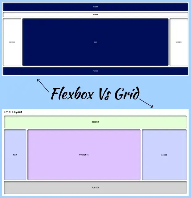
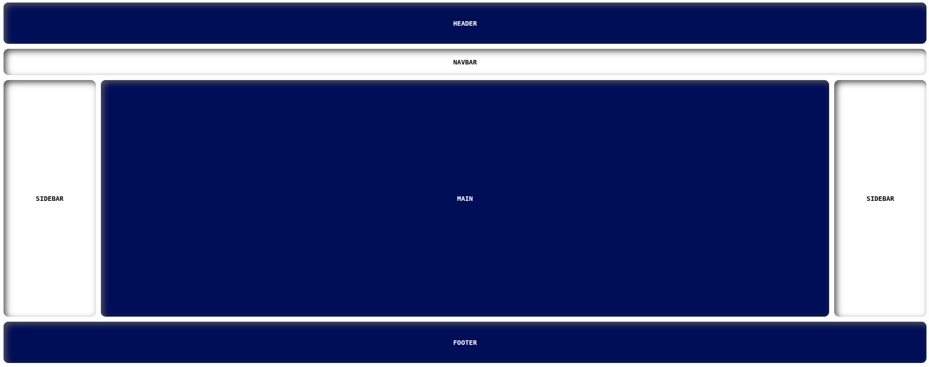
Layouts with flex
Layout
Index.html
<!DOCTYPE html>
<html lang="en">
<head>
    <link rel="stylesheet" href="./style.css">
    <title>Document</title>
</head>
<body>
    <div class="wrapper">
        <div class="container">
            <header>HEADER</header>
            <nav>NAVBAR</nav>
        </div>
        <div class="container1">
            <div class="sidebar1">SIDEBAR</div>
            <div class="container2">
                <main>MAIN</main>
            </div>
            <div class="sidebar2">SIDEBAR</div>
        </div>
        <footer>FOOTER</footer>
    </div>
</body>
</html>
Style.css
body{
  font-family: monospace;
}

.wrapper {
  display: flex;
  flex-direction: column;
  font-weight: 600;
}

.container1{
  display: flex;
}

.container2 {
  display: flex;
  flex-direction: column;
  flex: 1;
}

header, nav, main, .sidebar1, .sidebar2, footer{
  display: flex;
  align-items: center;
  justify-content: center;
  box-shadow: inset 5px 5px 12px #555, 5px 5px 12px rgb(235 235 235 / 16%);
  border-radius: 10px;
}

main {
  background-color: #000d57;
  color: #fff;
  margin-left: 10px;
  height: 48vh;
}

nav {
  background-color: #fff;
  color: #000;
  padding: 1rem;
  height: 20px;
}

.sidebar1, .sidebar2 {
  flex-basis: 10%;
  background-color: #fff;
  color: #000;
}

.sidebar2{
  margin-left: 10px;
}

header, footer {
  background-color: #000d57;
  color: #fff;
  padding: 1rem;
  height: 50px;
}

header, nav{
  margin-bottom: 10px;
  flex-basis: 50%;
}

footer{
  margin-top: 10px;
}
Output
https://manojbharath1.github.io/flex-blog-examples/5-flexbox-layouts/design1/index.html
Examples
Here you can find more examples list all the git urls:
https://manojbharath1.github.io/flex-blog-examples/5-flexbox-layouts/design2/index.html
https://manojbharath1.github.io/flex-blog-examples/5-flexbox-layouts/design3/index.html
https://manojbharath1.github.io/flex-blog-examples/5-flexbox-layouts/design4/index.html
https://manojbharath1.github.io/flex-blog-examples/5-flexbox-layouts/reps-layout/index.html
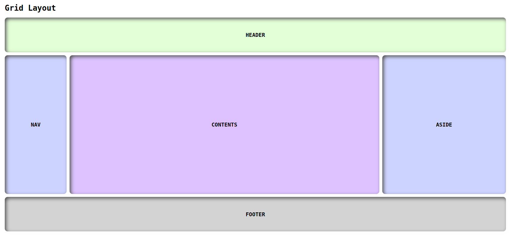
Layouts with grid
Layout
Index.html
<!DOCTYPE html>
<html lang="en">
<head>
    <link rel="stylesheet" href="./design1.css">
    <title>Document</title>
</head>
<body>
    <h1>Grid Layout</h1>
    <div class="container wrapper">
		<header class="items">HEADER</header>
		<nav class="items">NAV</nav>
		<div class="items contents">CONTENTS</div>
		<aside class="items">ASIDE</aside>
		<footer class="items">FOOTER</footer>
	</div>
</body>
</html>
Style.css
body{
  font-family: monospace;
  margin: 5rem;
}
.container {
  display: grid;
  grid-template-columns: 1fr 5fr 2fr;
  grid-template-rows: 5fr 20fr 5fr;
  grid-gap: 10px;
  height: 720px;
}

header {
  grid-column-start: 1;
  grid-column-end: 4;
  background-color: #e3ffd7;
}

nav{
  background-color: #cdd3ff;
}

.contents{
  background-color: 	#ddc2ff;

}

aside{
  background-color: #cdd3ff;
}

footer {
  grid-column-start: 1;
  grid-column-end: 4;
  background-color: #D3D3D3;
}

.items{
  display: grid;
  align-items: center;
  justify-content: center;
  box-shadow: inset 5px 5px 12px #555, 5px 5px 12px rgb(235 235 235 / 16%);
  border-radius: 10px;
  font-weight: 600;
  font-size: 18px;
}
Output
https://manojbharath1.github.io/grid-blog-exa/5-design%20layouts/Design1/design1.html
Examples
Here you can find more examples list all the git urls:
https://manojbharath1.github.io/grid-blog-exa/5-design%20layouts/Design2/design2.html
https://manojbharath1.github.io/grid-blog-exa/5-design%20layouts/Design3/design3.html
https://manojbharath1.github.io/grid-blog-exa/5-design%20layouts/Design4/design4.html
https://manojbharath1.github.io/grid-blog-exa/5-design%20layouts/Design5/design5.html
Flex vs grid
Pros and Cons
| Pros | Cons | |
| Flex |
|
|
| Grid |
|
|
when to use Flex
Here are the steps for when to use flex:
- Define the parent container with display: flex;.
- Specify the layout direction with flex-direction.
- Set the alignment of the flex items along the main axis with justify-content.
- Set the alignment of the flex items along the cross axis with align-items.
- Modify the size of the flex items with flex.
- Add space between the flex items with gap.
- Use flex-wrap to control wrapping of flex items in case of overflow.
- Set the order of the flex items with order.
- Use align-self to override the alignment for individual flex items.
- Use flex-flow as a shorthand for flex-direction and flex-wrap.
When to use Grid
Here are the steps for when to use Grid:
- Define the parent container with display: grid;.
- Set the number and size of the grid columns with grid-template-columns.
- Set the number and size of the grid rows with grid-template-rows.
- Position grid items within the grid with grid-column and grid-row.
- Adjust the size of grid items with grid-column-start, grid-column-end, grid-row-start, and grid-row-end.
- Use grid-template-areas to define grid areas and assign grid items to those areas.
- Control the spacing between grid lines with grid-gap.
- Use grid-auto-rows and grid-auto-columns to define the size of implicit grid tracks.
- Use grid-auto-flow to control the placement of grid items on the implicit grid.
how to use Flex
Here are the steps for how to use Flex:
- Set the parent container to display: flex;.
- Define the flex direction with flex-direction.
- Align flex items along the main axis with justify-content.
- Align flex items along the cross axis with align-items.
- Adjust the size and spacing of flex items with flex, flex-basis, and gap.
- Wrap flex items with flex-wrap.
- Change the order of flex items with order.
- Override alignment for individual flex items with align-self.
- Use flex-flow shorthand to combine flex-direction and flex-wrap.
- Nest flex containers to create complex layouts.
How to use Grid
Here are the steps for how to use Grid:
- Create a parent container element and set its display property to grid.
- Define the grid structure by specifying the number and size of rows and columns using the grid-template-rows and grid-template-columns properties.
- Position grid items within the grid using the grid-column and grid-row properties.
- Adjust the size of grid items using the grid-row-start, grid-row-end, grid-column-start, and grid-column-end properties.
- Use grid-template-areas to define named grid areas and assign grid items to those areas.
- Control the spacing between grid lines using the grid-row-gap and grid-column-gap properties.
- Use grid-auto-rows and grid-auto-columns to define the size of implicit grid tracks.
- Use grid-auto-flow to control the placement of grid items on the implicit grid.
- Use grid-template shorthand to specify the grid structure, row/column sizes, and grid item placement in one declaration.
- Use media queries to modify the grid layout based on screen size or device type.
Browser compatibility
| Google Chrome | Mozilla Firefox | Apple Safari | opera | Microsoft Edge | Internet Explorer | |
| Flex | 107.0.5304.121 | 111.0.1 | 16.4 | 10-11.5 Not supported | 111 |
6-9, not supported version 11 supported |
| Grid | 107.0.5304.121 | 111.0.1 | 3.1-10 |
10-27 Not Supported 28-43 Not supported |
111 |
6-9, not supported version 11 supported |
Browser compatibility refers to the ability of a website or web application to function correctly on different web browsers, such as Google Chrome, Mozilla Firefox, Microsoft Edge, Apple Safari, and their various versions.
Conclusion
In this blog, how to use and apply Flexbox and CSS Grid layouts. We created basic templates with flexbox and CSS grid and also we covered many other CSS properties. I hope you guys learnt something useful from this blog, Thank you.
 21 likes
 Add to read list

Comments