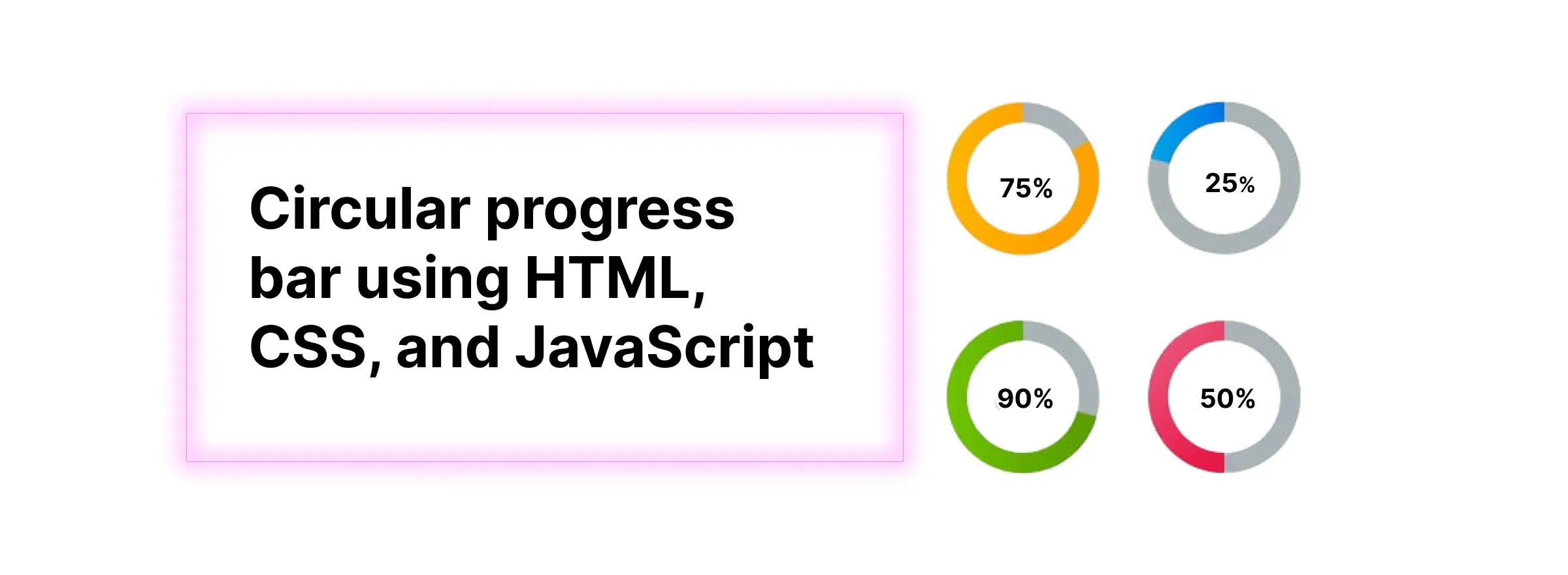
We have multiple ways of representing the progress bars on websites. In this blog, we are going to learn how to create a circular progress bar based on the input given by the user along with some nice color filling depending on the progress completion value.
Building the HTML markup
using HTML, CSS, and JavaScript then this blog will help you.
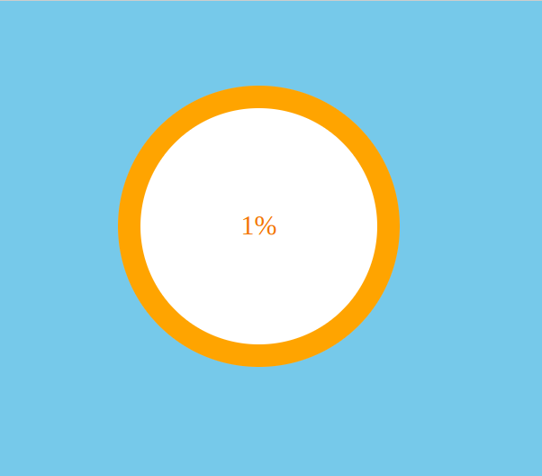
 <div class="circle-outer">
        <div class="circular-progress">
            <div class="value-container">1%</div>
        </div>
  </div>
Basic Styling
here are the styles for the circular progress bar
        *,
        *::before,
        *::after {
            padding: 0;
            margin: 0;
            box-sizing: border-box;
        }

        body {
            height: 100vh;
            background-color: #85C9E8;
        }

        .circle-outer {
            height: 400px;
            width: 400px;
            position: relative;
            border-radius: 8px;
            display: flex;
            margin: auto;
            align-items: center;
            justify-content: center;
            z-index: 1;
        }

        .circular-progress {
            position: relative;
            height: 250px;
            width: 250px;
            border-radius: 100%;
            background-color: orange;
            display: flex;
            align-items: center;
            justify-content: center;
        }

        .circular-progress::before {
            content: '';
            position: absolute;
            height: 84%;
            width: 84%;
            background-color: #ffffff;
            border-radius: 50%;
        }

        .value-container {
            position: relative;
            font-size: 24px;
            color: #e67e22;
        }
After applying all the above styles, let us check for the results, and here is the screenshot for your reference.
JavaScript functionality
Using JavaScript we can take the input value from the user and updated the progress bar.
   let progressBar = document.querySelector('.circular-progress');
   let valueContainer1 = parseInt(document.querySelector('.value-container').textContent);
   let valueContainer = document.querySelector('.value-container')
   let progressValue = 0;
   let progressEndValue = valueContainer1;
   let progress = setInterval(() => {
       if (valueContainer1 != 0) {
           progressValue++;
        }
       valueContainer1.textContent = `${progressValue}%`
       if (progressValue == progressEndValue && progressValue <= 25) {
            progressBar.style.background = `conic-gradient(#CD5C5C ${progressValue * 3.6}deg, #cadcff ${progressValue * 3.6}deg )`;
             clearInterval(progress);
         } else if (progressValue >= progressEndValue && progressValue <= 50) {
              progressBar.style.background = `conic-gradient(#ffa07a ${progressValue * 3.6}deg, #cadcff ${progressValue * 3.6}deg )`;
              clearInterval(progress);
          } else if (progressValue >= progressEndValue && progressValue <= 75) {
              progressBar.style.background = `conic-gradient(#568F56 ${progressValue * 3.6}deg, #cadcff ${progressValue * 3.6}deg )`;
              clearInterval(progress);
           } else if (progressValue >= progressEndValue && progressValue <= 100) {
               progressBar.style.background = `conic-gradient(#75B81F ${progressValue * 3.6}deg, #cadcff ${progressValue * 3.6}deg )`;
               clearInterval(progress);
           }
      });
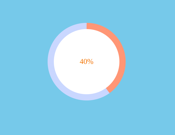
We are updating the progress from JavaScript
progressBar.style.background = `conic-gradient(#CD5C5C ${progressValue * 3.6}deg, #cadcff ${progressValue * 3.6}deg )`;
In the above code, we use progressValue multiple times 3.6 because We know that a circle is formed by 360 degrees.
The above CSS property value conic-gradient How it works.
- A conic gradient is a gradient with color transitions rotated around a center point.
- To create a conic gradient you must define at least two colors.
Final results:
Conclusion
With these simple steps, you have successfully created the circular progress bar. Hope you have learned something new from this blog. Thank you so much for reading.
 21 likes
 Add to read list

Comments