Discover essential standards for better (UX) simplicity, consistency, clear labels, visibility, responsiveness, feedback, hierarchy, and user testing.
What is UX?
UX stands for User Experience. It is a person's overall experience while using a product or service, such as a website, mobile application, or physical product. It encompasses all aspects of the user's interaction with the product or service, including its design, usability, accessibility, performance, and overall satisfaction.
Why UX?
UX is needed because it helps create products and services that are more user-centered and effective in meeting the needs and goals of users. Here are some specific reasons why UX is important:
- User Engagement: A good UX design increases user engagement with a product or service, increasing usage and adoption.
- Increased usability: UX design focuses on creating interfaces that are easy to use and navigate, making it more likely that users can accomplish their goals.
- Improved accessibility: A good UX design ensures that products and services are accessible to a broader range of users, including those with disabilities.
Standards of UX design
Major standards that we need to consider when planning a UX layout are,
- Design Elements
- Component level
- Block Level Design
- Page level Design
- Consistent navigation
Let’s get deep into all the standards of UX
Design Elements
Here are the major design elements that we need to consider before starting UX for a website.
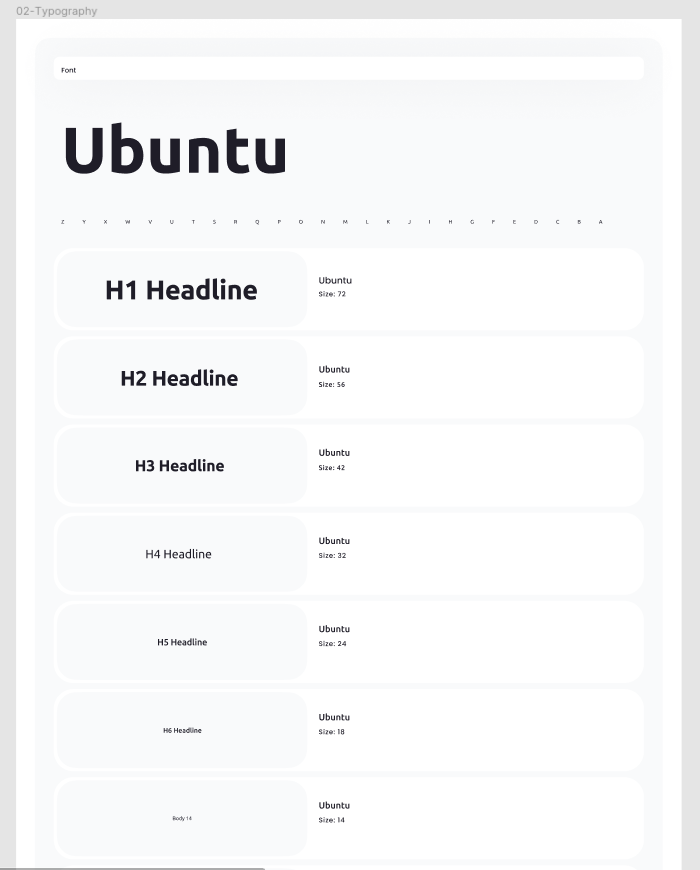
Typography
Typography includes having standardized fonts for all the HTML elements like heading, content, anchor text, and many others required. Check out here to get the Best practice for choosing and styling fonts, Tips & Tricks.
Here is an example that we followed the Typography for https://mycode.blog
Color Code
Choosing color code and the contrast between background and foreground colors in the UX will definitely help to have better accessibility and other benefits for the site. Check out here to get complete knowledge about Choosing color codes.
Layout
The layout is one of the major concepts that need to be planned as per the intention of the website. Layout designing must provide the column for all the types of content that the website holds.
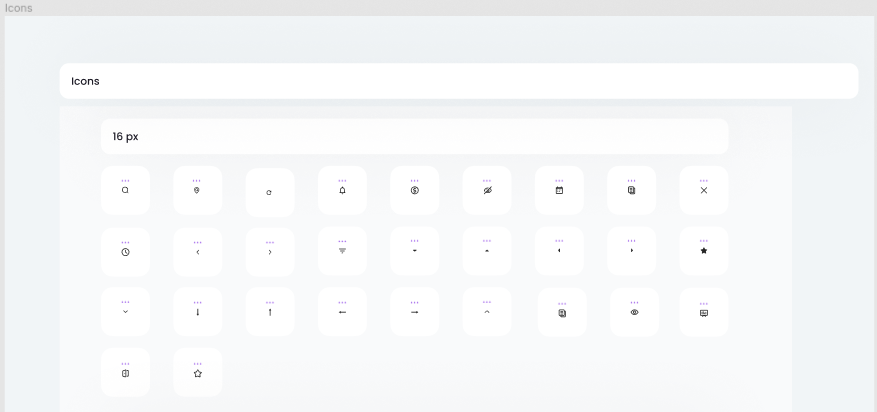
Icons
Icons must be included within the UI library of the UX design because taking third-party icons decreases the website performance and include more risk of bugs and load time of the website.
Background images
Choosing background images and the text on them is a very crucial element in UX, as we need to consider web accessibility standards. The contrast between the background image and foreground text should be readable. Check out here to get clarity on Choosing a color code.
Hover/focus effects
While designing Hover effects, we have to take care of a few areas, and here is the list,
- Meaningful hover effect: Ensure that the hover effect is meaningful and adds value to the user experience. A hover effect that serves no purpose or is purely decorative can be confusing or distracting for some users.
- Text alternatives: Provide text alternatives for the hover effect, such as descriptive text or tooltips, to ensure that users who cannot see or interact with the effect can still understand its purpose.
- Keyboard accessibility: Ensure that the hover effect can be triggered using the keyboard, as some users may not be able to use a mouse or touch screen to interact with the website.
- Consistency: Ensure that the hover effect is consistent across the website, so users can understand how it works and can use it consistently throughout the site.
- Color contrast: Ensure that the hover effect has sufficient color contrast with the background so that users with color vision deficiencies can still see and understand the effect.
- Animation speed: Be mindful of the speed of the animation. Slow down the animation speed to ensure users with cognitive or visual impairments have enough time to process and react to it.
Component level
Let us have the component level understanding of UX for a website. Firstly the designer must understand the purpose of the website and then analyze the required design elements after that they can plan for the component level.
Header
Designing an accessible header in UX is crucial to ensure that all users, regardless of their abilities, can easily navigate and use the website. Here are some standards to consider when designing an accessible header in UX:
- Logical hierarchy: The header should have a logical hierarchy with clear and consistent labeling for navigation items. The hierarchy should follow a top-down order with the most important items listed first.
- Keyboard accessibility: Ensure that all navigation items in the header can be accessed using the keyboard. This is important for users who cannot use a mouse or touch screen.
- Clear labeling: Use clear and descriptive labeling for all navigation items. This will help users understand what each item does and where it leads them.
- Contrast: Ensure that the text in the header has enough contrast with the background to make it easy to read. This is especially important for users with visual impairments.
- Responsive design: Ensure that the header is designed to work well on different devices and screen sizes. This includes making sure that the header is easily accessible and usable on mobile devices.
Navigation
Navigation must be accessible, adaptable, and consistent. Check out here for the standards of consistent navigation.
- Keep it Simple: Strive for simplicity in your navigation design. Avoid overwhelming users with too many options or complex navigation structures.
- Clear Labels: Use descriptive and concise labels for navigation elements. Labels should be easily understandable and provide a clear indication of the content or functionality behind each link or button.
- Depth and Hierarchy: Organize navigation elements in a logical hierarchy, especially for complex websites or applications. Use clear visual indicators to represent depth, such as dropdown menus, breadcrumbs, or hierarchical structures.
- Contextual Navigation: Provide contextually relevant navigation options based on the user's current location or task.
- User Testing and Iteration: Regularly conduct user testing to evaluate the effectiveness of your navigation design.
Breadcrumbs
Breadcrumbs are an important navigation element in UX that help users understand where they are on a website and how they can navigate to other pages.
Here are the few elements that must follow the accessibility standards, Sidebar menu, Buttons, Toggle & Tooltip, Accordion, Thumbnails, Tables, Form elements
Block Level Design
In the context of user experience (UX) design, block-level design refers to the practice of creating content sections or blocks within a digital interface, such as a webpage or application. These blocks are distinct visual and functional components that organize and present content in a structured manner. Each block typically focuses on a specific topic, task, or piece of information.
Block-level design helps improve the clarity, organization, and scannability of content by breaking it down into manageable sections. Each block can have its own visual treatment, layout, and functionality, making it easier for users to understand and interact with the content.
By utilizing block-level design, UX designers can effectively structure and present information, guide, user's attention, and create a more engaging and user-friendly experience. It allows for flexibility in arranging and prioritizing content, optimizing readability and comprehension, and enhancing overall usability.
Page level Design
In UX design, page-level design refers to the process of designing and structuring individual pages within a website, application, or digital product. It involves determining the layout, visual presentation, and interactive elements for each specific page, considering the content and goals of that particular page.
Standards of page-level design in UX:
- Information Architecture: Organizing and structuring content on the page in a logical and easily understandable manner. This involves establishing hierarchies, using headings and subheadings, and creating clear visual distinctions between different sections.
- Visual Design: Determining the overall visual aesthetic and style for the page, including the use of typography, colors, imagery, and other visual elements. It aims to create a visually appealing and cohesive presentation that aligns with the brand and supports the content.
- Interaction Design: Defining how users will interact with the page, such as the placement and behavior of buttons, links, forms, and other interactive elements. It involves considering the user's journey on the page and designing interactions that are intuitive, accessible, and aligned with user expectations.
- Content Placement and Formatting: Strategically placing content elements to optimize readability, comprehension, and engagement. This includes considerations such as paragraph length, use of white space, use of media, and content alignment.
- Responsiveness: Ensuring that the page design is responsive and adapts well to different screen sizes and devices. It involves designing flexible layouts and considering how the page's elements will rearrange and scale on smaller screens.
- Consistency: Maintaining consistency with the overall visual and interaction design patterns established throughout the entire product. Consistent use of visual elements, navigation patterns, and interaction behaviors helps users develop familiarity and reduces cognitive load.
How does UX affect accessibility?
User experience (UX) and accessibility are closely related, and one can greatly impact the other. In fact, designing for accessibility is an important part of creating a positive user experience for all users, including those with disabilities. Check out here to know the Accessibility Guidelines.
Finally, I want to conclude that Designing the best UX must include the best planning, apt layout designing, content alignment, and all the accessibility standards. Hope this blog helps you to find some useful info about UX designing.
 21 likes
 Add to read list

Comments