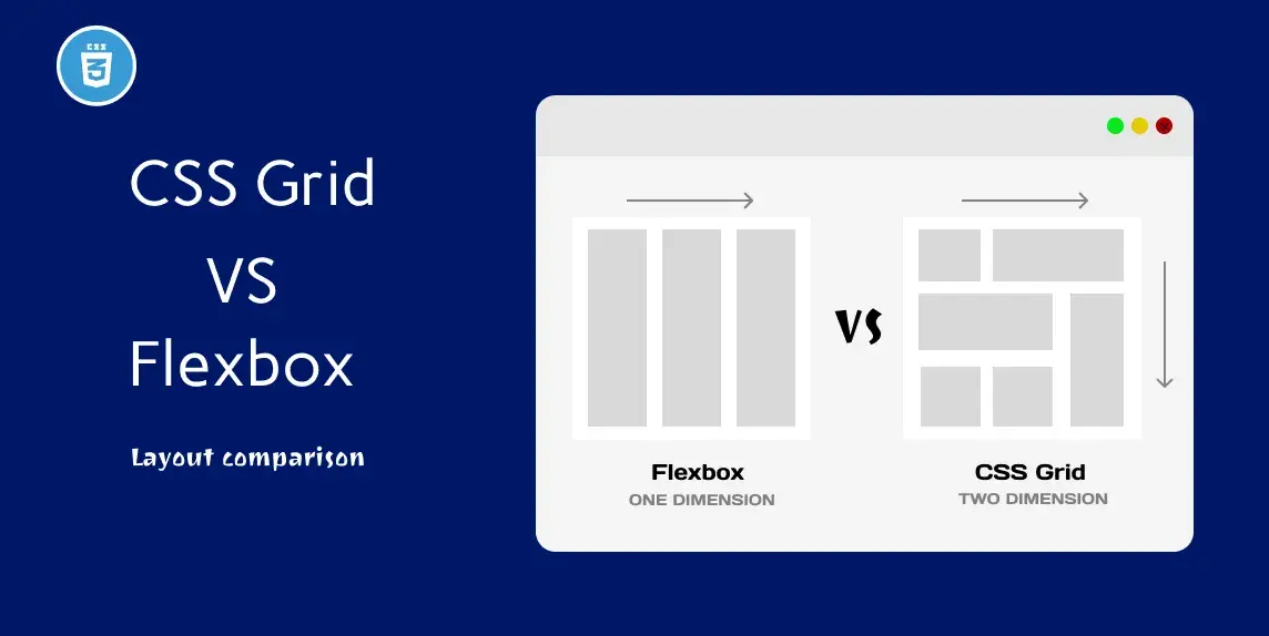
Create responsive web pages with ease using CSS Grid and Flexbox. Learn to create dynamic layouts that adjust to different screen sizes and devices.
Flexbox
Flexbox is a CSS layout module that helps in creating flexible and responsive web designs. It allows you to easily align, distribute and adjust the size of elements within a container, regardless of their content. It is a powerful tool for creating modern, dynamic, and adaptive web layouts.
You can learn more about How to use css flexbox Layouts to improve user Experience
CSS grid
CSS Grid is a layout system that allows you to create a two-dimensional grid of rows and columns to arrange content on a web page. It provides a powerful and flexible way to design and organize content, making it easier to create responsive and visually appealing layouts.
You can learn more about How to Use Grid Based Layouts to Improve User Experience
Layouts with flex
Layout 1
Index.html
<!DOCTYPE html>
<html lang="en">
<head>
    <link rel="stylesheet" href="./style.css">
    <title>Document</title>
</head>
<body>
    <div class="wrapper">
        <div class="container">
            <header>HEADER</header>
            <nav>NAVBAR</nav>
        </div>
        <div class="container1">
            <div class="sidebar1">SIDEBAR</div>
            <div class="container2">
                <main>MAIN</main>
            </div>
            <div class="sidebar2">SIDEBAR</div>
        </div>
        <footer>FOOTER</footer>
    </div>
</body>
</html>
style.css
body{
  font-family: monospace;
}

.wrapper {
  display: flex;
  flex-direction: column;
  font-weight: 600;
}

.container1{
  display: flex;
}

.container2 {
  display: flex;
  flex-direction: column;
  flex: 1;
}

header, nav, main, .sidebar1, .sidebar2, footer{
  display: flex;
  align-items: center;
  justify-content: center;
  box-shadow: inset 5px 5px 12px #555, 5px 5px 12px rgb(235 235 235 / 16%);
  border-radius: 10px;
}

main {
  background-color: #000d57;
  color: #fff;
  margin-left: 10px;
  height: 48vh;
}

nav {
  background-color: #fff;
  color: #000;
  padding: 1rem;
  height: 20px;
}

.sidebar1, .sidebar2 {
  flex-basis: 10%;
  background-color: #fff;
  color: #000;
}

.sidebar2{
  margin-left: 10px;
}

header, footer {
  background-color: #000d57;
  color: #fff;
  padding: 1rem;
  height: 50px;
}

header, nav{
  margin-bottom: 10px;
  flex-basis: 50%;
}

footer{
  margin-top: 10px;
}
Output
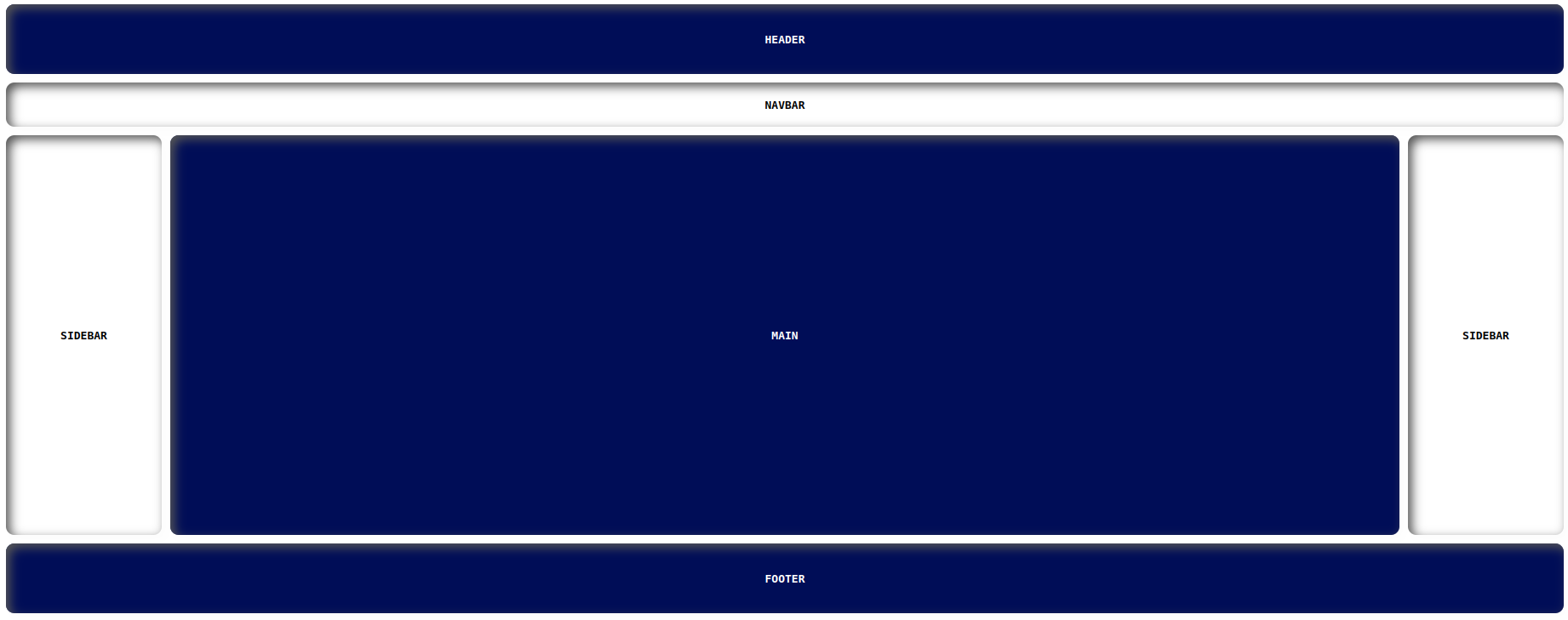
https://manojbharath1.github.io/flex-blog-examples/5-flexbox-layouts/design1/index.html
Layout 2
Here is the flexbox layout Github URL:
https://manojbharath1.github.io/flex-blog-examples/5-flexbox-layouts/design2/index.html
Layout 3
Here is the flexbox layout Github URL:
https://manojbharath1.github.io/flex-blog-examples/5-flexbox-layouts/design3/index.html
Layout 4
Here is the flexbox layout Github URL:
https://manojbharath1.github.io/flex-blog-examples/5-flexbox-layouts/design4/index.html
Layout 5
Here is the flexbox layout Github URL:
https://manojbharath1.github.io/flex-blog-examples/5-flexbox-layouts/reps-layout/index.html
Layouts with grid
Layout 1
Index.html
<!DOCTYPE html>
<html lang="en">
<head>
    <link rel="stylesheet" href="./design1.css">
    <title>Document</title>
</head>
<body>
    <h1>Grid Layout</h1>
    <div class="container wrapper">
		<header class="items">HEADER</header>
		<nav class="items">NAV</nav>
		<div class="items contents">CONTENTS</div>
		<aside class="items">ASIDE</aside>
		<footer class="items">FOOTER</footer>
	</div>
</body>
</html>
style.css
body{
  font-family: monospace;
  margin: 5rem;
}
.container {
  display: grid;
  grid-template-columns: 1fr 5fr 2fr;
  grid-template-rows: 5fr 20fr 5fr;
  grid-gap: 10px;
  height: 720px;
}

header {
  grid-column-start: 1;
  grid-column-end: 4;
  background-color: #e3ffd7;
}

nav{
  background-color: #cdd3ff;
}

.contents{
  background-color: 	#ddc2ff;

}

aside{
  background-color: #cdd3ff;
}

footer {
  grid-column-start: 1;
  grid-column-end: 4;
  background-color: #D3D3D3;
}

.items{
  display: grid;
  align-items: center;
  justify-content: center;
  box-shadow: inset 5px 5px 12px #555, 5px 5px 12px rgb(235 235 235 / 16%);
  border-radius: 10px;
  font-weight: 600;
  font-size: 18px;
}
Output
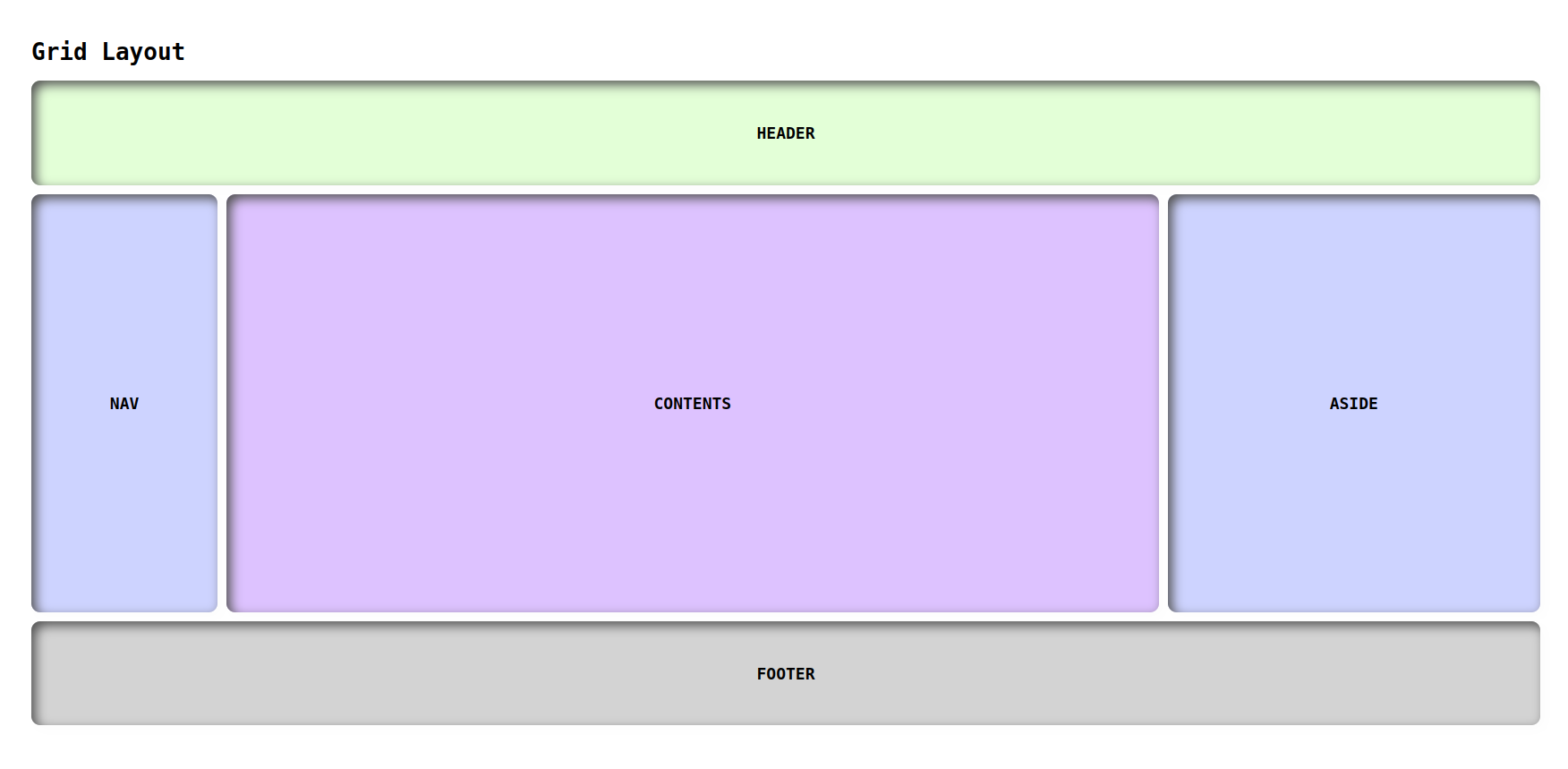
https://manojbharath1.github.io/grid-blog-exa/5-design%20layouts/Design1/design1.html
Layout 2
Here is the Grid layout Github URL:
https://manojbharath1.github.io/grid-blog-exa/5-design%20layouts/Design2/design2.html
Layout 3
Here is the Grid layout Github URL:
https://manojbharath1.github.io/grid-blog-exa/5-design%20layouts/Design3/design3.html
Layout 4
Here is the Grid layout Github URL:
https://manojbharath1.github.io/grid-blog-exa/5-design%20layouts/Design4/design4.html
Layout 5
Here is the Grid layout Github URL:
https://manojbharath1.github.io/grid-blog-exa/5-design%20layouts/Design5/design5.html
Flex vs grid
Pros and Cons
| Pros | Cons | |
| Flex |
|
|
| Grid |
|
|
How to use Grid and how to use flex
| How to use Grid | How to use flex |
|
|
When to use Grid and when to use flex
| When to use Grid | When to use flex |
|
|
Browser compatibility
| Chrome | Firefox | Safari | opera | |
| Flex | 107.0.5304.121 | 111.0.1 | 16.4 | 10-11.5 Not supported |
| Grid | 107.0.5304.121 | 111.0.1 | 3.1-10 |
10-27 Not Supported 28-43 Not supported |
Conclusion
In this blog, The CSS Grid and Flexbox together provide a powerful set of tools for creating responsive web pages that adapt to any device. I hope you guys learned something new in this blog, Thank you.
 21 likes
 Add to read list

Comments