A user-friendly navigation system is essential for any website or application. This blog gives the standards & tips to create a user-friendly navigation system.
What is a navigation system?
In web development, a navigation system refers to the design and implementation of elements that allow users to move between different pages or sections within a website. It provides a structure and pathway for users to explore and access the content and functionality of the website.
Standards of user-friendly navigation
1. Keep it Simple
The first and most important tip is to keep your navigation system simple. Avoid using too many menu items or submenus as it can confuse the users. Instead, focus on creating a clear and concise navigation system that is easy to understand.
2. Use Clear Labels
Using clear and descriptive labels for your menu items is crucial. It helps users quickly understand what each option represents and what they can expect to find. Avoid using technical jargon or vague terms that may confuse the users.
3. Organize Your Menu Items
Organizing your menu items in a logical and intuitive manner is another important tip. Group related items together and use submenus to further categorize your content. This will help users easily find what they are looking for and reduce the amount of time they spend searching.
4. Use Visual Cues
Using visual cues such as icons or images can make your navigation system more user-friendly. It can also make it more visually appealing and engaging. However, be careful not to overuse them as it can clutter your menu and make it harder to navigate.
5. Make it Accessible
Making your navigation system accessible is crucial for users with disabilities. Ensure that your menu is keyboard accessible and that it can be navigated using assistive technologies such as screen readers. This will help to ensure that all users can easily navigate your website or application.
6. Test and Iterate
Finally, it is important to test your navigation system and iterate based on user feedback. Utilize user testing to identify any issues or areas that require improvement, and subsequently implement necessary changes based on the findings. This will help to ensure that your navigation system is truly user-friendly and meets the needs of your users.
Types of Navigation
Before getting into designing the navigation system, it is important to understand the standards and here they are the standards of designing consistent navigation
Horizontal Menu
A horizontal menu is a navigation element commonly used in website design to help users navigate through different sections or pages of a website. It is typically displayed horizontally at the top or bottom of a webpage and consists of a series of clickable links or buttons.
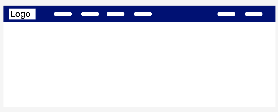
Example,
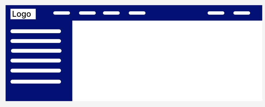
Vertical menu
A vertical menu is a navigation element commonly used in website design to provide users with a vertical list of clickable links or buttons that allow them to navigate through different sections or pages of a website. It is typically displayed vertically in a sidebar or a dedicated area on a webpage.

Mostly vertical navigation will be chosen for the dashboard type of need, here is an example
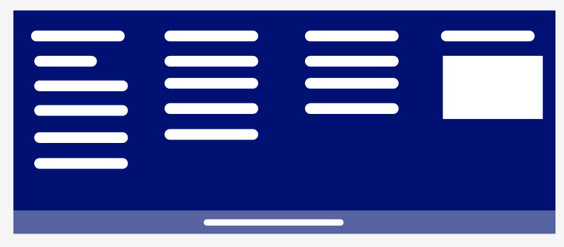
Combination of Horizontal and vertical menu
The combination of horizontal and vertical menus in website design is a strategic approach to navigation that offers the benefits of both menu styles. By integrating both horizontal and vertical menus, designers can create a comprehensive and efficient navigation system that optimizes space and enhances the user experience.
Example,
Drop-down Menu
A drop-down menu is a popular navigation element used in website design to present a list of options in a compact and space-saving manner. It typically appears as a horizontal or vertical list of menu items, which expands or drops down when users hover over or click on a parent menu item.
Example,
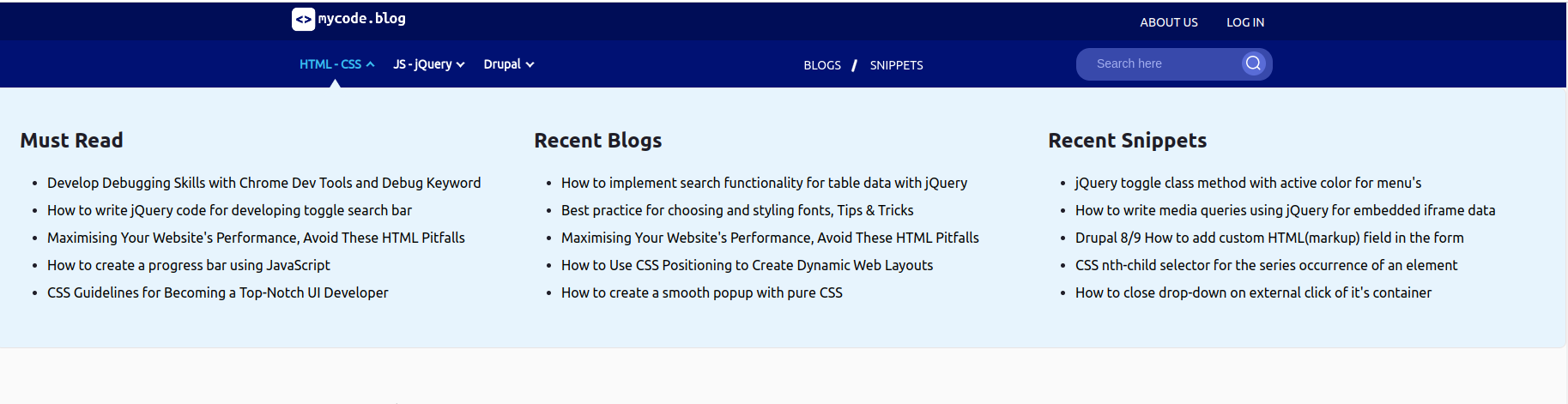
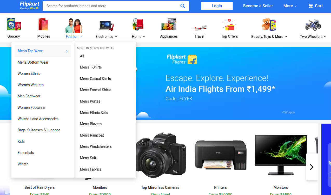
Mega Drop-down Menu
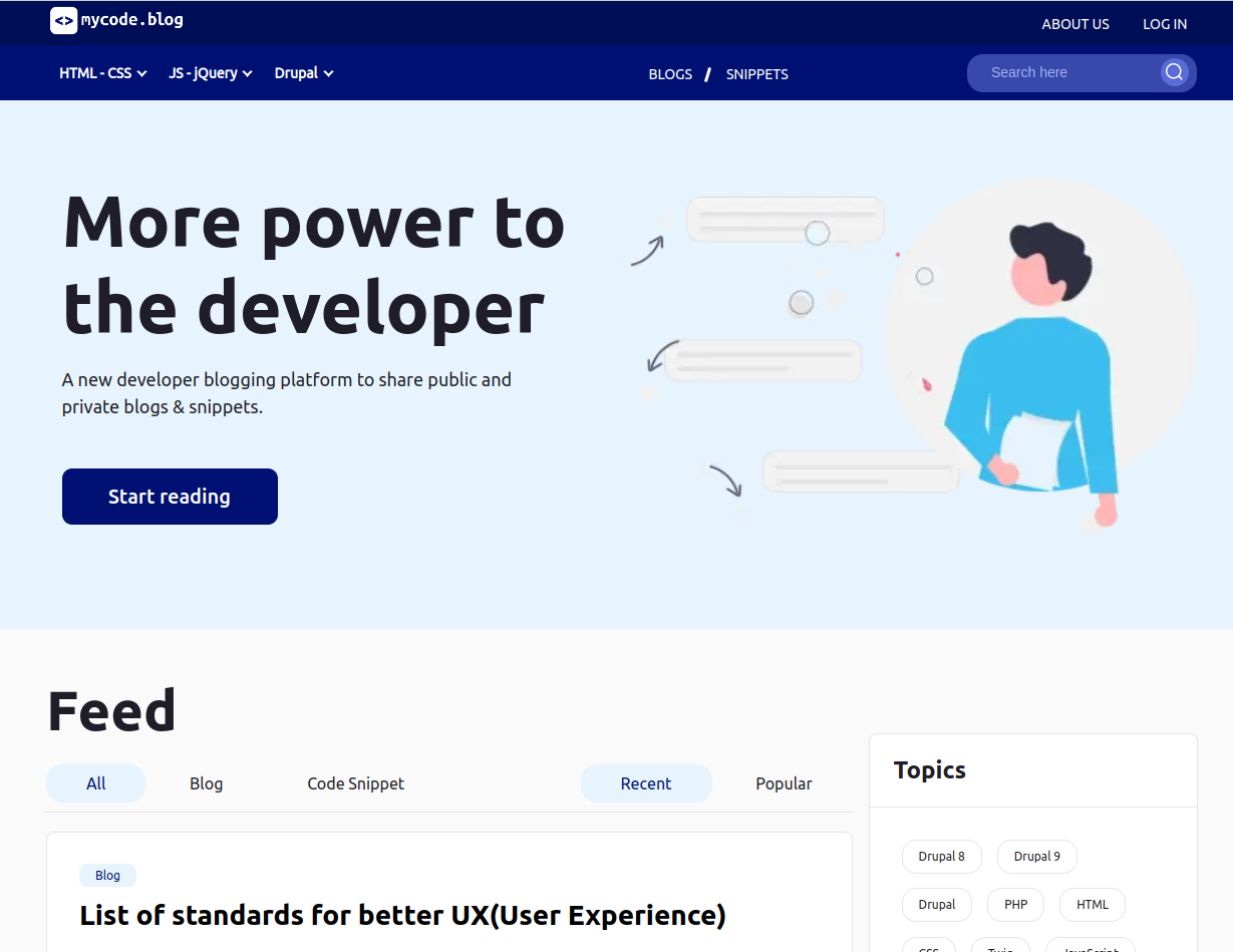
A mega drop-down menu is an advanced version of a drop-down menu that provides an expanded and feature-rich navigation experience. It allows websites to display not only a list of menu items, but also additional content, images, or even interactive elements within the expanded drop-down area.
We can take Flipkart menu as an example,
Fixed Navigation
Fixed navigation, also known as sticky navigation, is a website design technique where the navigation menu remains visible and fixed in position as the user scrolls through the webpage. Unlike traditional navigation menus that scroll off the screen as users move down, a fixed navigation menu stays in a consistent location, typically at the top or side of the webpage.
Example,
Footer Menu
A footer menu, also known as a bottom navigation or site footer, is a navigational element located at the bottom of a webpage. It typically contains a series of links or buttons that allow users to access important pages or sections of a website, such as contact information, site policies, terms of service, and other relevant links.
Example,
How does Navigation affect accessibility?
Consistent navigation across the site helps users to have ease of navigation and feel comfortable accessing the site. Check out here for the navigation accessibility standards.
Conclusion
In conclusion, creating a user-friendly navigation system is essential for any website or application. By keeping it simple, using clear labels, organizing your menu items, using visual cues, making it accessible, and testing and iterating, you can create a navigation system that is easy to use and improves the overall user experience.
 21 likes
 Add to read list

Comments