CSS positioning can make or break the layout. Learn how to use relative, absolute, fixed, and sticky positioning wisely for optimal and flexible designs.
Prior knowledge of position properties
The position properties in CSS are used to control the positioning of elements on a web page. These properties include "static", "relative", "absolute", "fixed", and "sticky".
Here is a tabular overview of the CSS position properties:
| Properties | Syntax | When to use | Example | Results |
| Static | position: static; |
The static position is the default position for HTML elements and is used when you want an element to follow the normal flow of the document without any special positioning. Use static when you do not need to set any other position properties such as top, right, bottom, left, or z-index. |
|
 |
| Relative | position: Relative; | Relative position is useful when you want to shift an element from its default position while still allowing it to flow with the surrounding content. |
|
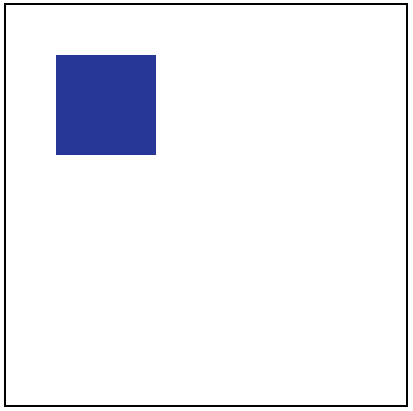 |
| Absolute | position: absolute; | Absolute positioning should be used when you want to precisely position an element relative to its parent container or the viewport, regardless of other elements on the page. |
|
 |
| Fixed | position: fixed; | Use CSS fixed position when you want an element to remain in a fixed position on the screen, even when the user scrolls or resizes the browser window. |
|
 |
| Sticky | position: sticky; | Use CSS sticky position when you want an element to "stick" to a specific position on the page as the user scrolls, but then resume its normal flow when the scrolling is complete. |
|
 |
Playing with HTML elements using position properties
Design sticky sidebar using CSS position property
A sticky sidebar is a popular design pattern for websites where the sidebar stays fixed to the screen as the user scrolls down the page. This can be achieved using the CSS position property with the sticky value.
We can see the example of a right sticky sidebar here Design a sticky sidebar using the CSS position property
You can also get the left sticky side with a pure CSS bar here How to create browser compatable sticky sidebar with pure CSS
Design Sticky Navigation using CSS position property
CSS sticky position is a type of positioning that allows an element to "stick" to a certain position on the screen as the user scrolls, similar to a fixed position element, but with the added benefit of being able to move out of its containing block when it reaches a certain point.
We can see the example of a sticky Navigation here Design a sticky Navigation using the CSS position property
Design overlaying layouts using CSS position property
Overlaying layouts using CSS position property can be useful when you want to place one element on top of another element, such as a text block over an image or a tooltip over a button.
Here's an example of how to create overlay two layouts using the position property:
Example:1
Structuring the layout with required HTML
Index.html
<!DOCTYPE html>
<html lang="en">
<head>
<link rel="stylesheet" href="./style.css">
<title>Document</title>
</head>
<body>
<div class="container">
<div class="content1">
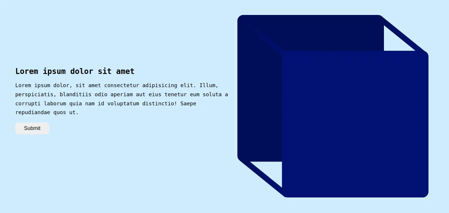
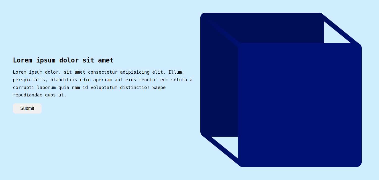
<h1>Lorem ipsum dolor sit amet</h1>
<p class="para1">Lorem ipsum dolor, sit amet consectetur adipisicing elit. Illum, perspiciatis, blanditiis odio aperiam aut eius tenetur eum soluta a corrupti laborum quia nam id voluptatum distinctio! Saepe repudiandae quos ut.</p>
<button>Submit</button>
</div>
<div class="content2">
<div class="box1"></div>
<div class="box2"></div>
<div class="hello"></div>
<div class="hello1"></div>
<div class="hello2"></div>
</div>
</div>
</body>
</html>Designing the layout with required CSS properties
Style.css
body {
  font-family: monospace;
  background-color: #d0ecff;
}

.container{
  display: flex;
  padding: 50px;
  gap: 20px;
}

.content1{
  padding: 10rem 0 30px;
  max-width: 40vw;
}

.para1{
  font-size: 18px;
  line-height: 1.7;
}

button{
  padding: 10px 30px;
  font-size: 18px;
  border: none;
  border-radius: 10px;
}
.content2{
  display: flex;
  align-items: center;
  justify-content: center;
  position: relative;
}

.box1, .box2{
  width: 500px;
  height: 500px;
  border-radius: 20px;
}

.box1{
  background-color: #000d57;
}

.box2{
  background-color: #001173;
  position: absolute;
  top: 122px;
  left: 152px;
}

.hello{
  background-color: #001173;
  position: absolute;
  top: -31px;
  left: 78px;
  width: 19px;
  height: 212px;
  rotate: 309deg;
  border-radius: 17px;
  background: linear-gradient(130deg, #000d57, #001173);
}

.hello1{
  position: absolute;
  bottom: -157px;
  left: 81px;
  width: 19px;
  height: 212px;
  rotate: 309deg;
  border-radius: 17px;
  background: linear-gradient(130deg, #000d57, #001173);
}

.hello2{
  position: absolute;
    top: -31px;
    right: -74px;
    width: 19px;
    height: 212px;
    rotate: 309deg;
    border-radius: 17px;
    background: linear-gradient(130deg, #000d57, #001173);
}
Final results:
Example 2
Structuring the layout with required HTML
Index.html
<!DOCTYPE html>
<html lang="en">
<head>
<link rel="stylesheet" href="./style.css">
<title>Document</title>
</head>
<body>
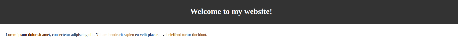
<div class="container">
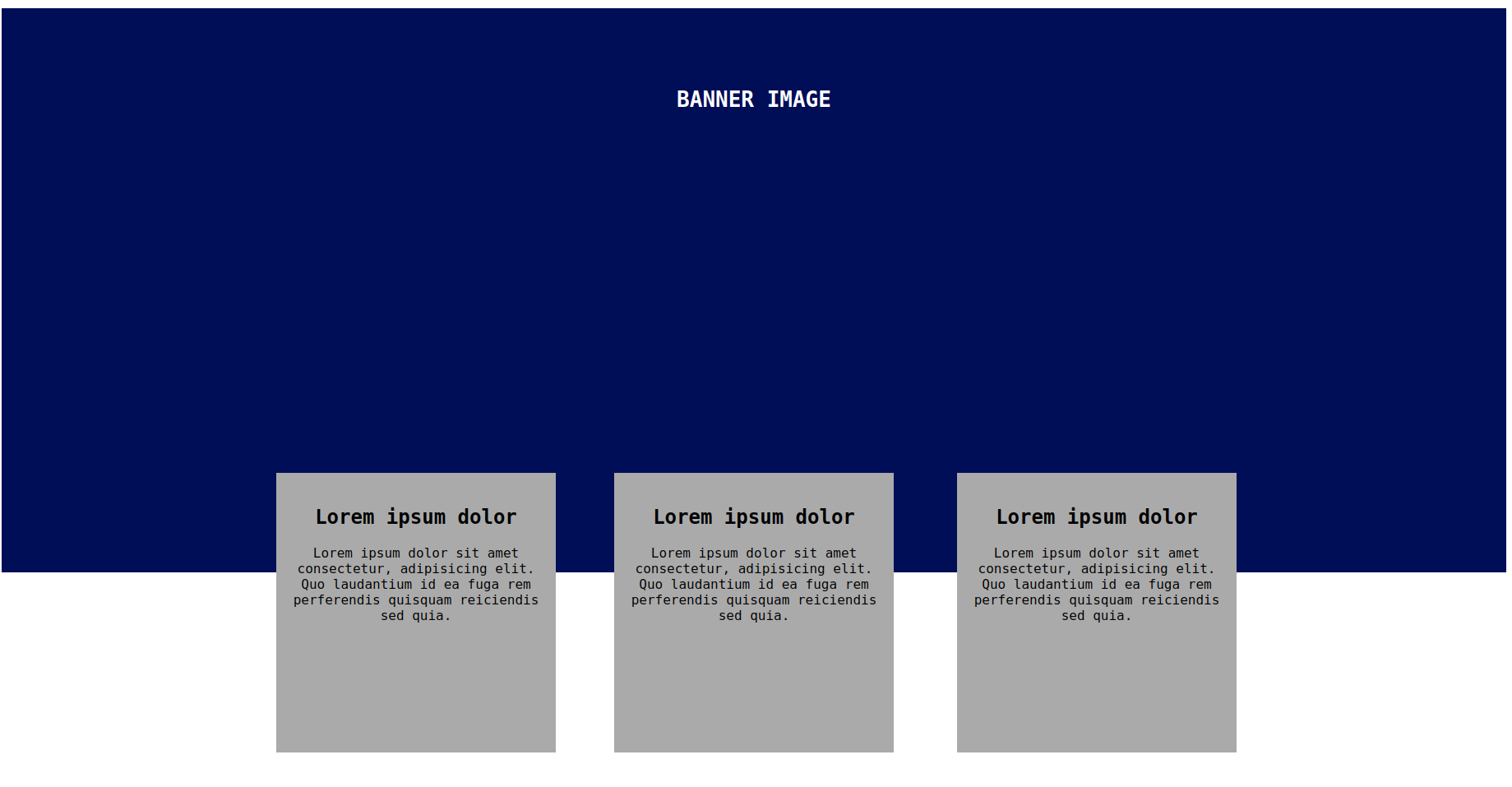
<h1>BANNER IMAGE</h1>
</div>
<div class="container2">
<div class="box1">
<h2>Lorem ipsum dolor</h2>
<p>Lorem ipsum dolor sit amet consectetur, adipisicing elit. Quo laudantium id ea fuga rem perferendis quisquam reiciendis sed quia.</p>
</div>
<div class="box2">
<h2>Lorem ipsum dolor</h2>
<p>Lorem ipsum dolor sit amet consectetur, adipisicing elit. Quo laudantium id ea fuga rem perferendis quisquam reiciendis sed quia.</p>
</div>
<div class="box3">
<h2>Lorem ipsum dolor</h2>
<p>Lorem ipsum dolor sit amet consectetur, adipisicing elit. Quo laudantium id ea fuga rem perferendis quisquam reiciendis sed quia.</p>
</div>
</div>
</body>
</html>Designing the layout with required CSS properties
Style.css
body {
  font-family: monospace;
}

.container{
  background-color: #000d57;
  height: 70vh;
}

h1{
  text-align: center;
  color: #fff;
  padding-top: 6rem;
}

.container2{
  position: relative;
  display: flex;
  align-items: center;
  justify-content: center;
  margin: 0 8rem;
}

.box1{
  background-color: #aaaaaa;
  width: 300px;
  height: 300px;
  position: absolute;
  top: -121px;
  text-align: center;
  font-size: 16px;
  padding: 20px;
}

.box2{
  background-color: #aaaaaa;
  width: 300px;
  height: 300px;
  position: absolute;
  top: -121px;
  left: 206px;
  text-align: center;
  font-size: 16px;
  padding: 20px;
}

.box3{
  background-color: #aaaaaa;
  width: 300px;
  height: 300px;
  position: absolute;
  top: -121px;
  right: 200px;
  text-align: center;
  font-size: 16px;
  padding: 20px;
}
Final results:
How to use position properties
here are the steps to use position properties in CSS:
- First, identify the element(s) you want to position on your web page.
- Choose the appropriate position property for your needs. There are several position properties you can use in CSS, including static, relative, absolute, fixed, and sticky.
- Use the position property to apply your chosen positioning value to the element. For example, to position an element absolutely, you would use the following code:
.element {
  position: absolute;
  top: 10px;
  left: 20px;
}- If you're using relative positioning, you can adjust the element's position using the top, right, bottom, and left properties. For example:
.element {
  position: relative;
  top: 10px;
  left: 20px;
}- If you're using absolute positioning, you can position the element relative to its closest positioned ancestor. For example:
.parent {
  position: relative;
}

.child {
  position: absolute;
  top: 10px;
  left: 20px;
}- If you're using fixed positioning, the element will be positioned relative to the viewport, so it will stay in the same position even if the user scrolls the page. For example:
.element {
  position: fixed;
  top: 10px;
  left: 20px;
}- If you're using sticky positioning, the element will be positioned relative to its nearest scrolling ancestor, and will "stick" to the top or bottom of the viewport when the user scrolls past it. For example:
.element {
  position: sticky;
  top: 10px;
}
common mistakes and corrections
here are the common mistakes and their corrections when using CSS position properties:
| Mistake | Correction | Example |
| Using “position: static” to position an element | Use "position: relative" or "position: absolute" instead |
|
| Not specifying a position property | Specify a position property such as "top", "left", etc. |
|
| Using "position: absolute" without a parent with "position: relative" | Wrap the element in a container with "position: relative" |
|
| Setting "position: relative" to move an element | Use "transform" instead to move elements while maintaining their original position in the document flow |
|
| Overusing "position: absolute" | Try to use "position: relative" or "display: inline-block" instead to avoid layout issues |
|
| Confusing "position: absolute" with "position: fixed" | Use "position: fixed" for elements that should stay fixed in the viewport |
|
Conclusion
This article full fills the requirement of getting the knowledge about positing elements in CSS along with justified examples, hope you learnt something new over here. Save it for quick reference. Happy learning!!
 21 likes
 Add to read list

Comments