| Property |
Syntax/Representation |
Example |
Output |
| Display grid |
.grid-container{display:grid;} |
.container {
display: grid;
display: inline-grid;
}
|
|
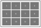
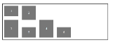
| Grid template columns |
grid-template-columns:<track-size><track-size>; |
.container{
grid-template-columns:
1fr 1fr 1fr;
grid-template-columns:
100px 200px 150px;
grid-template-columns:
repeat(3, 100px);
grid-template-columns:
repeat(3, minmax(100px, 1fr));
}
|
![grid template column image]() |
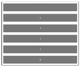
| Grid template rows |
grid-template-rows:<track-size><track-size>; |
.container{
grid-template-rows:
50px 20% 1fr;
grid-template-rows:
1fr 1fr 1fr;
grid-template-rows:
repeat(3, 150px);
}
|
![grid template row image]() |
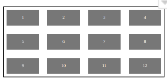
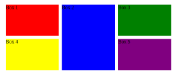
| Grid gap |
grid-gap:<grid-row-gap><grid-column-gap>; |
.container{
grid-gap: 30px;
grid-gap: 5% 12%;
grid-gap: 4rem 2em;
grid-gap: 2% 12px
}
|
![grid gap image]() |
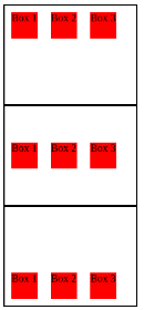
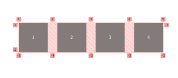
| Grid column |
grid-column:[grid-column-start]/[grid-column-end]; |
.container{
grid-column: auto auto;
grid-column: 1 / 3;
grid-column: span 3;
grid-column: 1 / span 4;
}
|
![grid column image]() |
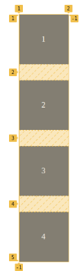
| Grid row |
grid-row:[gtid-row-start]/[grid-row-end]; |
.container{
grid-row: auto;
grid-row: span 2 / 5;
grid-row: inherit;
grid-row: 2 / -3;
grid-row: initial;
}
|
![grid row image]() |
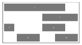
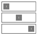
| Justify content |
justify-content:[value]; |
.container{
justify-content: center;
justify-content: start;
justify-content: end;
justify-content: flex-start;
justify-content: flex-end;
justify-content: left;
justify-content: right;
justify-content: space-between;
justify-content: space-around;
justify-content: space-evenly;
justify-content: inherit;
}
|
![justify content image]() |
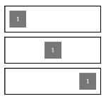
| align items |
align-items:[value]; |
.container{
align-items:normal;
align-items: start;
align-items: end;
align-items: center;
align-items: flex-start;
align-items:  flex-end;
align-items: inherit;
align-items: baseline;
align-items: first baseline;
align-items: last baseline;
}
|
![align items image]() |
| Justify items |
justify-items:<value>; |
.container{
justify-items: normal;
justify-items: left;
justify-items: right;
justify-items: start;
justify-items: end;
justify-items: baseline;
justify-items: first baseline;
justify-items: last baseline;
justify-items: center;
justify-items: flex-start;
justify-items:  flex-end;
justify-items: inherit;
}
|
![justify item image]() |
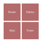
| grid template areas |
grid-template-areas:none|<string>values; |
.container{
grid-template-areas: none;
grid-template-areas: "a b";
grid-template-areas:
  "a b b"
  "a c d";
grid-template-areas: "header sidebar"
"main footer";
}
|
![grid template area image]() |
| grid auto rows |
grid-auto-rows:<values>; |
.container{
grid-auto-rows: min-content;
grid-auto-rows: max-content;
grid-auto-rows: auto;
grid-auto-rows: 100px;
grid-auto-rows: 10%;
grid-auto-rows: 0.5fr;
grid-auto-rows: minmax(100px, auto);
grid-auto-rows: minmax(max-content, 2fr);
grid-auto-rows: fit-content(400px);
grid-auto-rows: min-content max-content auto;
grid-auto-rows: 0.5fr 3fr 1fr;
grid-auto-rows:minmax(100px, auto)
minmax(max-content, 2fr)
minmax(20%, 80vmax);
}
|
![grid auto row image]() |
| grid column gap |
grid-columnn-gap:value; |
.container{
grid-coumn-gap: 8px;
grid-column-gap: 4%;
grid-column-gap: 3rem;
grid-column-gap: 2em;
}
|
![grid column gap image]() |
| Grid row gap |
grid-row-gap:value; |
.container{
grid-row-gap: 3rem;
grid-row-gap: 12px;
grid-row-gap: 5%;
grid-row-gap: 2em;
}
|
![grid row gap image]() |
 21 likes
 Add to read list

Comments