Common types of grid layouts include fixed, modular, fluid, hierarchical, and multi-column grids, used in graphic and web design.
Types of grid layouts
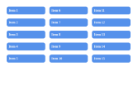
You can see examples for types of grid layouts
| Layouts | Definition | Syntax | Example | Output |
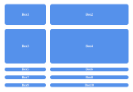
| Fixed Layout | CSS fixed layout is a design approach where the position and size of elements on a webpage are set to fixed values. |
display: grid; |
|
 |
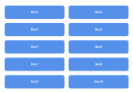
| Fluid Layout | The fluid layout basically means the size of the page changes as the window resizes | display: grid; grid-template-columns: repeat(auto-fit, minmax(<Value>, <Value>)); grid-template-rows: <Value> <Value>; |
|
 |
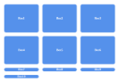
| Modular Layout | The modular layout allows creating of reusable and flexible design components. | display: grid; grid-template-columns: repeat(4, <value>); grid-template-rows: repeat(2, <value); |
|
 |
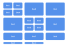
| Hierarchical Layout | Hierarchical layout is a way of arranging elements on a webpage based on their parent-child relationship | grid-template-columns: 1fr 1fr; grid-template-rows: 1fr 1fr; |
|
 |
| Multi-column grid Layout | A multi-column grid layout is a type of layout used in web design that arranges content into multiple columns. | columns: <'column-width'> | <'column-count'>: |
|
 |
 21 likes
 Add to read list

Comments