Flexbox layout is a powerful tool for building flexible and responsive web layouts. Key concepts include flex containers, items, axes, and alignment.
Features of flexbox layout
You can learn more information about using the flexbox layout
One-Dimensional Layout:
Flexbox provides a one-dimensional layout, either horizontally or vertically. This makes it easy to align and distribute items along a single axis, without affecting the other axis.
Alignment and Justification:
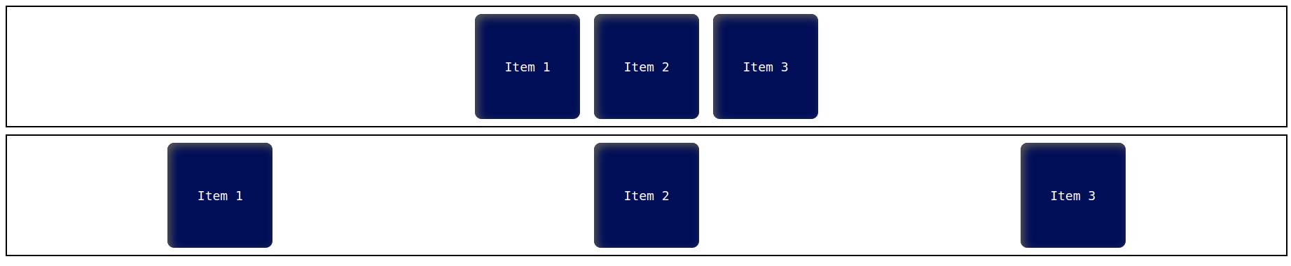
Flexbox provides powerful alignment and justification options that allow you to align items along the main axis or the cross axis. This includes options like centering, space-between, and space-around.
|
When to use |
Behavior |
Responsiveness |
Examples |
|
Use alignment to position items along the cross-axis, and justification to align items along the main axis in Flexbox. |
In flexbox, Alignment can be controlled using the align-items property, which accepts values such as stretch, flex-start, flex-end, center, and baseline. Justification can be controlled using the justify-content property, which accepts values such as flex-start, flex-end, center, space-between, space-around, and space-evenly. |
For responsiveness alignment and justification in flexbox, use the properties "align-items", "align-content", "justify-content", and "flex-wrap". |
 |
Flexible item sizing:
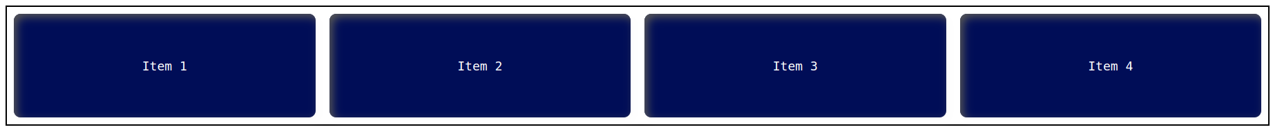
Flex items can be sized based on their content, or given a specific size using flexible units such as percentages or flexible lengths.
|
When to use |
Behavior |
Responsiveness |
Examples |
|
Flexible item sizing is useful when designing layouts that need to accommodate content of varying lengths or sizes. It allows for a more responsive and adaptive design that can adjust to different screen sizes and user preferences. |
Flexible item sizing means that the design should adjust to fit different screen sizes. The behavior should be user-friendly and ensure that the design remains functional and attractive on any device. |
Flexible item sizing requires responsiveness to ensure that content adjusts smoothly and seamlessly to different screen sizes. |
 |
Wrap control:
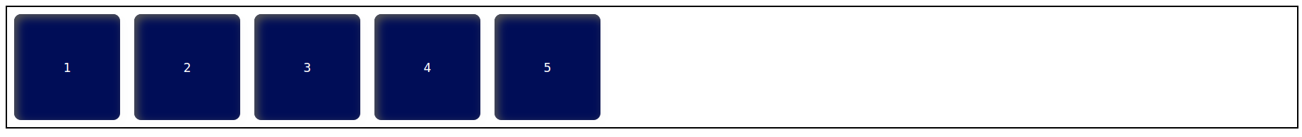
Flexbox can control whether the items wrap onto a new line when they reach the edge of the container or not.
|
When to use |
Behavior |
Responsiveness |
Examples |
|
Wrap control in flexbox should be used when you want the flex items to wrap to a new line when they exceed the container width. |
When using Wrap control, it's important to ensure that the layout remains legible and easy to navigate, while also being flexible and responsive to changes in screen size. |
In Wrap control, responsiveness means adjusting the layout to fit the available space while maintaining readability and usability. |
 |
Order control:
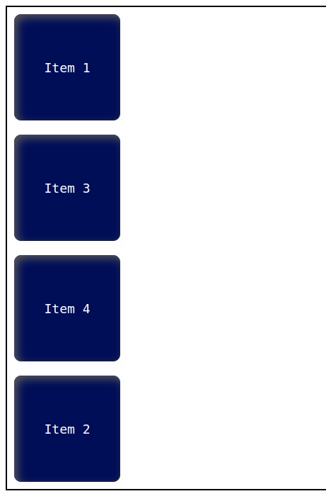
The order of the items can be rearranged without having to change the HTML structure.
|
When to use |
Behavior |
Responsiveness |
Examples |
|
Use order control in flexbox when you need to change the visual order of flex items without changing their position in the source code. |
To control the order of flex items in a flex container, use the CSS property "order" and assign a value to it representing the order in which the items should be displayed. |
The "order" property in flexbox controls the order in which flex items are displayed within their container and affects their responsiveness. |
 |
 21 likes
 Add to read list

Comments