
Testing on multiple devices and browsers is crucial for consistent performance and user experience. it is essential to find and fix compatibility issues by testing on various devices.
Device and browser compatibility
It's important to ensure that your design works correctly and looks good on various devices and browsers. You should test your design on popular desktop and mobile browsers such as Chrome, Safari, Firefox, and Edge, as well as on different devices such as phones, tablets, laptops, and desktop computers.
Some examples of device and browser compatibility issues include:
- A website that looks great on a desktop computer, but is difficult to navigate on a mobile device due to small text or buttons.
- A website that uses plugins or features that are not supported on certain browsers, leads to broken functionality or missing content.
- A website that takes a long time to load on slower devices or connections, leads to a poor user experience.
- A website that is not optimized for different screen sizes, results in a layout that looks broken or unreadable on certain devices.
- A website that relies on outdated technologies or programming languages, leads to compatibility issues with newer browsers or devices.
Responsive design
Your design should be responsive, meaning it should adapt and adjust to different screen sizes and orientations. This is especially important for mobile devices, which have smaller screens and may be held in different orientations. Click here to know more about responsive desigh
Page load speed
The speed at which your design loads is crucial for user experience and search engine optimization. You should test your design's load speed on different devices and browsers to ensure it loads quickly.
There are several factors that can affect page load speed, including:
- Server response time: The amount of time it takes for a server to respond to a request from a user's browser.
- File size: The size of the web page's files, including images, videos, scripts, and stylesheets.
- Caching: The practice of storing website files in a user's browser or on a content delivery network (CDN) to reduce load times.
- Compression: The practice of compressing files to reduce their size and improve load times.
- Website design: The complexity of a website's design can affect load times, with simpler designs typically loading faster than more complex ones.
To improve page load speed, web designers can take several steps, such as optimizing images and other files to reduce their size, using caching and compression techniques, and minimizing the use of scripts and plugins. They may also use a content delivery network (CDN) to store website files in multiple locations to reduce load times for users in different regions.
Accessibility
Your design should be accessible to all users, including those with disabilities. You should test your design for accessibility features such as keyboard navigation, screen readers, and color contrast. Click here to know more about accessibility
User testing
It's essential to get feedback from actual users on your design. You can conduct user testing sessions with individuals who represent your target audience to get feedback on usability, design, and functionality.
There are several types of user testing, including:
- Usability testing: This involves observing users as they perform specific tasks on the product and gathering feedback on their experience.
- A/B testing: This involves presenting users with two versions of a product, and gathering data on which version performs better.
- Remote testing: This involves testing the product with users who are located in different geographic locations.
- Prototype testing: This involves testing a preliminary version of a product to gather feedback before the final version is developed.
User testing is important in web design because it helps designers understand how users interact with the product, identify potential usability issues, and make data-driven design decisions. By understanding user behavior and preferences, designers can create products that are intuitive, easy to use, and meet the needs of their target audience.
Cross-browser testing tools
Many tools are available to help you test your design on different devices and browsers. Some popular tools include BrowserStack, CrossBrowserTesting, and Sauce Labs.
Some useful examples of cross-browser testing tools include:
BrowserStack
A cloud-based platform that allows users to test their website or application on over 2,000 different browsers and devices.
Here is a visual reference of the browser stack
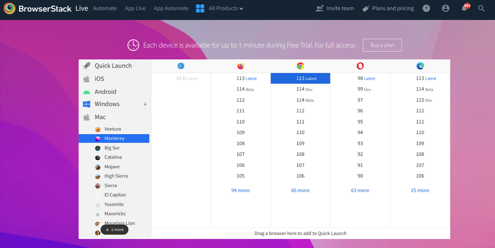
In this browser stack framework, we have lot a of real mobile devices and desktops available to test your application on real devices
Here is the iphoe14 pro dev tool visual reference

CrossBrowserTesting
A tool that allows users to test their website or application on over 2,000 real desktop and mobile browsers.
Sauce Labs
A cloud-based platform that allows users to run automated tests on over 700 browser and operating system combinations.
Browserling
A tool that allows users to test their website on a variety of browsers and operating systems, including legacy versions of Internet Explorer.
Conclusion
Through this blog, we have covered important topics such as device compatibility, responsive design, and testing guidelines, providing you with valuable insights. We hope that you have learned something new and appreciate you taking the time to read it.
 21 likes
 Add to read list

Comments