Grid-based layouts are a design approach that uses a grid structure to organize and present content on a website, improving consistency and navigation.
What is grid
Grid Layout is a two-dimensional layout system that allows you to create complex layouts for web pages. It allows you to divide a web page into a grid of rows and columns, and then place content in any grid cell.
You can also control the size and position of each grid cell, and create responsive layouts that adjust to different screen sizes.
Properties of grid
CSS Grid is a powerful layout system that allows you to create complex grid-based layouts for your web pages and you can learn complete information about the Properties of grid
Why grid
CSS grid layout is used in web design to create a grid-based layout for content such as text, images, and other elements. It allows designers to easily arrange elements in rows and columns, making it easy to create complex and organized layouts.
With a CSS grid layout, designers can control the size, position, and spacing of each element, resulting in a more responsive and flexible design that can adapt to different screen sizes and devices.
When should we go for grid layouts
- Creating responsive layouts for websites or web applications.
- Organizing content on a webpage into a grid structure.
- Creating multi-column layouts without using floats and positioning.
- Designing visually appealing image galleries or portfolio websites.
- Creating complex layouts for e-commerce websites, dashboards, or news websites.
- Creating custom layouts for landing pages, hero sections, or call-to-action sections.
- Designing magazine layout with different-sized article tiles arranged in a grid structure.
- Arranging social media feeds or post previews in a grid layout.
- Designing mobile applications with a grid-based layout for better navigation and user experience
Methods of grid layout
We can use CSS Grid in a variety of ways. We can start developing CSS Grids quickly and easily with the aid of CSS Grids Methods.
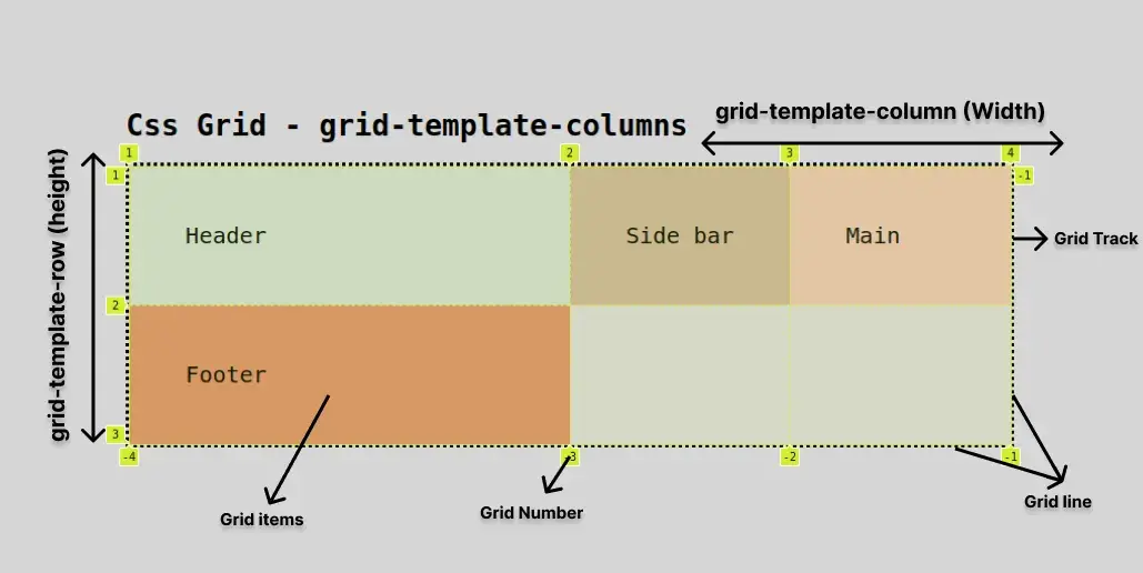
Base Method
We can create a grid to declare grid-template-column.
Here is an example of a base method:
index.html
<!DOCTYPE html>
<html lang="en">
<head>
    <link rel="stylesheet" href="./style.css">
    <title>Document</title>
</head>
<body>
    <h1>Css Grid - grid-template-columns</h1>
    <div class="container">
        <header class="header">Header</header>
        <aside class="aside">Side bar</aside>
        <main class="main">Main</main>
        <footer class="footer">Footer</footer>
    </div>
</body>
</html>
style.css
body{
    display: grid;
    align-items: center;
    justify-content: center;
    padding-top: 8rem;
    background-color: #88888857;
    font-family: monospace;
}

.container{
    display: grid;
    grid-template-columns:2fr 1fr 1fr;
    font-size:20px;
    border: dotted #000;
}

.header{
    background:#ccd8cf;
    padding: 50px;
}

.aside{
    background: #c7b299;
    padding: 50px;
}

.main{
    background:#e4c1b3;
    padding: 50px;
}

.footer{
    background:#d68e6b;
    padding: 50px;
}
Output

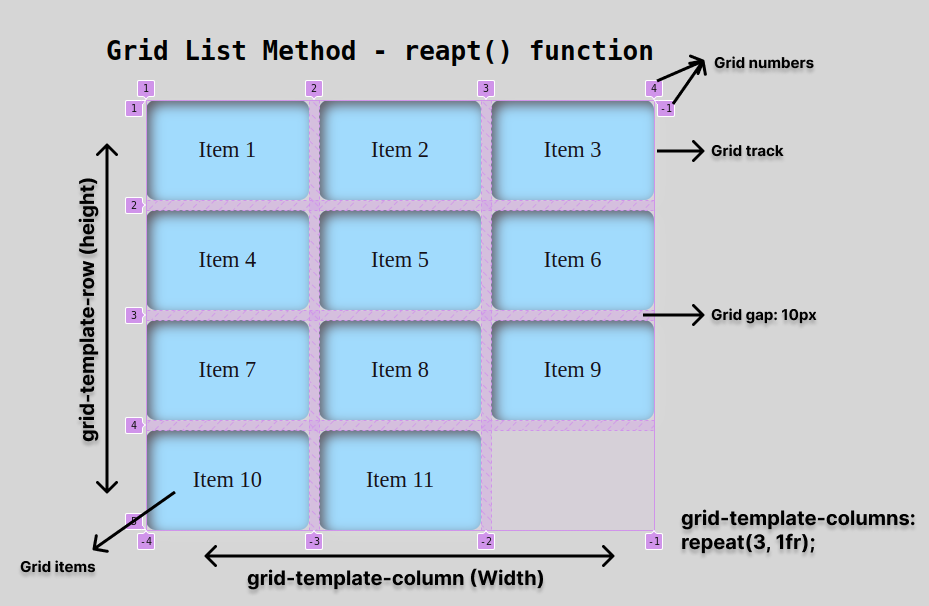
List Method
We can easily create a list sequence of items using the "base method" and the repeat() function.
index.html
<!DOCTYPE html>
<html lang="en">
<head>
    <link rel="stylesheet" href="./style.css">
    <title>Document</title>
</head>
<body>
    <h1>Grid List Method - repeat() function</h1>
    <ul class="List">
        <li class="list-item">Item 1</li>
        <li class="list-item">Item 2</li>
        <li class="list-item">Item 3</li>
        <li class="list-item">Item 4</li>
        <li class="list-item">Item 5</li>
        <li class="list-item">Item 6</li>
        <li class="list-item">Item 7</li>
        <li class="list-item">Item 8</li>
        <li class="list-item">Item 9</li>
        <li class="list-item">Item 10</li>
        <li class="list-item">Item 11</li>
     </ul>
</body>
</html>
style.css
body{
    display: grid;
    align-items: center;
    justify-content: center;
    padding-top: 8rem;
    background-color: #88888857;
}

h1{
    font-family: monospace;
}

.List{
    display: grid;
    grid-template-columns: repeat(3, 1fr);
    grid-gap: 10px;
}

.list-item{
    display: grid;
    align-items: center;
    justify-content: center;
    box-shadow: inset 5px 5px 12px #555, 5px 5px 12px rgb(235 235 235 / 16%);
    background: rgb(155 226 255);
    color:#fff;
    font-size:1.4rem;
    height:100px;
    list-style-type: none;
    color: #000;
    border-radius: 10px;
}
Output
Features of grid layout
Grid layout is a CSS module used to create responsive web page layouts using a two-dimensional grid. It offers features such as flexible sizing, alignment, and More
you can learn complete information about features of grid layout
How to plan a layout with a grid concept
Here are the simple steps for Planning a layout with a CSS grid concept:
- Determine the purpose of the layout: Before you start planning the layout, it is important to understand the purpose of the website or web page. This will help you decide on the number of columns, rows, and grid structures to use.
- Plan the grid structure: Once you understand the purpose of the layout, plan the grid structure of the layout. CSS grid allows you to create a grid structure by defining rows and columns. You can use the grid-template-columns and grid-template-rows properties to define the number of columns and rows respectively.
- Define the grid areas: After defining the grid structure, you can create grid areas. A grid area is a specific portion of the grid that contains content. Use the grid-template-areas property to define the grid areas.
- Place content on the grid: Once you have defined the grid areas, you can place the content on the grid. Use the grid-area property to position content within the grid.
- Add media queries: Media queries allow you to adjust the layout based on the size of the screen. Use media queries to adjust the layout on different screen sizes.
- Test the layout: Test the layout on different devices and screen sizes to ensure it is responsive and looks good on all platforms.
- Make adjustments: Make any necessary adjustments to the layout based on your testing.
- Finalize the layout: Once you are satisfied with the layout, finalize it and prepare it for production.
Types of grid layouts
You can learn a cheat sheet for types of grid layouts
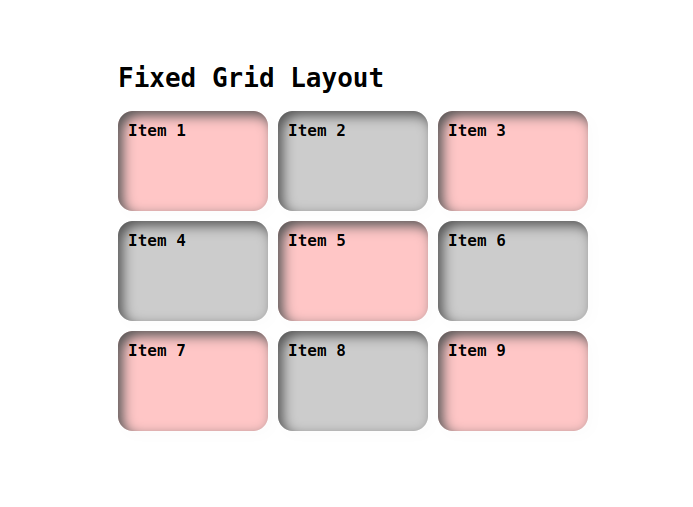
Fixed grid layout:
A fixed grid layout has a set number of columns and rows, and the size of each grid cell is fixed. Here's an example:
index.html
<!DOCTYPE html>
<html lang="en">
<head>
    <link rel="stylesheet" href="./style.css">
    <title>Document</title>
</head>
<body>
  <div class="container">
  <h1>Fixed Grid Layout</h1>
  <div class="grid-container">
    <div class="items item">Item 1</div>
    <div class="items">Item 2</div>
    <div class="items item">Item 3</div>
    <div class="items">Item 4</div>
    <div class="items item">Item 5</div>
    <div class="items">Item 6</div>
    <div class="items item">Item 7</div>
    <div class="items">Item 8</div>
    <div class="items item">Item 9</div>
  </div>
 </div>
</body>
</html>
style.css
.container{
  display: grid;
  align-items: center;
  justify-content: center;
  padding-top: 8rem;
  font-family: monospace;
}

.grid-container {
  display: grid;
  grid-template-columns: repeat(3, 150px);
  grid-template-rows: repeat(3, 100px);
  grid-gap: 10px;
  font-size: 16px;
}

.items {
  background-color: #ccc;
  padding: 10px;
  border-radius: 15px;
  box-shadow: inset 5px 5px 12px #555, 5px 5px 12px rgb(235 235 235 / 16%);
  font-weight: 600;
}

.item{
  background-color: #ffaeaeb3;
  border-radius: 15px;
  font-weight: 600;
}
Output
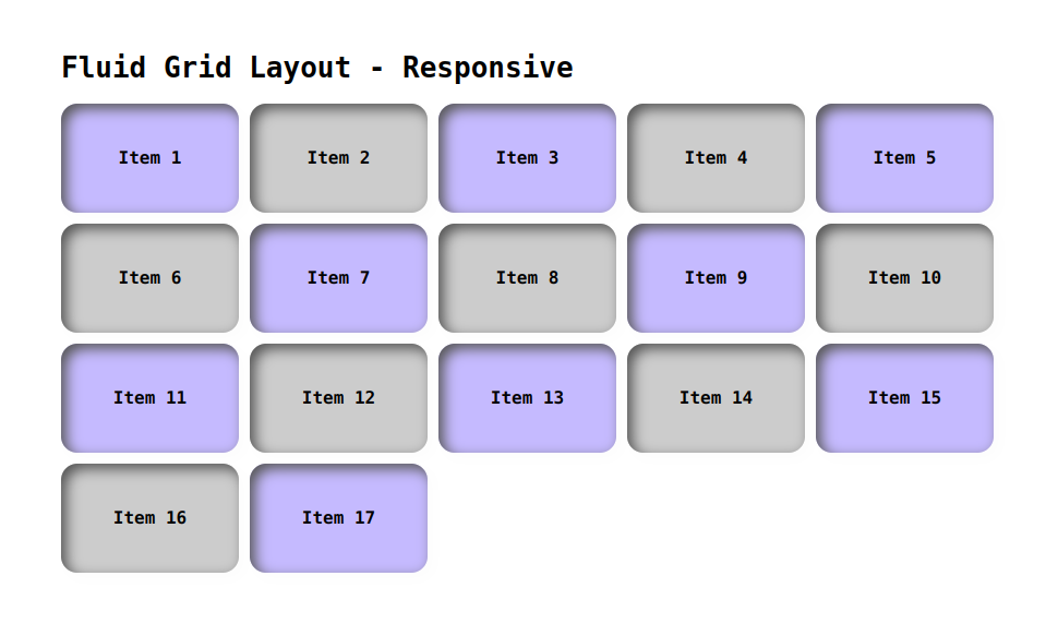
Fluid Grid Layout:
This type of grid layout allows elements to be resized proportionally to the size of the container. This is commonly used in web design, where the layout needs to be responsive and adapt to different screen sizes.
index.html
<!DOCTYPE html>
<html lang="en">
<head>
    <link rel="stylesheet" href="./style.css">
    <title>Document</title>
</head>
<body>
   <div class="container">
    <h1>Fluid Grid Layout - Responsive</h1>
    <div class="grid-container">
        <div class="items item">Item 1</div>
        <div class="items">Item 2</div>
        <div class="items item">Item 3</div>
        <div class="items">Item 4</div>
        <div class="items item">Item 5</div>
        <div class="items">Item 6</div>
        <div class="items item">Item 7</div>
        <div class="items">Item 8</div>
        <div class="items item">Item 9</div>
        <div class="items">Item 10</div>
        <div class="items item">Item 11</div>
        <div class="items">Item 12</div>
        <div class="items item">Item 13</div>
        <div class="items">Item 14</div>
        <div class="items item">Item 15</div>
        <div class="items">Item 16</div>
        <div class="items item">Item 17</div>
    </div>
   </div>
</body>
</html>
style.css
.container{
    padding: 30rem;
    font-family: monospace;
  }

.grid-container {
    display: grid;
    grid-template-columns: repeat(auto-fit, minmax(150px, 1fr));
    grid-auto-rows: 100px;
    grid-gap: 10px;
}

.items {
    display: grid;
    align-items: center;
    justify-content: center;
    font-size: 16px;
    font-weight: 600;
    background-color: #ccc;
    padding: 10px;
    border-radius: 15px;
    box-shadow: inset 5px 5px 12px #555, 5px 5px 12px rgb(235 235 235 / 16%);
}

.item{
    background-color: #9ffffa;
    border-radius: 15px;
    box-shadow: inset 5px 5px 12px #575757, 5px 5px 12px rgb(235 235 235 / 16%);
}
Output
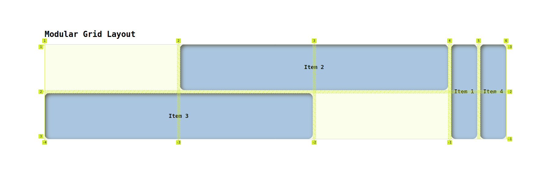
Modular Grid Layout:
A modular grid layout uses a consistent grid structure, but allows for different module sizes and configurations within that structure. Here's an example:
index.html
<!DOCTYPE html>
<html lang="en">
<head>
    <link rel="stylesheet" href="./style.css">
    <title>Document</title>
</head>
<body>
  <div class="container">
    <h1>Modular Grid Layout</h1>
    <div class="grid-container">
        <div class="grid-item small">Item 1</div>
        <div class="grid-item medium">Item 2</div>
        <div class="grid-item large">Item 3</div>
        <div class="grid-item small">Item 4</div>
      </div>
    </div>
</body>
</html>
style.css
.container{
    padding: 10rem;
    font-family: monospace;
}

.grid-container {
    display: grid;
    grid-template-columns: repeat(3, 1fr);
    grid-template-rows: repeat(2, 150px);
    grid-gap: 10px;
  }

.grid-item {
    background-color: #a5c0f3;
    padding: 10px;
    border-radius: 15px;
    box-shadow: inset 5px 5px 12px #555, 5px 5px 12px rgb(235 235 235 / 16%);
    display: grid;
    align-items: center;
    justify-content: center;
    font-size: 16px;
    font-weight: 600;
}

.small {
    grid-row: 1 / 3;
}

.medium {
    grid-row: 1 / 2;
    grid-column: 2 / 4;
}

.large {
    grid-row: 2 / 3;
    grid-column: 1 / 3;
}
Output
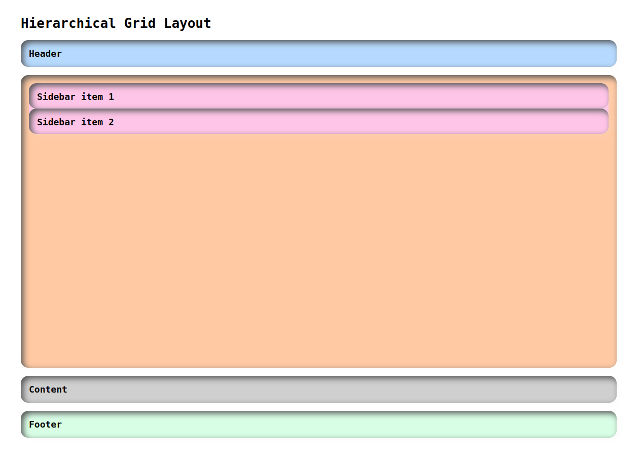
Hierarchical Grid Layout:
A hierarchical grid layout uses nested grids to create more complex grid structures. Here's an example:
index.html
<!DOCTYPE html>
<html lang="en">
<head>
    <link rel="stylesheet" href="./style.css">
    <title>Document</title>
</head>
<body>
    <div class="container">
        <h1>Hierarchical Grid Layout</h1>
        <div class="grid-container">
            <div class="grid-item header">Header</div>
            <div class="grid-item sidebar">
            <div class="sidebar-grid">
                <div class="sidebar-item grid-item">Sidebar item 1</div>
                <div class="sidebar-item grid-item">Sidebar item 2</div>
            </div>
            </div>
            <div class="grid-item content">Content</div>
            <div class="grid-item footer">Footer</div>
        </div>
    </div>
</body>
</html>
style.css
.container{
    padding: 20rem;
    font-family: monospace;
}

.grid-container {
    display: grid;
    grid-template-columns: 1fr;
    grid-template-rows: auto 1fr auto;
    height: 80vh;
    font-weight: 600;
    font-size: 18px;
}

.sidebar-grid {
    display: grid;
    grid-template-columns: 1fr;
    grid-template-rows: repeat(2, 50px);
    background-color: #ffc5e8;
    border-radius: 15px;
}

.grid-item {
    padding: 1rem;
    border-radius: 15px;
    box-shadow: inset 5px 5px 12px #555, 5px 5px 12px rgb(235 235 235 / 16%);
}

.header {
    background-color: #b6daff;
    margin-bottom: 1rem;
}

.sidebar {
    background-color: #ffc9a3;
    margin-bottom: 1rem;
}

.content {
    background-color: #cfcfcf;
    margin-bottom: 1rem;
}

.footer {
    background-color: #d8ffe6;
}
Output
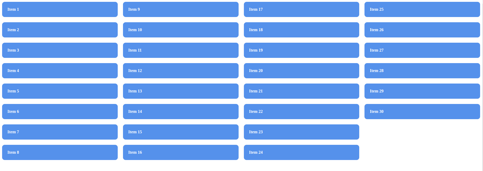
Multi-column Grid Layout
Multi-column grid layout is a design technique that divides a webpage into multiple columns to improve readability and visual appeal.
index.html
<!DOCTYPE html>
<html lang="en">
<head>
    <link rel="stylesheet" href="./style.css">
    <title>Document</title>
</head>
<body>
    <div class="container">
        <div class="item">Item 1</div>
        <div class="item">Item 2</div>
        <div class="item">Item 3</div>
        <div class="item">Item 4</div>
        <div class="item">Item 5</div>
        <div class="item">Item 6</div>
        <div class="item">Item 7</div>
        <div class="item">Item 8</div>
        <div class="item">Item 9</div>
        <div class="item">Item 10</div>
        <div class="item">Item 11</div>
        <div class="item">Item 12</div>
        <div class="item">Item 13</div>
        <div class="item">Item 14</div>
        <div class="item">Item 15</div>
        <div class="item">Item 16</div>
        <div class="item">Item 17</div>
        <div class="item">Item 18</div>
        <div class="item">Item 19</div>
        <div class="item">Item 20</div>
        <div class="item">Item 21</div>
        <div class="item">Item 22</div>
        <div class="item">Item 23</div>
        <div class="item">Item 24</div>
        <div class="item">Item 25</div>
        <div class="item">Item 26</div>
        <div class="item">Item 27</div>
        <div class="item">Item 28</div>
        <div class="item">Item 29</div>
        <div class="item">Item 30</div>
      </div>
</body>
</html>
style.css
.container {
    column-count: 4;
    column-gap: 20px;
    height: 100vh;
  }

.item {
    background-color: #5591eb;
    margin-bottom: 20px;
    padding: 20px;
    color: #fff;
    font-weight: 600;
    border-radius: 10px;
  }
Output
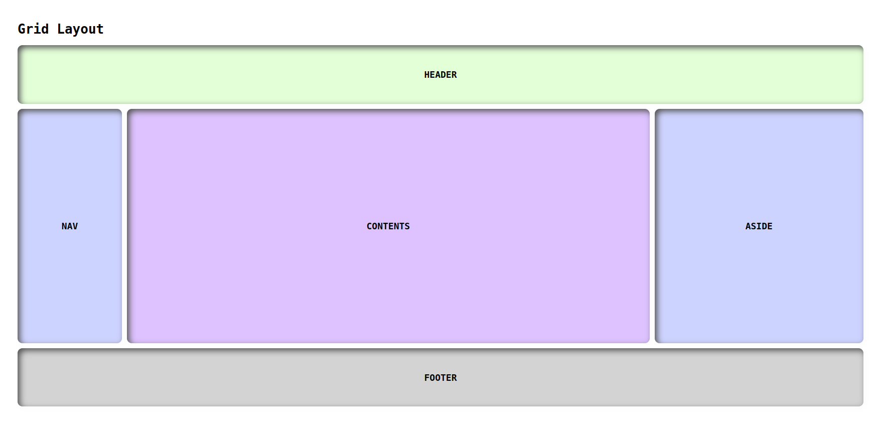
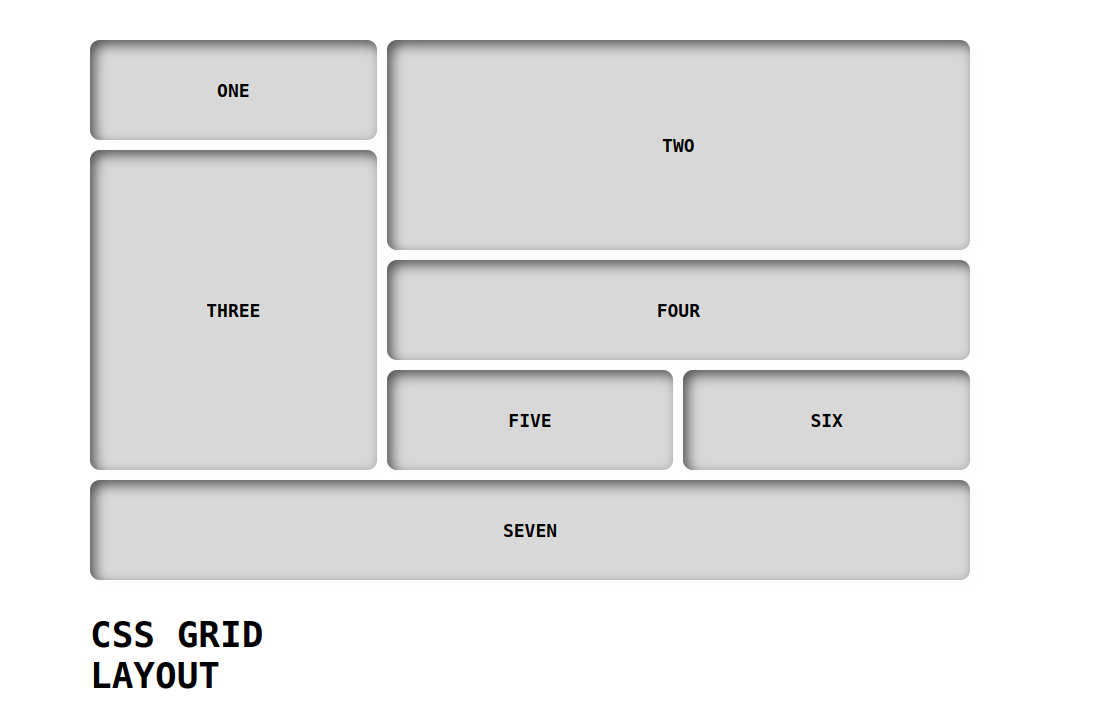
Examples of Grid layouts
Layout 1
index.html
<!DOCTYPE html>
<html lang="en">
<head>
    <link rel="stylesheet" href="./style.css">
    <title>Document</title>
</head>
<body>
    <h1>Grid Layout</h1>
    <div class="container wrapper">
		<header class="items">HEADER</header>
		<nav class="items">NAV</nav>
		<div class="items contents">CONTENTS</div>
		<aside class="items">ASIDE</aside>
		<footer class="items">FOOTER</footer>
	</div>
</body>
</html>
style.css
body{
    font-family: monospace;
    margin: 5rem;
}
.container {
    display: grid;
    grid-template-columns: 1fr 5fr 2fr;
    grid-template-rows: 5fr 20fr 5fr;
    grid-gap: 10px;
    height: 720px;
}

header {
    grid-column-start: 1;
    grid-column-end: 4;
    background-color: #e3ffd7;
}

nav{
    background-color: #cdd3ff;
}

.contents{
    background-color: 	#ddc2ff;
}

aside{
    background-color: #cdd3ff;
}

footer {
    grid-column-start: 1;
    grid-column-end: 4;
    background-color: #D3D3D3;
}

.items{
    display: grid;
    align-items: center;
    justify-content: center;
    box-shadow: inset 5px 5px 12px #555, 5px 5px 12px rgb(235 235 235 / 16%);
    border-radius: 10px;
    font-weight: 600;
    font-size: 18px;
}
Output
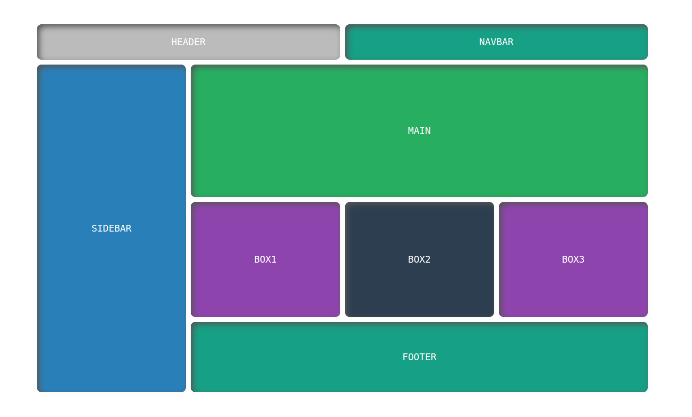
Layout 2
index.html
<!DOCTYPE html>
<html lang="en">
<head>
    <link rel="stylesheet" href="./style.css">
    <title>Document</title>
</head>
<body>
    <div class="container">
        <header class="items">HEADER</header>
        <nav class="items">NAVBAR</nav>
        <main class="items">MAIN</main>
        <div class="sidebar items">SIDEBAR</div>
        <div class="box1 items">BOX1</div>
        <div class="box2 items">BOX2</div>
        <div class="box3 items">BOX3</div>
        <footer class="items">FOOTER</footer>
    </div>
</body>
</html>
style.css
*{
    padding: 0;
    margin: 0;
    box-sizing: border-box;
    font-family: monospace;
}

.container{
    display: grid;
    height: 80vh;
    color: #fff;
    grid-template-columns: 1fr 1fr 1fr 1fr;
    grid-template-rows: 0.4fr 1.5fr 1.3fr 0.8fr;
    grid-template-areas: "header header navbar navbar"
                        "sidebar main main main"
                        "sidebar box1 box2 box3"
                        "sidebar footer footer footer";
    grid-gap: 10px;
    text-align: center;
    font-size: 1.5rem;
    margin: 22rem;
}

.items{
    display: flex;
    align-items: center;
    justify-content: center;
    border-radius: 10px;
    box-shadow: inset 5px 5px 12px #555, 5px 5px 12px rgb(235 235 235 / 16%);
}

header{
    background-color: rgb(187, 187, 187);
    grid-area: header;
}

nav{
    background-color: #16a085;
    grid-area: navbar;
}

main{
    background-color: #27ae60;
    grid-area: main;
}

.sidebar{
    background-color: #2980b9;
    grid-area: sidebar;
}

.box1{
    background-color: #8e44ad;
    grid-area: box1;
}

.box2{
    background-color: #2c3e50;
    grid-area: box2;
}

.box3{
    background-color: #8e44ad;
    grid-area: box3;
}

footer{
    background-color: #16a085;
    grid-area: footer;
}
Output
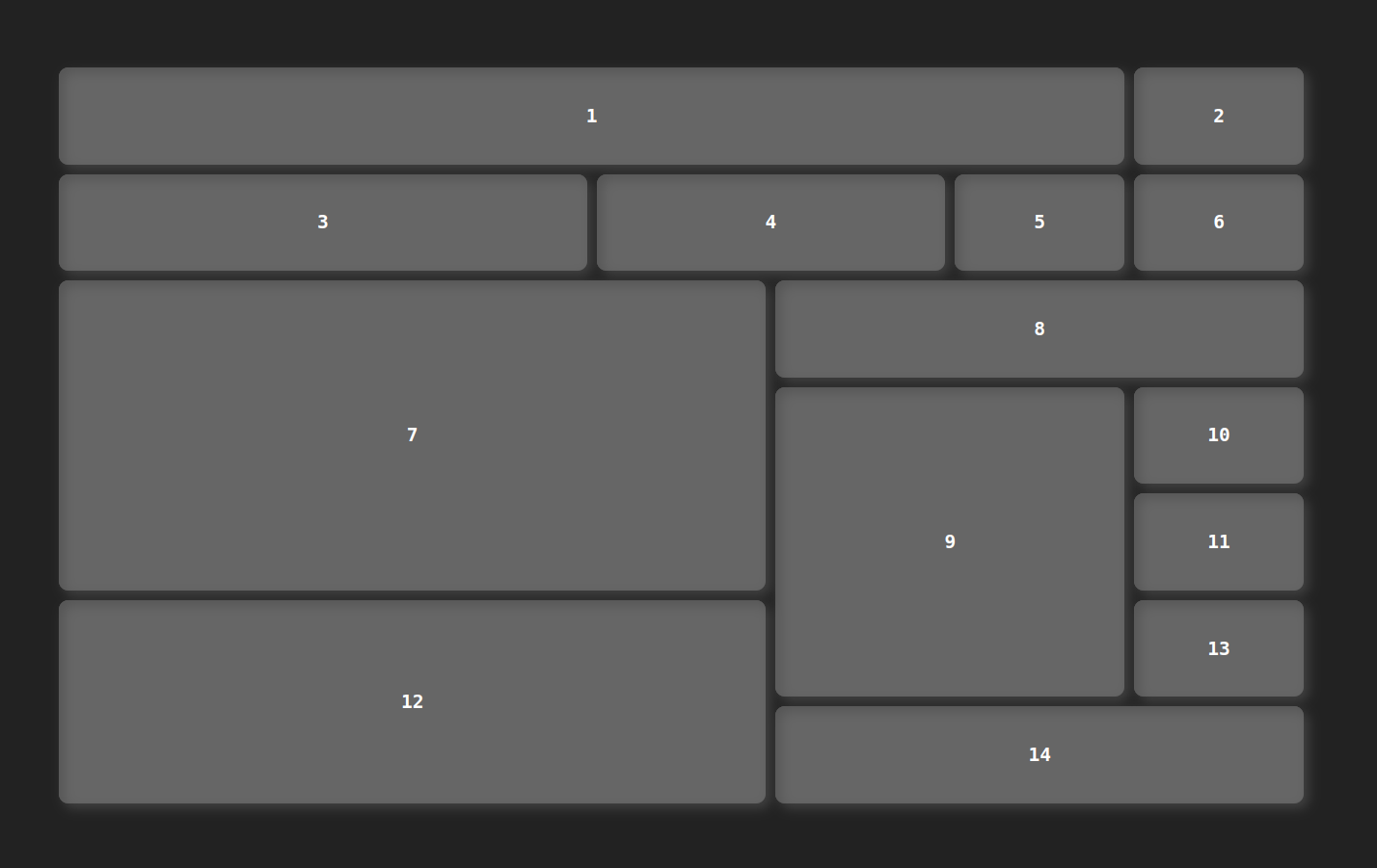
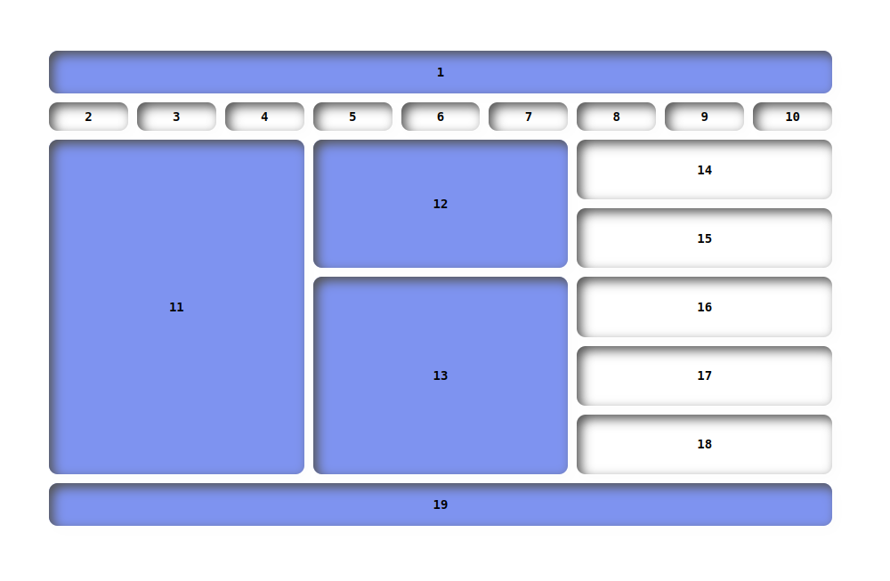
Hey👋, guys let's take some challenges to justify ourselves about the deep understanding of the grid.
Challenges
Here are your grid layouts challenges
Challenge 1
Here is the grid layout 3 solution GitHub URL:
https://manojbharath1.github.io/grid-blog-exa/5-design%20layouts/Design3/design3.html
Challenge 2
Here is the grid layout 4 solution GitHub URL:
https://manojbharath1.github.io/grid-blog-exa/5-design%20layouts/Design4/design4.html
Challenge 3
Here is the grid layout 5 solution GitHub URL:
https://manojbharath1.github.io/grid-blog-exa/5-design%20layouts/Design5/design5.htm
 21 likes
 Add to read list

Comments