Grid layout is a web design approach that organizes content into a grid of columns and rows. It provides a flexible and responsive design system.
Features of grid layout
you can learn more information about the Grid layout
Two-dimensional layout control:
Grid Layout allows designers to create complex layouts with control over both rows and columns.
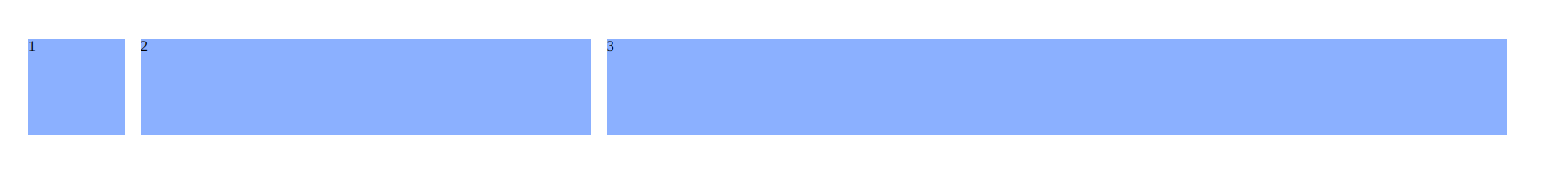
Flexible sizing:
Grid Layout allows for flexible sizing of columns and rows, which can be defined in absolute or relative units.
|
When to use |
Behavior |
Responsiveness |
Examples |
|
Use flexible sizing when designing a website or application that needs to be responsive across multiple devices and screen sizes. Flexible sizing is also useful when creating clothing or accessories that need to fit a range of body shapes and sizes. |
The flexible grid can be used to define a layout for more than one page. This means that you don't have to create a template for each page. |
we can set up your flexible grid to adjust to the screen size of a device (a desktop, tablet, or phone), the display orientation, or the amount of available space on the screen. |
 |
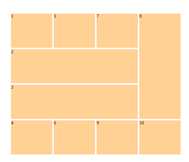
Grid items placement:
Grid Layout offers various placement options to precisely position items within the grid.
|
When to use |
Behavior |
Responsiveness |
Examples |
|
These items positions on the grid can be adjusted using line-based positioning. We want the initial item to span single-column track and begin at the very left of the grid. |
Grid items contained within a grid container. A container has one grid item for each column and row by default, but you can style the grid items to have multiple columns and rows. |
We can change the order in which our grid items appear automatically. |
 |
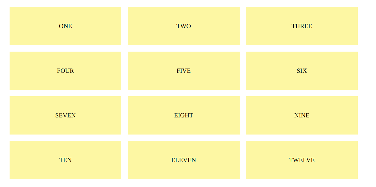
Responsive design:
Grid Layout supports responsive design by enabling designers to define different grid layouts for different screen sizes or media types.
|
When to use |
Behavior |
Responsiveness |
Examples |
|
When designing web pages, a grid view is extremely useful. It makes placing elements on the page easier. |
Column width is specified in responsive layouts using percentages rather than fixed numbers. Hence, content can be adjusted to fit any screen size. |
A responsive grid view typically has 12 columns and a total width of 100%, shrinking and expanding as the browser window is resized. |
 |
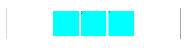
Alignment Controls:
CSS Grid makes it easier than ever to align an element/item within a container. We can now arrange elements/items horizontally and vertically in the container.
|
When to use |
Behavior |
Responsiveness |
Examples |
|
Use alignment controls when you want to ensure that all elements in a design are properly aligned and spaced Alignment controls are particularly useful when creating tables, grids, and other structured layouts. |
Alignment Controls can be controlled by selecting the desired alignment option and adjusting the settings to align objects, text, or images in a specific way. |
The alignment controls are designed to be flexible and adapt to different screen sizes and devices. Test alignment controls thoroughly on different devices and monitors their responsiveness to make necessary adjustments. |
 |
 21 likes
 Add to read list

Comments