CSS flexbox layouts can enhance user experience by creating dynamic and responsive designs. Use flex containers, items, and properties to optimize layout.
What is flexbox
Flexbox is a CSS layout system that allows you to align and distribute content within a container. It makes it easier to create responsive and dynamic layouts and simplifies the process of arranging items on a web page.
Properties of flexbox
Flexbox is a layout module in CSS that makes it easier to design responsive and flexible layouts for web pages.
you can see more properties of flexbox
Why flexbox
CSS flexbox is a layout module that makes it easy to align and distribute content within a container. It allows you to control the size, position, and spacing of elements in a flexible way, regardless of their order or size.
It's especially useful for responsive design and works well on both horizontal and vertical axis.
When should we go for flexbox layout
- For creating complex layouts that are difficult to achieve with traditional CSS.
- For building responsive layouts that adapt to different screen sizes and orientations.
- To easily control the alignment and spacing of elements within a container.
- To make code more modular and easier to maintain.
- To create layouts that are compatible with older browsers.
- When desiring more intuitive and easy-to-understand layout code.
- For faster development and improved user experience.
Features of flexbox layout
Flexbox layout is a CSS layout mode designed to provide a more efficient way to arrange and align-items within a container.
You can learn complete information about the features of flexbox layout
How to plan a layout with a flexbox concept
Determine your layout requirements: Before you start planning your layout, you need to determine what elements you want to include on your page and how they should be arranged. Make a list of the elements you want to include, such as headers, navigation menus, content sections, and footers.
Create a basic HTML structure: Once you have a list of the elements you want to include, create a basic HTML structure that includes these elements. Use semantic HTML to give each element a meaningful tag, such as <header>, <nav>, <main>, and <footer>.
Add CSS styles: Once you have your basic HTML structure in place, you can start adding CSS styles to create your layout. To use CSS flexbox, set the display property of the parent container to flex. This will make all the child elements of the container flex items that can be aligned and positioned using various flexbox properties.
Define the flex container properties: To create a flexible layout, you need to define the flex container properties. These include the flex-direction, justify-content, align-items, and flex-wrap properties. These properties allow you to control the direction of the flex items, the alignment of the items along the main and cross axes, and how the items wrap when there isn't enough space on the screen.
Define the flex item properties: Once you have defined the flex container properties, you can start defining the flex item properties. These include the flex-grow, flex-shrink, and flex-basis properties. These properties allow you to control how much space each item should take up, how much the items should shrink or grow when the screen size changes, and the initial size of each item.
Test and adjust: Once you have defined all the flexbox properties, test your layout on different screen sizes to ensure that it is flexible and responsive. Make adjustments as necessary to ensure that your layout looks great on all devices.
Types of flexbox layouts
Here are the different types of flexbox layouts that can be created using the flexbox module of CSS.
You can learn more information about types of flexbox layouts
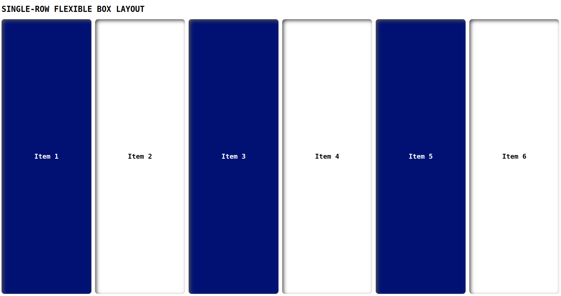
Single-row flexible box layout
This is the simplest type of flexbox layout, where items are arranged in a single row and can be stretched to fill the available space.
index.html
<!DOCTYPE html>
<html lang="en">
<head>
    <link rel="stylesheet" href="./style.css">
    <title>Document</title>
</head>
<body>
    <h1>SINGLE-ROW FLEXIBLE BOX LAYOUT</h1>
    <div class="flex-container">
        <div class="flex-item flex1">Item 1</div>
        <div class="flex-item flex2">Item 2</div>
        <div class="flex-item flex3">Item 3</div>
        <div class="flex-item flex4">Item 4</div>
        <div class="flex-item flex5">Item 5</div>
        <div class="flex-item flex6">Item 6</div>
      </div>
</body>
</html>
style.css
.flex-container {
    display: flex;
    justify-content: space-between;
    font-weight: 600;
    font-size: 22px;
}

body{
    font-family: monospace;
}

.flex-item {
    flex-basis: 15%;
    background-color: #001173;
    color: #fff;
    padding: 10px;
    box-shadow: inset 5px 5px 12px #555, 5px 5px 12px rgb(235 235 235 / 16%);
    border-radius: 10px;
    height: 90vh;
    display: flex;
    align-items: center;
    justify-content: center;
}

.flex2, .flex4, .flex6{
    color: #000;
    background-color: #fff;
}
Output
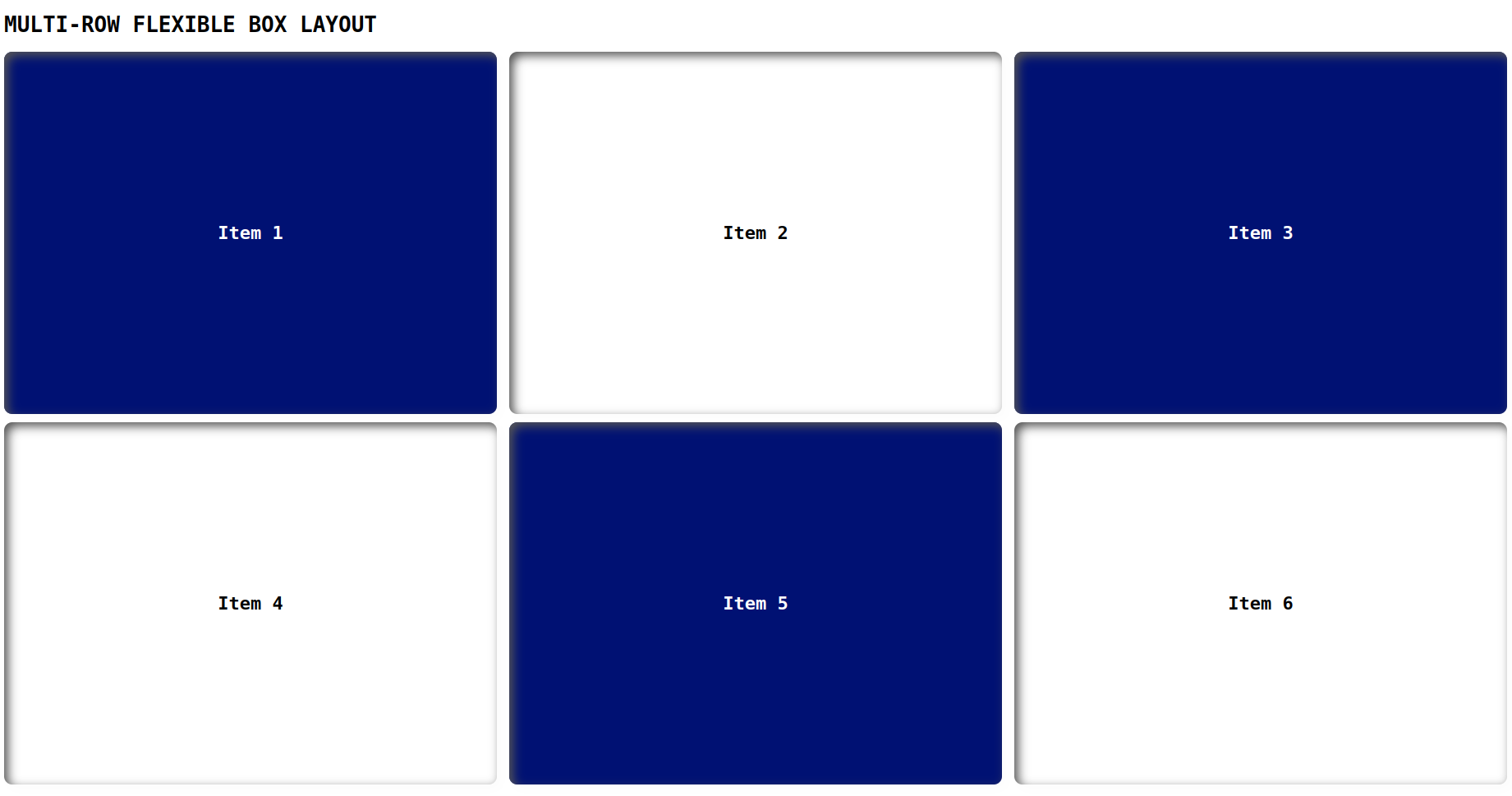
Multi-row flexible box layout:
This type of layout is similar to the single-row layout, but items can be wrapped onto multiple rows as needed.
index.html
<!DOCTYPE html>
<html lang="en">
<head>
    <link rel="stylesheet" href="./style.css">
    <title>Document</title>
</head>
<body>
    <h1>MULTI-ROW FLEXIBLE BOX LAYOUT</h1>
    <div class="container">
        <div class="flex flex1">Item 1</div>
        <div class="flex flex2">Item 2</div>
        <div class="flex flex3">Item 3</div>
        <div class="flex flex4">Item 4</div>
        <div class="flex flex5">Item 5</div>
        <div class="flex flex6">Item 6</div>
      </div>
</body>
</html>
style.css
.container {
    display: flex;
    flex-wrap: wrap;
    justify-content: space-between;
    font-weight: 600;
    font-size: 22px;
    row-gap: 10px;
    column-gap: 10px;
}

body{
    font-family: monospace;
}

.flex {
    flex-basis: calc(33.33% - 20px);
    background-color: #001173;
    color: #fff;
    padding: 5px;
    box-shadow: inset 5px 5px 12px #555, 5px 5px 12px rgb(235 235 235 / 16%);
    border-radius: 10px;
    height: 44vh;
    display: flex;
    align-items: center;
    justify-content: center;
}

.flex2, .flex4, .flex6{
    color: #000;
    background-color: #fff;
}
Output
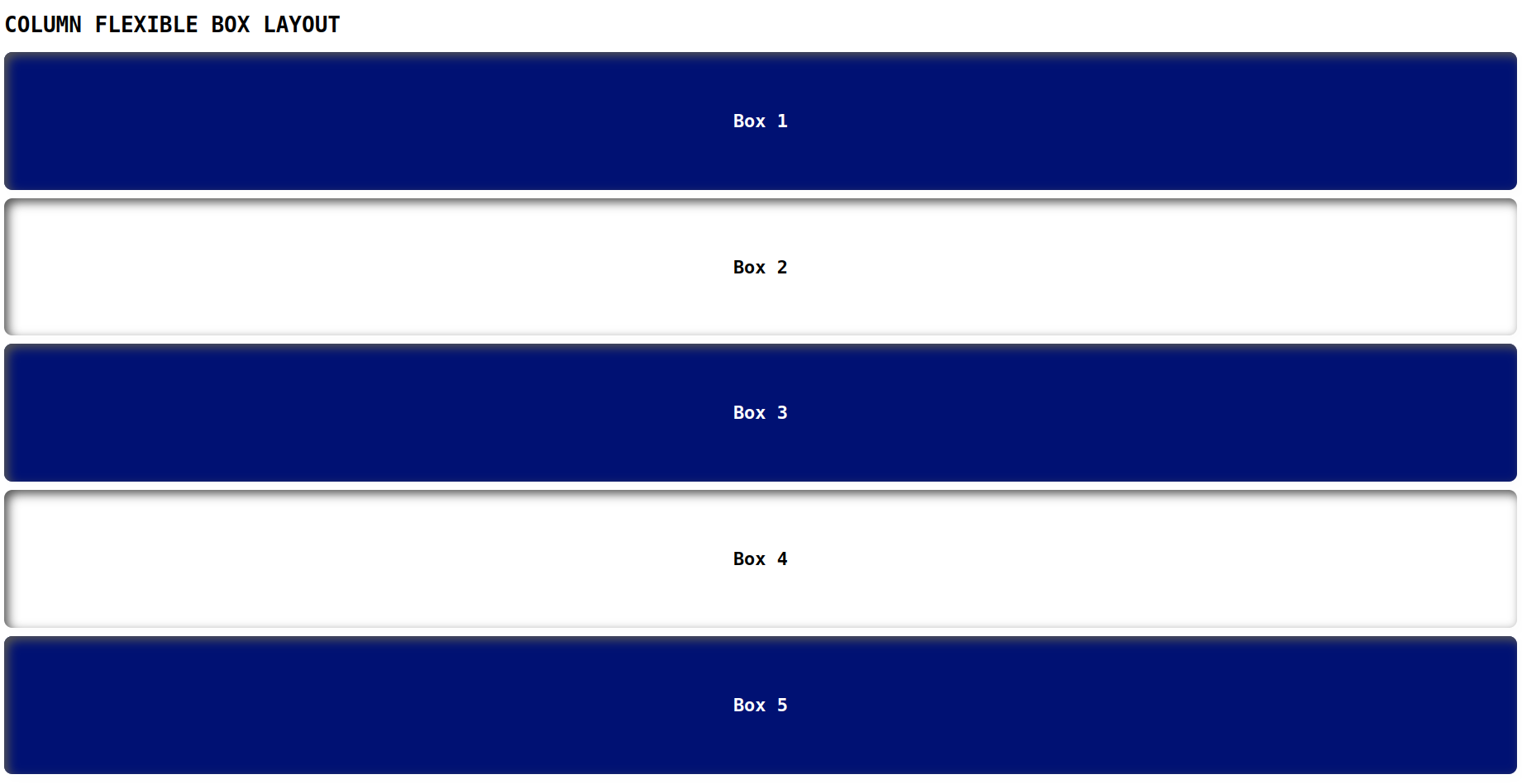
Column flexible box layout:
This layout arranges items in a single column, with the ability to stretch items to fill the available space.
index.html
<!DOCTYPE html>
<html lang="en">
<head>
    <link rel="stylesheet" href="./style.css">
    <title>Document</title>
</head>
<body>
    <h1>COLUMN FLEXIBLE BOX LAYOUT</h1>
    <div class="container">
        <div class="box">Box 1</div>
        <div class="box flex2">Box 2</div>
        <div class="box">Box 3</div>
        <div class="box flex4">Box 4</div>
        <div class="box">Box 5</div>
    </div>
</body>
</html>
style.css
.container {
    display: flex;
    flex-direction: column;
    font-weight: 600;
    font-size: 22px;
    row-gap: 10px;
    column-gap: 10px;
}
body{
    font-family: monospace;
}

.box {
    background-color: #001173;
    color: #fff;
    padding: 5px;
    box-shadow: inset 5px 5px 12px #555, 5px 5px 12px rgb(235 235 235 / 16%);
    border-radius: 10px;
    height: 16vh;
    display: flex;
    align-items: center;
    justify-content: center;
}

.flex2, .flex4, .flex6{
    color: #000;
    background-color: #fff;
}
Output
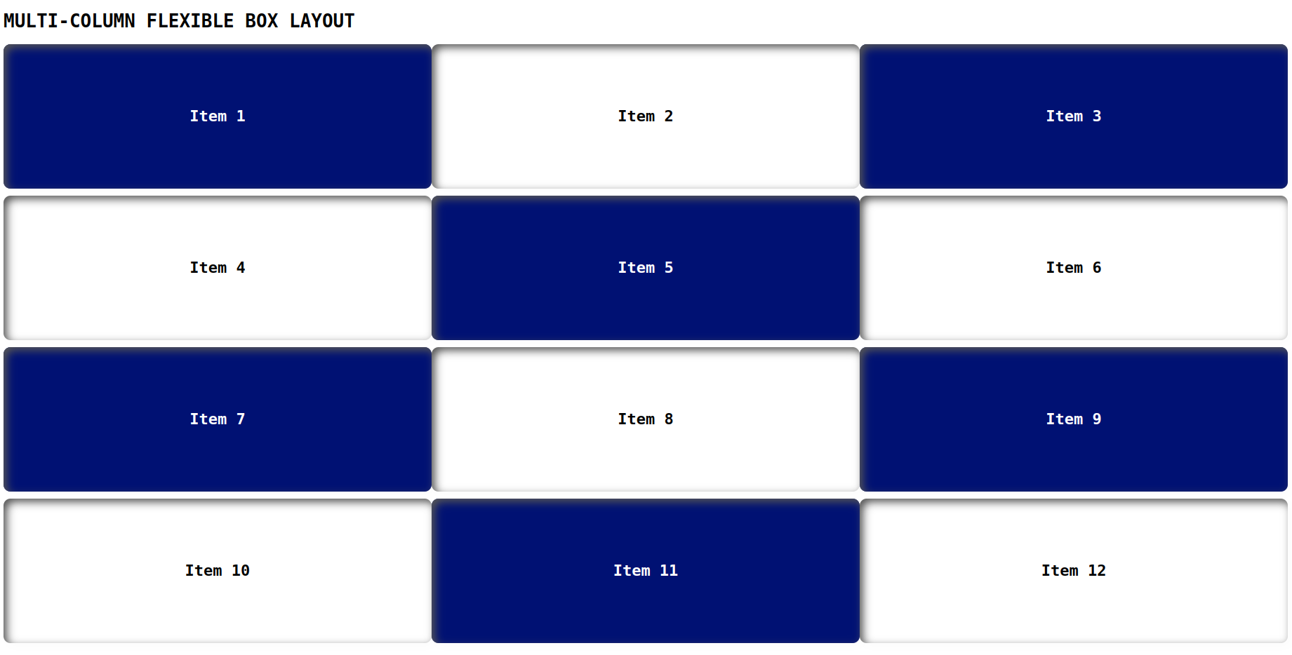
Multi-column flexible box layout:
Similar to the column layout, but items can be wrapped onto multiple columns as needed.
index.html
<!DOCTYPE html>
<html lang="en">
<head>
    <link rel="stylesheet" href="./style.css">
    <title>Document</title>
</head>
<body>
    <h1>MULTI-COLUMN FLEXIBLE BOX LAYOUT</h1>
    <div class="container">
        <div class="flex flex1">Item 1</div>
        <div class="flex flex2">Item 2</div>
        <div class="flex flex3">Item 3</div>
        <div class="flex flex4">Item 4</div>
        <div class="flex flex5">Item 5</div>
        <div class="flex flex6">Item 6</div>
        <div class="flex flex1">Item 7</div>
        <div class="flex flex2">Item 8</div>
        <div class="flex flex3">Item 9</div>
        <div class="flex flex4">Item 10</div>
        <div class="flex flex5">Item 11</div>
        <div class="flex flex6">Item 12</div>
      </div>
</body>
</html>
style.css
.container {
    display: flex;
    flex-wrap: wrap;
    justify-content: space-between;
    align-items: flex-start;
    font-weight: 600;
    font-size: 22px;
    row-gap: 10px;
}
body{
    font-family: monospace;
}

.flex {
    flex-basis: calc(33.33% - 10px);
    background-color: #001173;
    color: #fff;
    padding: 5px;
    box-shadow: inset 5px 5px 12px #555, 5px 5px 12px rgb(235 235 235 / 16%);
    border-radius: 10px;
    height: 20vh;
    display: flex;
    align-items: center;
    justify-content: center;
}

.flex2, .flex4, .flex6{
    color: #000;
    background-color: #fff;
}
Output
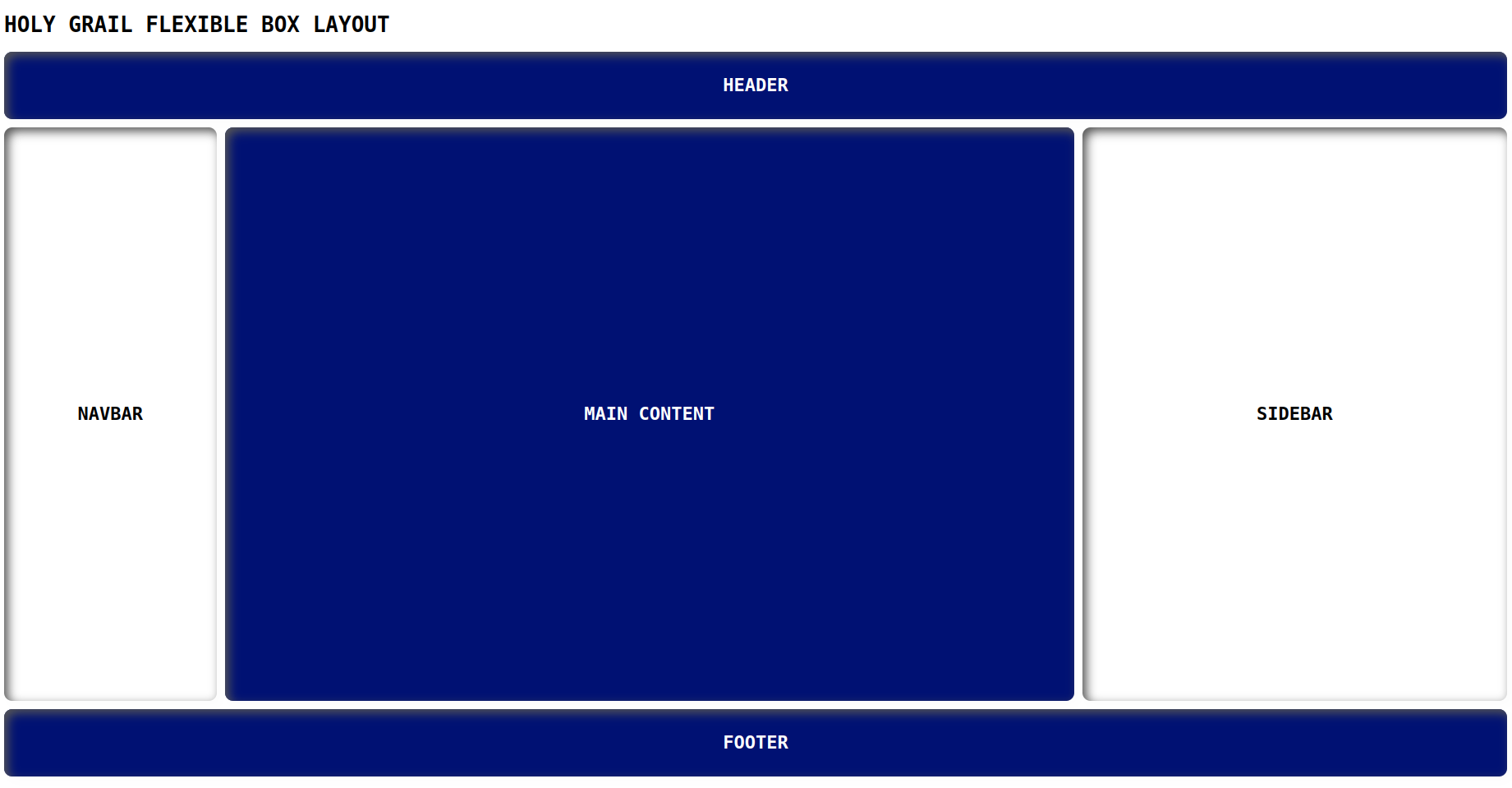
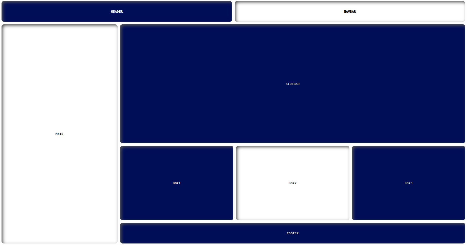
Holy Grail flexible box layout:
This is a complex layout that arranges items in a grid-like format with a header, footer, and three columns that can have variable widths.
index.html
<!DOCTYPE html>
<html lang="en">
<head>
    <link rel="stylesheet" href="./style.css">
    <title>Document</title>
</head>
<body>
    <h1>HOLY GRAIL FLEXIBLE BOX LAYOUT</h1>
    <div class="wrapper">
        <header>HEADER</header>
        <div class="container">
            <nav>NAVBAR</nav>
            <main>MAIN CONTENT</main>
            <aside>SIDEBAR</aside>
        </div>
        <footer>FOOTER</footer>
    </div>
</body>
</html>
style.css
body{
    font-family: monospace;
}

.wrapper {
    display: flex;
    flex-direction: column;
    min-height: 90vh;
    font-weight: 600;
    font-size: 22px;
}

.container {
    display: flex;
    flex: 1;
}

header, nav, main, aside, footer{
    display: flex;
    align-items: center;
    justify-content: center;
    box-shadow: inset 5px 5px 12px #555, 5px 5px 12px rgb(235 235 235 / 16%);
    border-radius: 10px;
}

main {
    flex: 2;
    background-color: #001173;
    color: #fff;
}

nav {
    flex: 0.5;
    background-color: #fff;
    margin-right: 10px;
}

aside {
    flex: 1;
    background-color: #fff;
    margin-left: 10px;
}

header, footer {
    background-color: #001173;
    color: #fff;
    padding: 1rem;
    height: 50px;
}

header{
    margin-bottom: 10px;
}

footer{
    margin-top: 10px;
}
Output
Examples of flexbox layouts
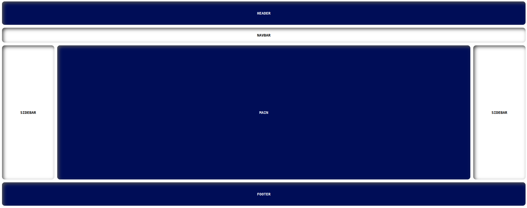
Layout 1
index.html
<!DOCTYPE html>
<html lang="en">
<head>
    <link rel="stylesheet" href="./style.css">
    <title>Document</title>
</head>
<body>
    <div class="wrapper">
        <div class="container">
            <header>HEADER</header>
            <nav>NAVBAR</nav>
        </div>
        <div class="container1">
            <div class="sidebar1">SIDEBAR</div>
            <div class="container2">
                <main>MAIN</main>
            </div>
            <div class="sidebar2">SIDEBAR</div>
        </div>
        <footer>FOOTER</footer>
    </div>
</body>
</html>
style.css
body{
    font-family: monospace;
}

.wrapper {
    display: flex;
    flex-direction: column;
    font-weight: 600;
}

.container1{
    display: flex;
}

.container2 {
    display: flex;
    flex-direction: column;
    flex: 1;
}

header, nav, main, .sidebar1, .sidebar2, footer{
    display: flex;
    align-items: center;
    justify-content: center;
    box-shadow: inset 5px 5px 12px #555, 5px 5px 12px rgb(235 235 235 / 16%);
    border-radius: 10px;
}

main {
    background-color: #000d57;
    color: #fff;
    margin-left: 10px;
    height: 48vh;
}

nav {
    background-color: #fff;
    color: #000;
    padding: 1rem;
    height: 20px;
}

.sidebar1, .sidebar2 {
    flex-basis: 10%;
    background-color: #fff;
    color: #000;
}

.sidebar2{
    margin-left: 10px;
}

header, footer {
    background-color: #000d57;
    color: #fff;
    padding: 1rem;
    height: 50px;
}

header, nav{
    margin-bottom: 10px;
    flex-basis: 50%;
}

footer{
    margin-top: 10px;
}
Output
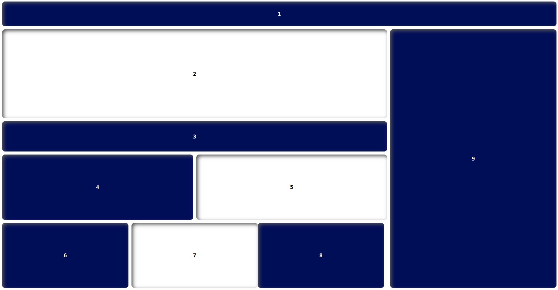
Layout 2
index.html
<!DOCTYPE html>
<html lang="en">
<head>
    <link rel="stylesheet" href="./style.css">
    <title>Document</title>
</head>
<body>
    <div class="wrapper">
        <div class="container">
            <header>1</header>
        </div>
        <div class="container1">
            <div class="container2">
                <main>2</main>
                <div class="content">3</div>
                <div class="container3">
                    <div class="box box1">4</div>
                    <div class="box box2">5</div>
                </div>
                <div class="container3">
                    <div class="box box3">6</div>
                    <div class="box box4">7</div>
                    <div class="box box5">8</div>
                </div>
            </div>
            <div class="sidebar1">9</div>
        </div>
    </div>
</body>
</html>
style.css
body{
    font-family: monospace;
  }

.wrapper {
    display: flex;
    flex-direction: column;
    font-weight: 600;
    font-size: 18px;
}

.container1{
    display: flex;
}

.container2 {
    display: flex;
    flex-direction: column;
    flex: 1;
    margin-right: 10px;
}

.container3{
    display: flex;
}

.box{
    height: 22vh;
    flex-basis: 50%;
    margin-top: 10px;
}

.box3{
    margin-right: 10px;
}

  .box1, .box3, .box5{
    background-color: #000d57;
    color: #fff;
    margin-right: 10px;
}

header, main, .sidebar1, footer, .box, .content{
    display: flex;
    align-items: center;
    justify-content: center;
    box-shadow: inset 5px 5px 12px #555, 5px 5px 12px rgb(235 235 235 / 16%);
    border-radius: 10px;
}

main {
    background-color: #fff;
    color: #000;
    height: 30vh;
}

.sidebar1{
    flex-basis: 30%;
    background-color: #000d57;
    color: #fff;
}

header {
    background-color: #fff;
    color: #000;
    padding: 1rem;
    height: 50px;
}

header{
    margin-bottom: 10px;
    flex-basis: 50%;
    background-color: #000d57;
    color: #fff;
}

.content {
    background-color: #000d57;
    color: #fff;
    height: 100px;
    margin-top: 10px;
}
Output
Hey👋, guys let's take some challenges to justify ourselves about the deep understanding of the flexbox.
Challenges
Here are your flexbox layouts challenges
Challenge 1
Here is the flexbox layout solution GitHub URL:
https://manojbharath1.github.io/flex-blog-examples/5-flexbox-layouts/design3/index.html
Challenge 2
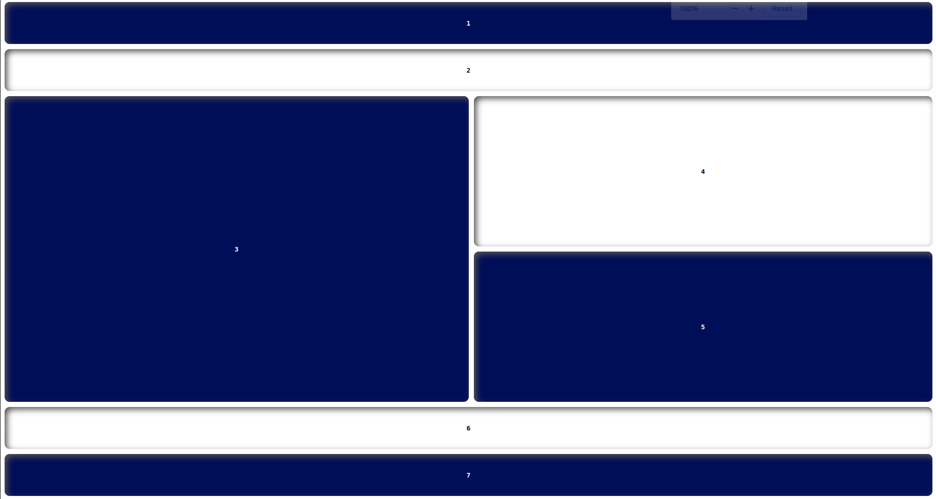
Here is the flexbox layout solution GitHub URL:
https://manojbharath1.github.io/flex-blog-examples/5-flexbox-layouts/design4/index.html
Challenge 3
Here is the flexbox layout solution GitHub URL:
https://manojbharath1.github.io/flex-blog-examples/5-flexbox-layouts/reps-layout/index.html
 21 likes
 Add to read list

Comments