This blog will look at how to use the float property to create a custom grid with CSS classes. We will not only learn how to create a custom grid in this blog, but we will also learn about the following topics.
- What is a grid system?
- How to build a custom grid.
- How to use calc() Function in CSS.
- How to use :not() pseudo-selector and last-child pseudo-element.
Introduction
A grid and grid system is a collection of horizontal and vertical lines, which is used to maintain the structure clean and clear. A grid typically consists of rows ,with columns and gutters.
What is a grid system?
Grid systems are used to create responsive web designs. It will suit almost any kind of layout. This will help us to improve our productivity.
There are several ways to build a custom grid by using a float, flex, or CSS grid. In this blog, we are using float because the float property will support almost all browsers.
HTML markup
<div class="container">

     <!-- Col-1-of-2 -->
       <div class="row">
         <div class="col-1-of-2">Column 1 of 2</div>
         <div class="col-1-of-2">Column 1 of 2</div>
       </div>

       <!-- Col-1-of-3 -->
       <div class="row">
         <div class="col-1-of-3">Column 1 of 3</div>
         <div class="col-1-of-3">Column 1 of 3</div>
         <div class="col-1-of-3">Column 1 of 3</div>
      </div>

       <!-- col-1-of-3 col-2-of-3 -->
       <div class="row">
         <div class="col-1-of-3">Column 1 of 3</div>
         <div class="col-2-of-3">Column 1 of 3</div>
       </div>

       <!-- col-1-of-4 -->
       <div class="row">
         <div class="col-1-of-4">Column 1 of 4</div>
         <div class="col-1-of-4">Column 1 of 4</div>
         <div class="col-1-of-4">Column 1 of 4</div>
         <div class="col-1-of-4">Column 1 of 4</div>
       </div>

       <!-- col-1-of-4 col-2-of-4 -->
       <div class="row">
         <div class="col-1-of-4">Column 1 of 4</div>
         <div class="col-2-of-4">Column 2 of 4</div>
         <div class="col-1-of-4">Column 1 of 4</div>
       </div>

       <!-- col-1-of-4 col-3-of-4 -->
       <div class="row">
         <div class="col-1-of-4">Column 1 of 4</div>
         <div class="col-3-of-4">Column 3 of 4</div>
       </div>

       <!-- col-1-of-4 col-2-of-4 -->
       <div class="row">
         <div class="col-2-of-4">Column 2 of 4</div>
         <div class="col-1-of-4">Column 1 of 4</div>
         <div class="col-1-of-4">Column 1 of 4</div>
       </div>
 </div>
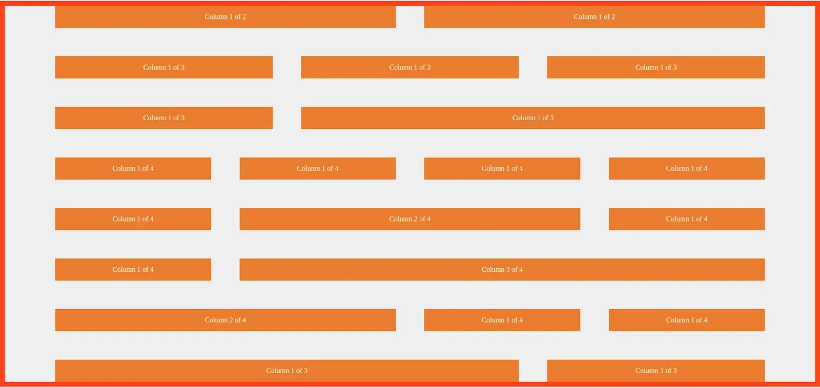
The above markup consists of 8 rows. According to the grid system, each row includes 12 columns. Based on the above markup, we assume that each row will have 4 columns..
Styling the rows and columns.
Row styling
First, we write the styles for rows, such as how much width you want; we just added the 100rem = 1600px and are creating the styles for 1600px. We calculated 1rem = 16px.
.row {
     max-width: 100rem;
     margin: 0 auto;
   }
We used max-width in the above code since it performs better than the smaller viewports devices.
.row [class^="col-"] {
   float: left;
}
From the above code [class^=”col-”] It will target all the elements starting with the class name col- and apply the given style properties.
There are two more attribute selectors like this.
[class$=”col”] It will target all the element ends with the class name col-
[class*=”col-”] It will target all the element which contains the class name col-
While we use the float property it will collapse the parent elements to height Zero. While fixing this issue we use Clearfix hacks with pseudo-element like :after and :before. Append the pseudo-element to the parent and it will clear the float.
.row::after {
   content: "";
   display: table;
   clear: both;
}
Create vertical and horizontal Gutters( Space between the two rows and two columns )
.row [class^="col-"]:not(:last-child) {
   margin-right: 4rem;
}
In the above example, we used pseudo-element like :not(:last-child). It will apply the styles to all the child elements present in the parent element row except the last one.
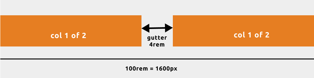
The markup for one row of two columns
   <!-- Col-1-of-2 -->
   <div class="row">
     <div class="col-1-of-2">Column 1 of 2</div>
     <div class="col-1-of-2">Column 1 of 2</div>
   </div>
From the above markup, it has one row and two columns to calculate that each has equal value and space between both columns
.row .col-1-of-2 {
   width: calc((100% - 4rem) / 2);
}
Result
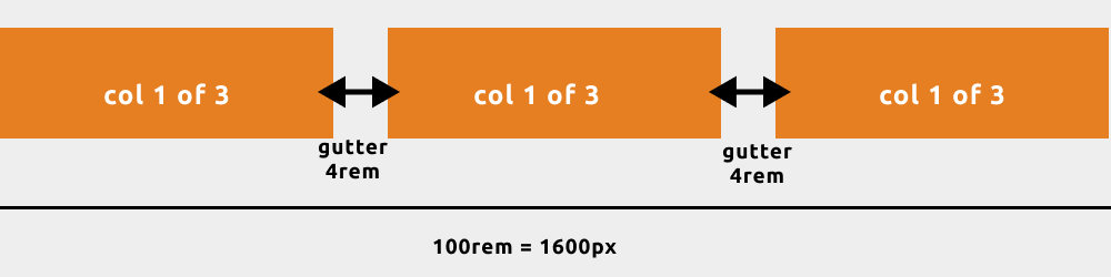
The markup for one row three columns
    <!-- Col-1-of-3 -->
   <div class="row">
     <div class="col-1-of-3">Column 1 of 3</div>
     <div class="col-1-of-3">Column 1 of 3</div>
     <div class="col-1-of-3">Column 1 of 3</div>
   </div>
Calculating the width of column 1 of 3
.row .col-1-of-3 {
   width: calc((100% - 2 * 4rem) / 3);
}
Result
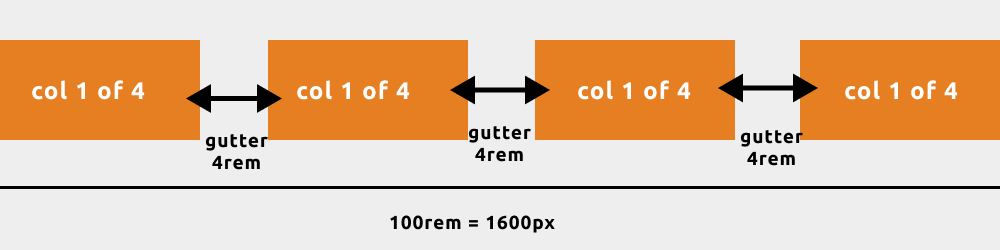
The markup for one row four columns
   <!-- col-1-of-4 -->
   <div class="row">
     <div class="col-1-of-4">Column 1 of 4</div>
     <div class="col-1-of-4">Column 1 of 4</div>
     <div class="col-1-of-4">Column 1 of 4</div>
     <div class="col-1-of-4">Column 1 of 4</div>
   </div>
Calculating the width of column 1 of 4
.row .col-1-of-4 {
   width: calc((100% - 2 * 4rem) / 3);
}
Result
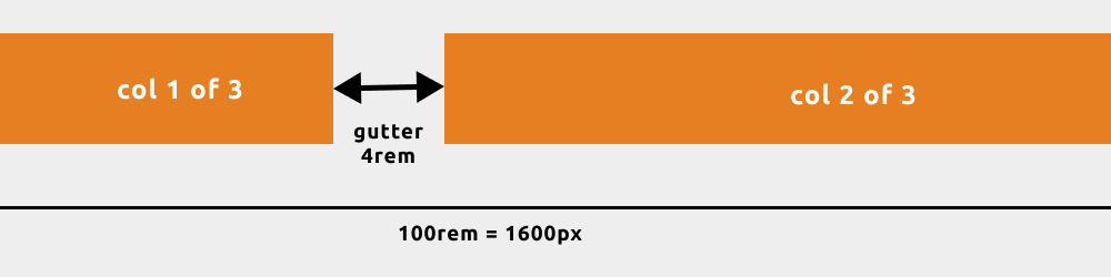
The markup col 2 of 3
 <!-- col-2-of-3 -->
   <div class="row">
     <div class="col-1-of-3">Column 1 of 3</div>
     <div class="col-2-of-3">Column 1 of 3</div>
   </div>
Calculating the width of column 2 of 3
.row .col-2-of-3 {
   width: calc(2 * ((100% - 2 * 4rem) / 3) + 4rem);
}
Result
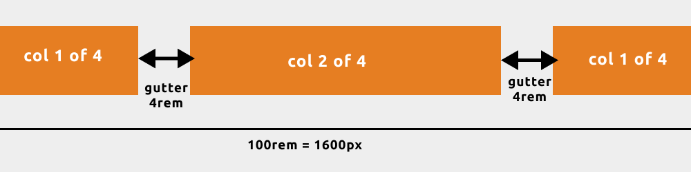
The markup for col 2 of 4
 <!-- col-1-of-4 col-2-of-4 -->
   <div class="row">
     <div class="col-1-of-4">Column 1 of 4</div>
     <div class="col-2-of-4">Column 2 of 4</div>
     <div class="col-1-of-4">Column 1 of 4</div>
   </div
Calculating the width of column 2 of 4
.row .col-2-of-4 {
   width: calc(2 * ((100% - 3 * 4rem) / 4) + 4rem);
}
Result
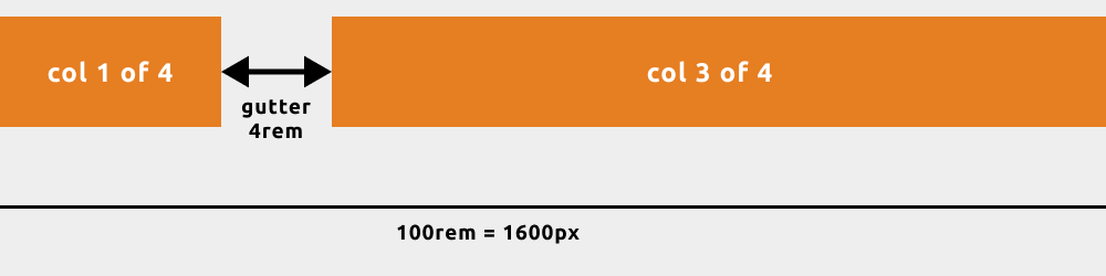
The markup for col 3 of 4
<!-- col-3-of-4 -->
   <div class="row">
     <div class="col-1-of-4">Column 1 of 4</div>
     <div class="col-3-of-4">Column 3 of 4</div>
   </div>
Calculating the width of columns 3 of 4
.row .col-3-of-4 {
   width: calc(3 * ((100% - 3 * 4rem) / 4) + 2 * 4rem);
}
Result
Responsive for grid layout
@media (max-width: 56.25em) {  //max-width 900px
   .row {
       max-width: 50rem;
       padding: 0 3rem;
   }
   .row:not(:last-child) {
       margin-bottom: 4rem;
   }
   .row [class^="col-"]:not(:last-child) {
       margin-right: 0;
       margin-bottom: 4rem;
   }
   .row [class^="col-"] {
       width: 100% !important;
   }
}
Final result
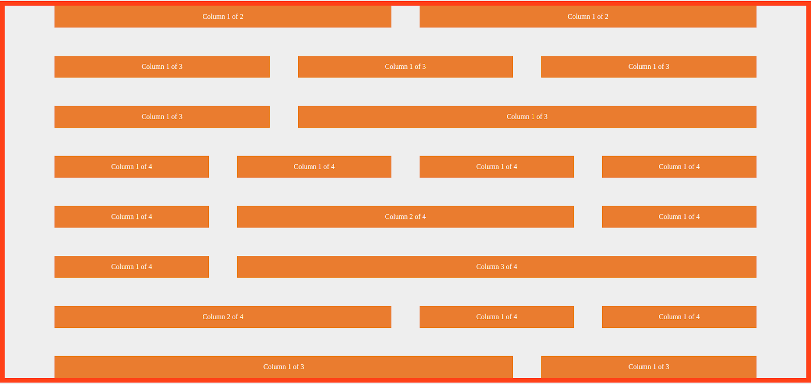
Conclusion
In this blog, we created a custom grid that can cover a lot of web designs. I hope you learn something new. Thank you for reading! Do share your comments below.
 21 likes
 Add to read list

Comments