Follow best practices for styling and layout with the following CSS guidelines to make clean, responsive designs that stand out and improve user experience.
For example, all the primary menu actions of a website can be named as navigation and styled at the top of the navigation, all the main page content is styled at the middle of the page, and finally, all the company and product-related information will be designed at the end of the page by the name footer. So CSS plays a key role in all website development.
We the developer need to follow some sort of rules and guidelines while designing the websites, here are some major points that need to be followed and should be taken care of to avoid any other conflicts.
Proper usage of float
Float is the very first property used for layout development, but using float alone will break down the next block on the page. To avoid such kind of breakage, we need to use clearfix to the parent div of the html component which is holding float. Check out the below example for clarification.
If you have the html in the following way,
<div class="parent clearfix">
    <div class="first_child"></div>
    <div class="second_child"></div>
</div>
Now, with the above html, you need to align the first and second child side by side then we can use float and their properties left and right. Along with float, we have to write clearfix properties to the parent div, here is an example.
.parent .clearfix{
  content: "";
  clear: both;
  display: table;
}
.first_child {
float:left;
}
.second_child {
float:right;
}
Consistency in property value units
On a website, all the space management is going to handle by margin, padding, line space, letter spacing, and other properties. So all of the property values are measured in some units and that may be either px or em or rem but not mixed values. We have to maintain that consistency over the units of property values.
The wrong method
.parent{
   margin: 50px;
   padding: 2rem;
   line-height: 1em;
}
Anyone among the three is correct
.parent{
   margin: 50px;
   padding: 2px;
   line-height: 1px;
}
.parent{
   margin: 5rem;
   padding: 2rem;
   line-height: 1rem;
}
.parent{
   margin: 5em;
   padding: 2em;
   line-height: 1em;
}
Margin/padding usage
Let us assume that all the HTML elements are containers in their way of representation and their features. If we do need outer space for the container, then we have to use margin and padding for inner space.
- Margin values should not be in percentages, until unless it is a special case.
- Margin and padding should be used only for space alignment purposes but not for layout alignment
Maintaining proper comments
Adding a little line of message over every block design will help for the purpose of the design and make it easier to maintain. Click here to learn the different types of comments and their representation.
Meaning full class and id names
Class and id names should be descriptive. For example, if you are writing CSS for navigation and the classes should be in such a way that, they are going to represent the purpose of their use. Check below for examples.
Wrong class and id names:
<header>
       <nav>
           <ul class="listing">
               <li class="nav-1">
                   <a href="#">About Us</a>
               </li>
               <li class="nav-2">
                   <a href="#">Home</a>
               </li>
               <li id="nav-3">
                   <a href="#">Contact Us</a>
               </li>
               <li class="nav-4">
                   <a href="#">Blog</a>
               </li>
               <li class="part-5">
                   <a href="#">Snippet</a>
               </li>
           </ul>
       </nav>
 </header>
Right class and id names:
<header class="primary_navigation">
       <nav class="navigation">
           <ul>
               <li class="navigationAboutUs">
                   <a href="#">About Us</a>
               </li>
               <li class="navigation_home">
                   <a href="#">Home</a>
               </li>
               <li id="navigation_contact_us">
                   <a href="#">Contact Us</a>
               </li>
               <li class="navigation_blog">
                   <a href="#">Blog</a>
               </li>
               <li class="navigationSnippet">
                   <a href="#">Snippet</a>
               </li>
           </ul>
       </nav>
   </header>
In the above examples we have two scenarios, if we want to write common styles for all the li values, then here is the method you can write
Case1:
.primary_navigation nav ul{
	/* styles that you want to write for ul */
}
.primary_navigation nav ul li{
	/* styles that you want to write for all the li items */
}
Case2:
If you do want unique classes for each li item in the above example, you can follow any one of the class-defining methods from the above example. We can use the same flow while defining the class or ids.
Note: ID usage in the html document should be very much limited, we have to take IDs only if necessary.
Fonts implementation
Carefully we have to choose the fonts, there are some standards for taking font from respective resources and adding them to our website. Here is an article that gives you crystal clear details about font implementation. https://mycode.blog/navya/drupal-89-methods-render-require-font-family
Writing bootstrap classes with plain HTML and CSS
We must avoid taking bootstrap classes for styling because it generates a conflict when using bootstrap libraries. Here is an example that we should avoid taking bootstrap classes for custom styling.
<header class="container-fluid">
       <nav class="nav">
           <ul>
               <li class="list-unstyled">
                   <a href="#">About Us</a>
               </li>
               <li class="container">
                   <a href="#">Home</a>
               </li>
           </ul>
       </nav>
</header>
Taking care of the width and height units
Width and Height values have various units to apply them, but we have to choose only the standard one. Width and Height should be given either px or rem or in percentages. We have to avoid using vh units because they will disturb the actual dimensions of the container.
Maintaining color code standards
Some major points we need to consider while choosing the color and applying them
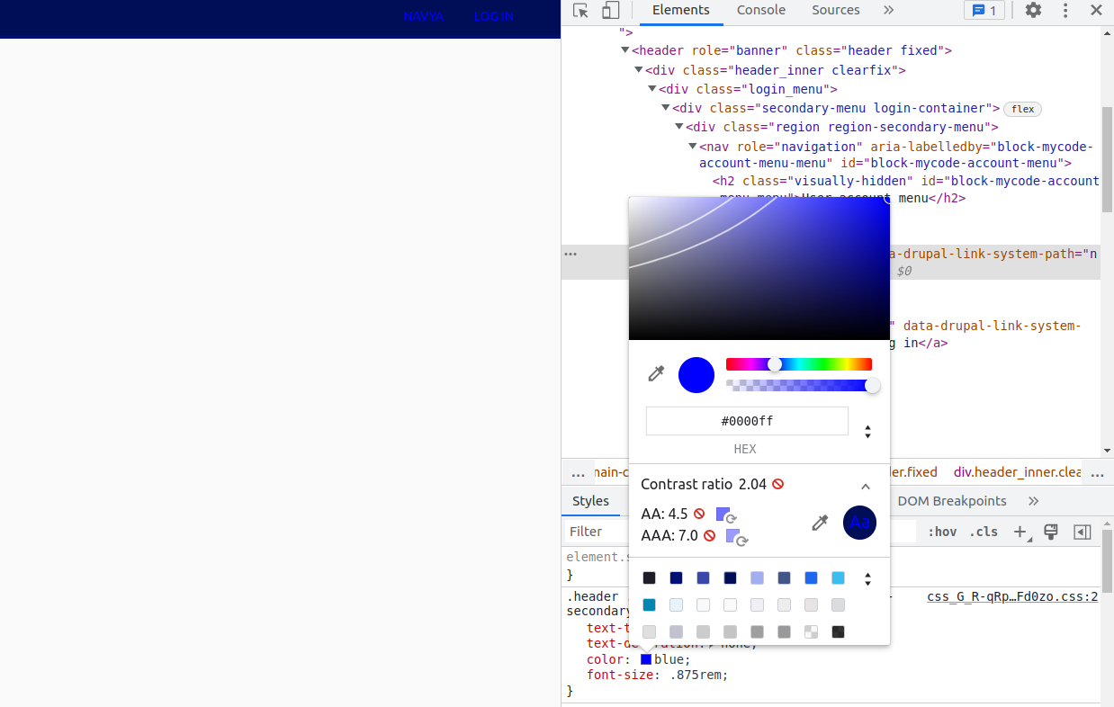
- We have to choose contrast-free color codes
In the below screenshot, you can see the contrast issue, which means the background color and text color choices will make it the user's eye tough to read things. We have to choose colors very carefully.
- Always prefer hexadecimal color code
- Choose eye cache colors, as per some studies people’s vision will first catch and recognize the colors. For example, blue and white is a professional combo for websites.
Know the usage of position properties and their values
This position property is very important and we all should know when to use it, here are the use cases
- We have to use the position property when we are developing sticky navigation, which means whenever we scroll on a website the top navigation should be sticked to the top of the browser. This helps to navigate to the required faster Here is an example of usage of positions Sticky sidebar with pure CSS, and How to make a container sticky with jQuery.
- In the case of overlapping, for example, if we want to place text over some image or icons within the input elements then we can use positions.
- Using positions for design layout is a bad choice and it will cause hectic complications while moving to the next block of design
Choosing apt layout methods
There are multiple layout techniques there. Still, we have to choose the apt and upgraded technique for a standard layout. I personally prefer flexbox over all other techniques because we can achieve a responsive design with less code. Here we may face one challenge, some older browsers didn’t support this latest technique, but we also have a solution for this and that is using browser prefixes. Click here to see all the browser prefixes for flexbox.
Choosing a bad media query
This is the ultimate goal of every web developer and he should concentrate more on responsive design. Responsive design in a sense the website should be accessible for all the available media devices like laptops, desktops, larger screens, tabs, mobiles, and mini mobiles, and the site should render in all the available OS (Windows, Linux, Mac). Please avoid the repetition of the same media query.
This is the standard method of media query
Desktop First Approach
@media (max-width: 1199px) {}
@media (max-width: 1023px) {}
@media (max-width: 767px) {}
Mobile First Approach
@media (min-width: 768px) {}
@media (min-width: 1024px) {}
@media (min-width: 1200px) {}
Finally, I want to conclude that the quality of the website defines how carefully, we have chosen the standards of the technology. So we need to remember all the standards of any technology that we are using for the development of a perfect website. As the appearance of the website matters, we need to consider all the above-mentioned.
 21 likes
 Add to read list

Comments