Summary
Flexbox allows designers to create flexible and responsive layouts quickly and easily. Use it to align, distribute, and space elements in a web page.
Types of flexbox layouts
You can learn more information about using flexbox layout
| Layouts | Definition/Syntax | Example | Output |
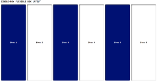
| Single-row layout |
Single-row layout in flexbox refers to a flex container where the flex items are arranged in a horizontal row, with optional alignment and spacing. Syntax: display: flex; |
|
 |
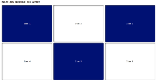
| Multi-row layout |
A multi-row layout in flexbox is a flexible design technique that allows for the creation of multiple rows of items that respond to different screen sizes. Syntax: display: flex; |
|
 |
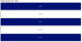
| Column layout |
Column layout in Flexbox is a layout mode where items are arranged vertically in a column, with each item taking up the full width of the container. Syntax: display: flex; |
|
 |
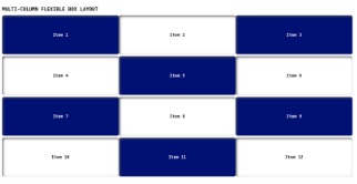
| Multi-column layout |
Multi-column layout in Flexbox allows for the creation of flexible, responsive web page designs with multiple content sections organized in rows and columns. Syntax: display: flex; |
|
 |
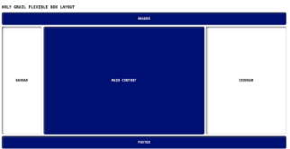
| Holy grail layout |
The Holy Grail layout in Flexbox is a popular web design pattern that features a header, footer, and three columns of content that can be dynamically resized and repositioned using Flexbox properties. Syntax: display: flex; |
|
 |
 21 likes
 Add to read list

Comments