Let's analyze the list of standards for accessible web applications & solutions with Drupal, as every user has equal rights to access the information & services.
What is Accessibility?
Accessibility is the practice of designing digital content so that it can be used by people with disabilities. It's about making sure that everyone, regardless of their abilities, can navigate, understand, and interact with web content.
Why Accessibility
Accessibility is important as each and every user in this should world should access web content irrespective of their disabilities. Here are some major reasons why we should focus on accessibility.
- Compatibility with assistive technologies
- Better SEO
- Legal Requirements
- User-centered design
- Accessible multimedia content
Many people who are suffering from disabilities also have an opportunity to access web content with advanced technologies like screen readers, Brail keyboards, transcription devices, and many more.
Our website must follow all the accessibility guidelines and make it available for all the users in the world.
Accessibility Elements in web applications
Here are the top most required elements for a complete accessibility website, let us learn more from below,
Proper use of semantic HTML elements
Semantic HTML
Semantic HTML is the practice of using HTML elements that clearly and accurately convey the meaning and purpose of their content to both humans and machines. This involves using HTML tags that are more appropriate for the content being presented, rather than using generic or ambiguous tags, as you can see the difference clearly below screenshot.
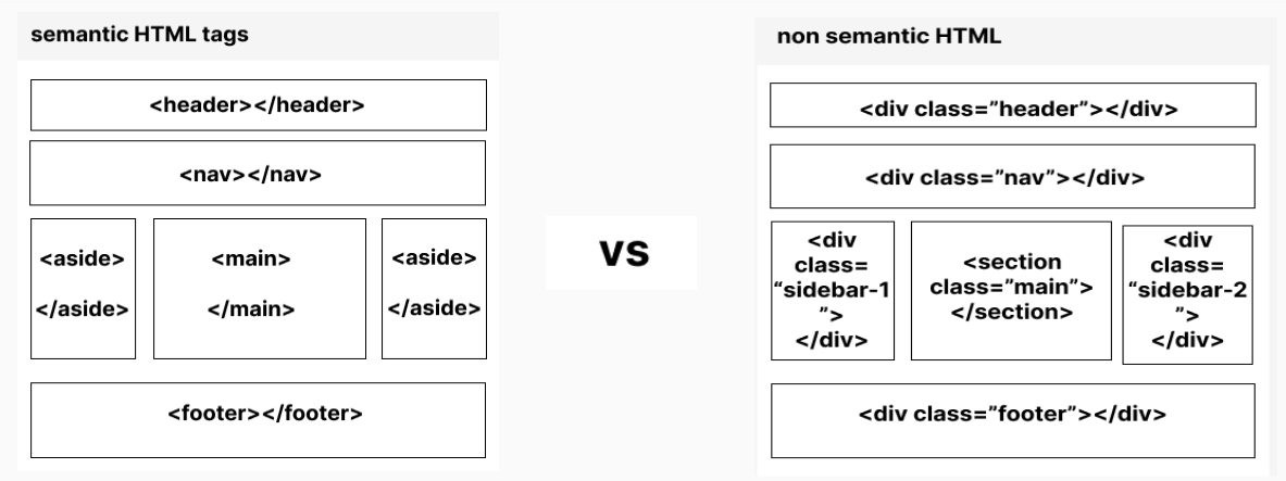
For example, using the <header> tag to mark the header section of a webpage, <nav> for navigation links, <article> for the main content of an article, <aside> for secondary content, and <footer> for the footer section.
How to achieve semantic HTML structure with Drupal
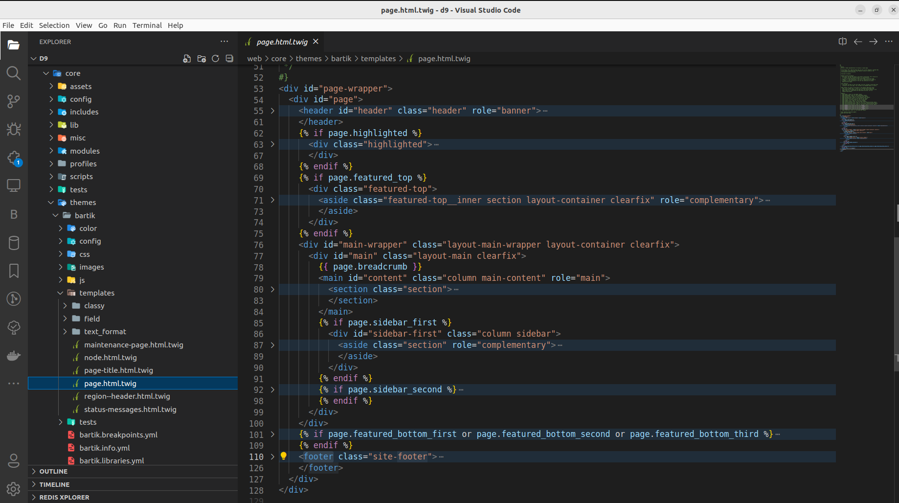
Default core themes come with a semantic structure
Example:
Structured Entity Types
Drupal core has a structured entity type, for example, if we take content type we can create the fields as per required and arrange them as per the need
Views
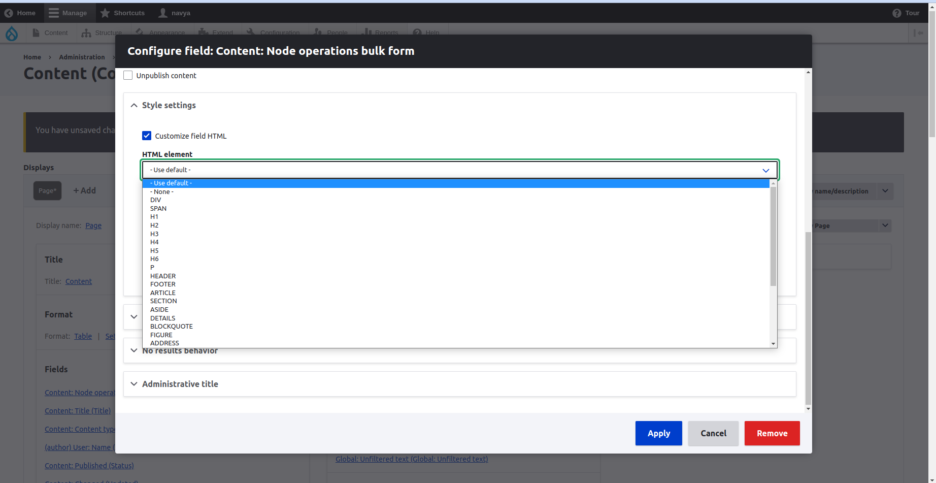
Another Drupal core feature that gives the feasibility to arrange data in lists and grid format is Views. In the view fields, we can easily configure the HTML of the field. For example take the Drupal content view, if we do edit the view field settings there we can change the HTML for the field as shown in the below figure.
Example:
The custom theme Template customization
If we are unable to get the required structure from the core then we can go with template customization within our custom theme.
Contributed themes have a semantic structure
As with core and custom themes, we also have the contributed themes from Drupal which follow the exact semantic structure and all the accessibility guidelines. Bootstrap 5 is the best example of an accessible theme.
HTML attributes for accessibility
- Lang - used to indicate the content language of the HTML doc
- tabindex - Tabindex attr helps to navigate via keyboard, it decides in which order the focus will move, and it takes the numeric value either 0 or -1.
- The numeric value 0 indicates like the element should be included in neutral form like 1,2,3… I mean the successive elements,
- The numeric value -1 indicates that the element should be focusable but not included in the natural tab order of the page.
- title - provides additional information on the tooltip, hover, and focus
- role - defines the semantic meaning beyond its default role
- accesskey - helps to provide keyboard shortcuts for a specific HTML element
- aria-attributes - provide additional information on an HTML element
How can we accomplish these HTML attributes with Drupal
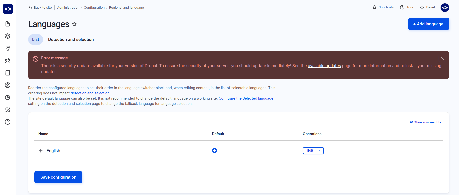
We have a language core module to make the website available for all the available regional languages.
Can be customized via the Drupal template system
Apart from lang, many other required attributes can be managed via twig templates.
Proper hierarchical heading structures
A well-structured hierarchy of headings makes it easier for users to navigate and understand the content, particularly for those who use assistive technology like screen readers.
To create a proper hierarchical heading structure, it's important to use the correct heading levels (i.e. H1, H2, H3, etc.) in the appropriate order. Here are some rules.
Standards
- One page one H1 tag
- H1 is not allowed after H2
- Heading tags must be descriptive
- The heading structure will always be in this flow
- H1->H2->H3->H4->H5->H6
- H1 ->H2
->H2->H3->H4->H5->H6
->H3
->H2->H3->h4
How can we achieve a proper hierarchical heading structure with Drupal
Drupal has core CKEditor features which are very generalized to users and are not formatted well as per accessibility guidelines. If the user is a tech guy, he might know the website standards and will write the content in the proper format.
So to have the properly structured headings we can use one of the CKEditor’s features called CKEditor templates. With this feature, we can design customized CKEditor templates and use the templates as per the need.

Alternative text for media
Content can be represented in multiple formats such as text, image, video, gif, and audio depending upon the requirements. To represent content in image format, we have to follow some defined rules in web development. The standard structure of an image as per HTML must have these attributes included. They are,
The first and very most important is the alt text, It provides a text description of the image, which is displayed when the image cannot be loaded or when a user uses a screen reader to browse the web and must be descriptive, and remaining attr gives their own value for an accessible website.
Image tag and required attributes
|
Image |
Example |
|
|
Video tag and required attributes
|
Video tag |
Example |
|
|
Achieving Alternative Text for Media with Drupal
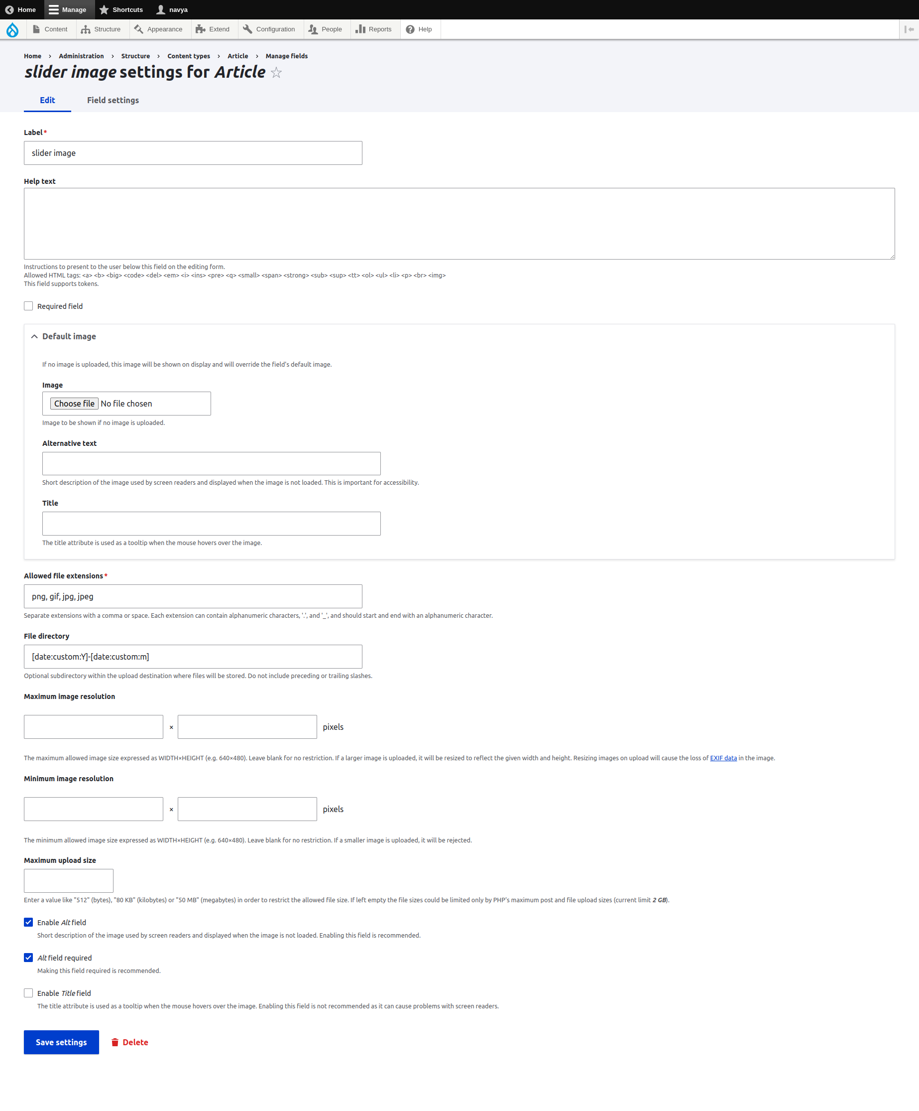
Drupal core image field
Drupal core gives all the required attributes to full fill the accessibility guidelines, here is an example.
The custom theme template customization
Any other required attributes can easily be added with the template customization, as we all know that Drupal runs with a template system.
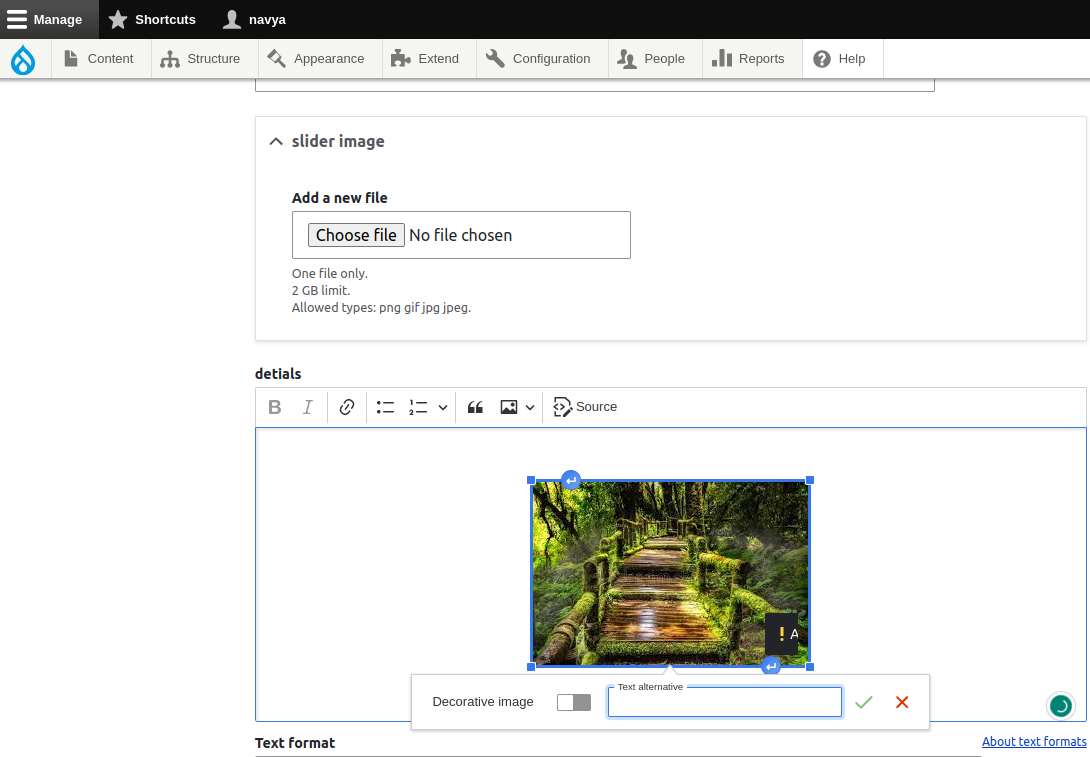
CKEditor image field
With the help of CKEditor features also we can have the required attributes for the image.
Link attributes for accessibility
Links are action elements that redirect to another page and they should follow all the below attributes to make assistive technology users feel safe opening the url along with additional information as well.
The rel="noopener" attribute is used in HTML to add security measures to links that open in a new window or tab. When a link with target="_blank" is clicked, a new window or tab is opened in the user's browser.
By default, the new window has access to the window.opener property of the original window, which can potentially be exploited by malicious websites to steal sensitive information or perform other attacks.
Link tag and required attributes
|
Anchor tag |
Example |
|
|
Button tag and required attributes
|
Button |
Example |
|
|
Achieving Link attributes for accessibility with Drupal
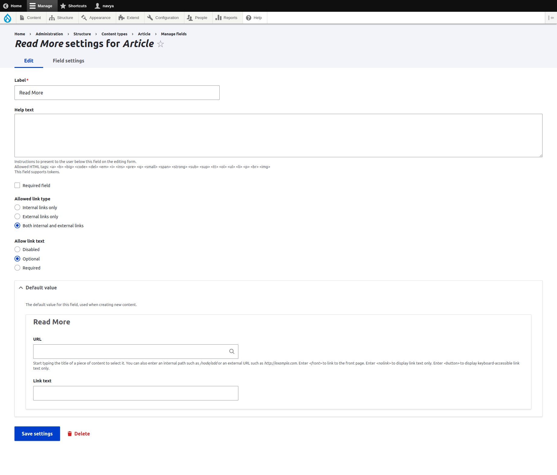
Drupal core link field
Drupal core gives the required attributes and values that are required for accessibility. Here is an example of a link field in Drupal.
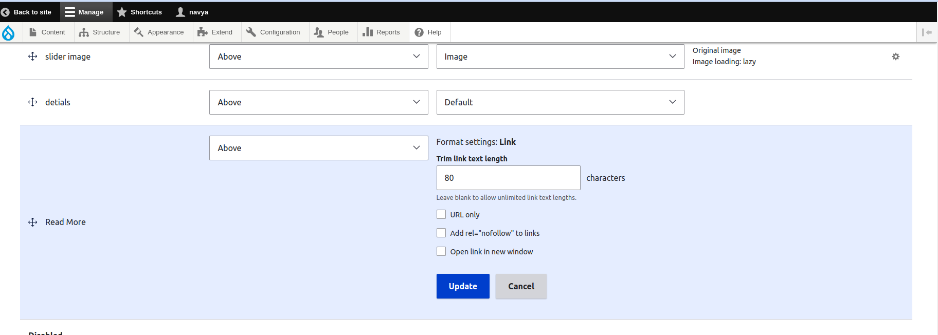
With Drupal Manage Display
In Drupal, the field’s manage display also gives the feasibility to configure the required attributes for the link field.
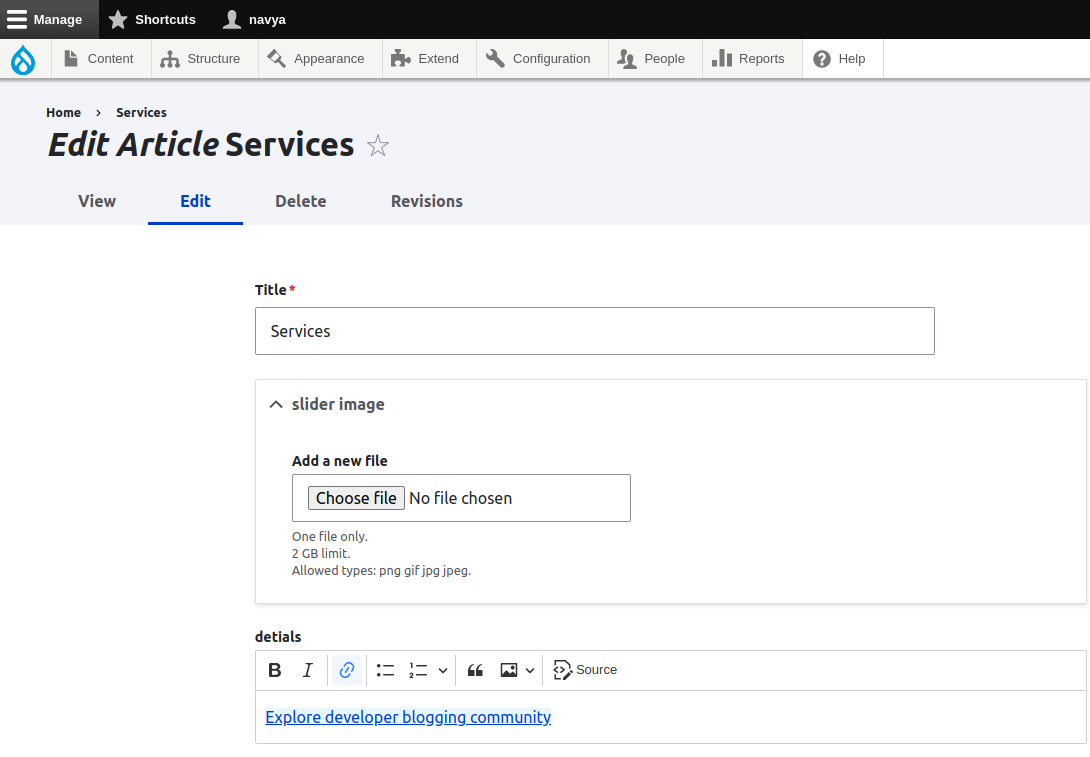
CKEditor link field
In CKEditor field settings also we can have the required attributes for accessibility.
With Drupal twig templates
If we have any other requirements other than core features we can have one hundred percent feasibility of having all the required attributes with the twig template system.
Accessible forms
Forms should be accessible as they are the source to get users and engage with the public. All the forms must be accessible with a keyboard and we need to display clear error and alert messages.
Here is the list of must-include attributes for the form
- title
- aria-describedby
- placeholder
- required
- autocomplete
- aria-label
- aria-labelledby
- role
- tabindex
- pattern
- min and max
- step
- multiple
- disabled
Achieving Accessible forms
Using core contact forms entity
Drupal core contact form entity gives the features to have major required form attributes that are mandatory for accessibility. The below video shows how the Drupal contact form is accessible with a keyboard.
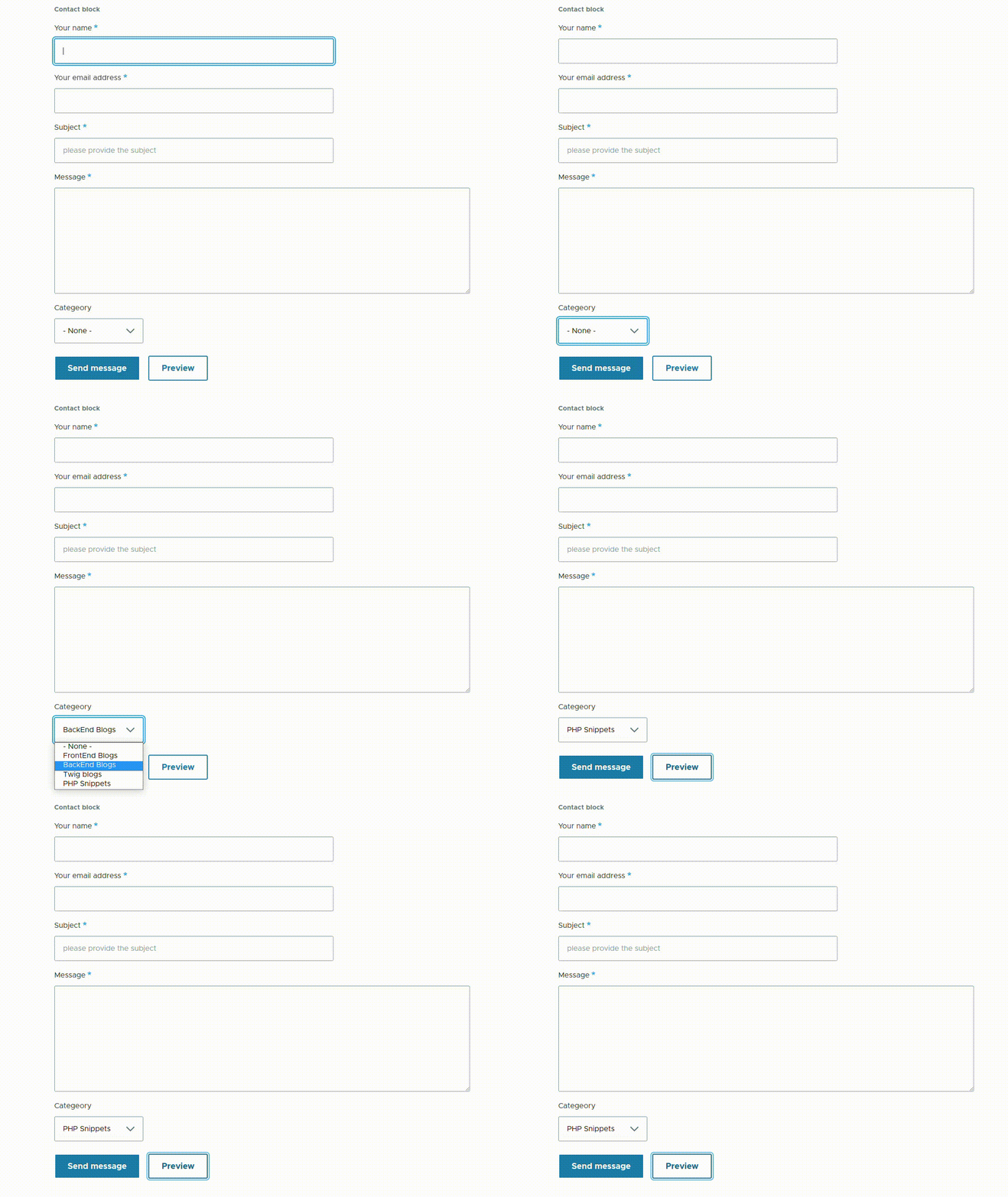
Check here about Form Elements in Drupal.
Creating custom forms
If the requirement will not be fulfilled in the core contact form, then we can create our own custom forms with all the required attributes with the help of twig templates. Check out this article to Build Custom Form in Drupal.
Required attributes can be added via preprocessing function
We can also have another option in Drupal, that is adding required form attributes via preprocess functions. Check here to know How to alter Form fields and attributes in Drupal
Color Contrast
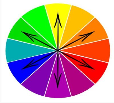
Color contrast is an important consideration in web accessibility because it can affect the ability of users with visual impairments to read and understand the content on a website.
Good color contrast can make it easier for users to distinguish between different elements on a page, such as text, images, and buttons.
When designing or developing a website, it's important to ensure that the color contrast between the text and its background meets the minimum accessibility standards so that all users, regardless of their visual abilities, are able to access and understand the content on a website.
Achieving Color Contrast with Drupal
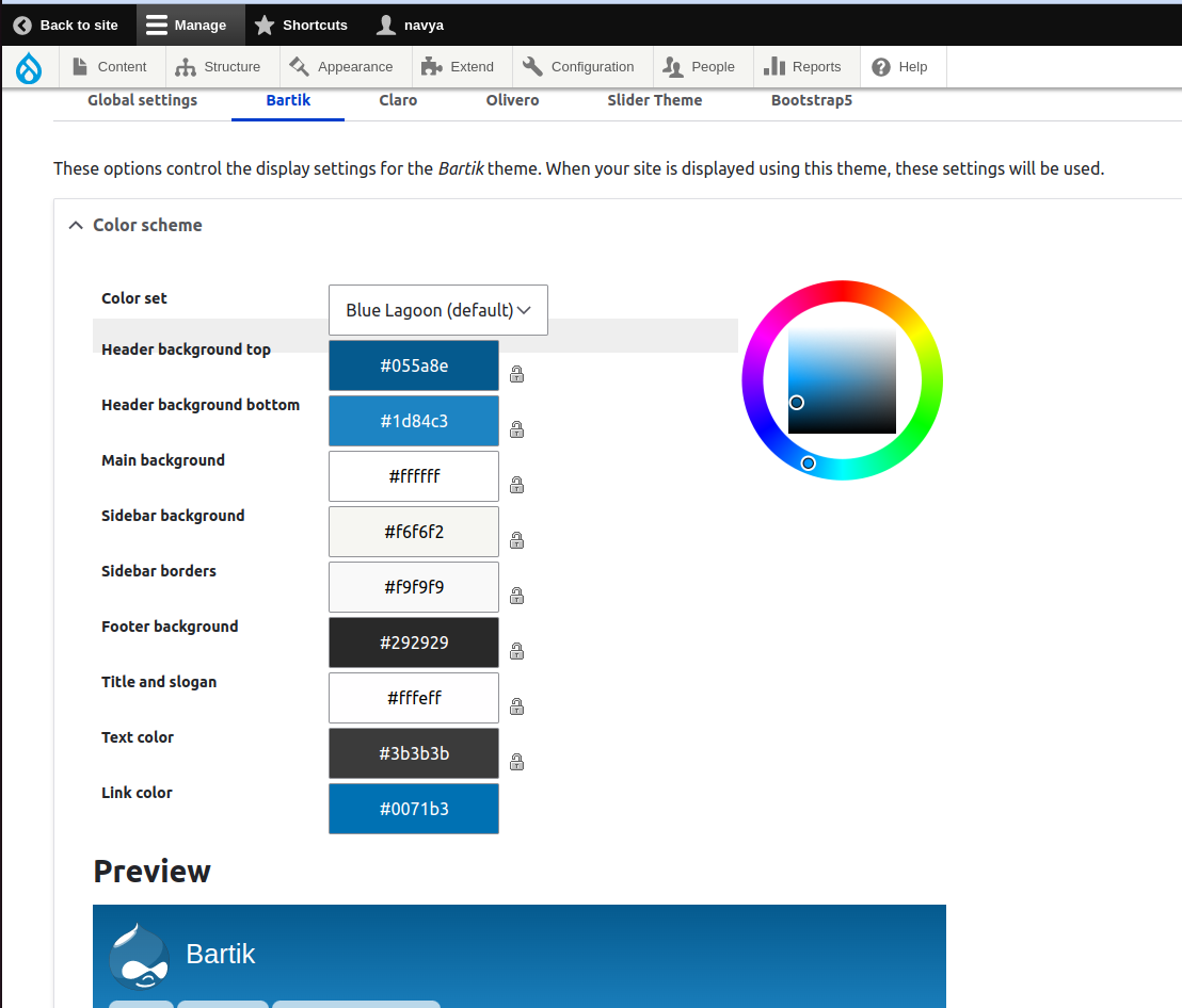
Color scheme customization for core themes
Drupal has a color module and it provides all the features to customize the color contrast of the site.
Custom theme UX should follow the standards of Color Contrast
If we are going with a custom theme then we have to give all the accessibility guidelines to the UX designer.
Clear and consistent navigation
Consistent navigation across the site helps users to have ease in navigation and feel comfortable accessing the site. Here are a few standards for clear and consistent navigation.
Standards:
Navigation should follow the semantic structure
Semantic navigation will help browsers to read what type of list that we are providing to users and screen readers will have a proper understanding to read the navigation. Here is an example of semantic navigation.
<nav>
   <ul>
      <li> <span></span></li>
      <li> <a></a></li>
      <li>
        <ul>
          <li> <span></span></li>
          <li> <a></a></li>
        </ul>
      </li>
   </ul>
</nav>
Navigation should be adaptable
A website must be crawlable across all types of browsers considering the assistive technology screens, navigation must be adaptable.
Multi-navigation should be accessible
The menu within Menu gives the multi-navigation, so on hover or focus the multi-navigation should be accessible and must work with keyboard navigation.
Achieving Clear and consistent navigation with Drupal
- Using menus for navigation: Drupal menus give the semantic structure and here is an example.
![Drupal menu with semantic nav structure]()
- We can customize it via
- preprocessors
- templates and
- custom modules
If we have the mega menu requirements that can't be achieved with the core menu, we can go with any of the above approaches.
Accessible modal dialogs and pop-ups
Dialog boxes and pop-ups give extra information about the website, so those must be accessible as the screen readers must feel safe to open the popup. Here are the required standards.
Standards for accessibility
- Focus management
- Avoid Auto-Playing Content
- Accessibility Documentation
- Consistency
Achieving Accessible modal dialogs and pop-ups with Drupal
- Ajax, Drupal dialog box: check here to know how to create Drupal Ajax dialogs.
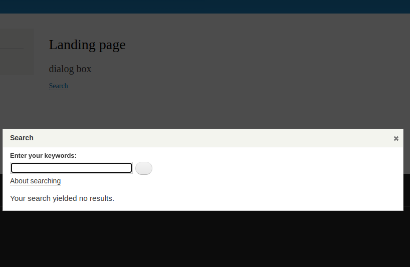
- Using Drupal modals: Drupal models also have the option to have all the accessibility guidelines.
Responsive design
As the website must fit all the screens in the globe, the website must be responsive. Check out here for the responsive design guidelines.
Achieving Responsive Design with Drupal
Here are the available Drupal features that provide responsive design.
- D9 and D10 are coming up with responsive themes
- Bartik
- Claro
- Contributed responsive themes from Drupal
- Bootstrap 5
- Designing responsive custom themes with CSS layout techniques: check out here to learn the css layout techniques.
Accessibility Testing Tools
Here are the popular accessibility testing tools.
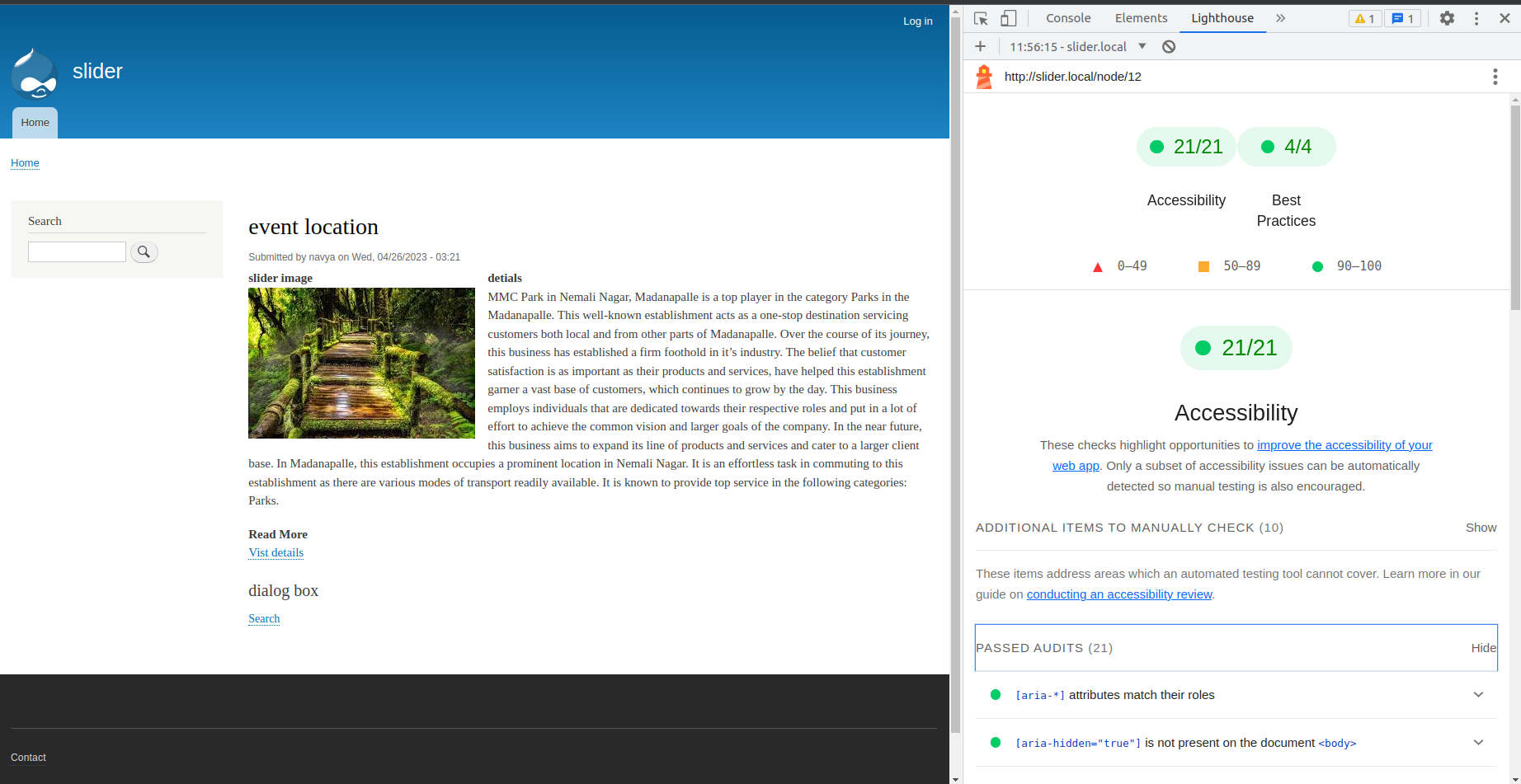
Google Lighthouse
Google Lighthouse is the Chrome dev tool that generates the audit report on Accessibility, Markup validation, Performance, and many other SEO testing areas along with proper reports and suggestions.
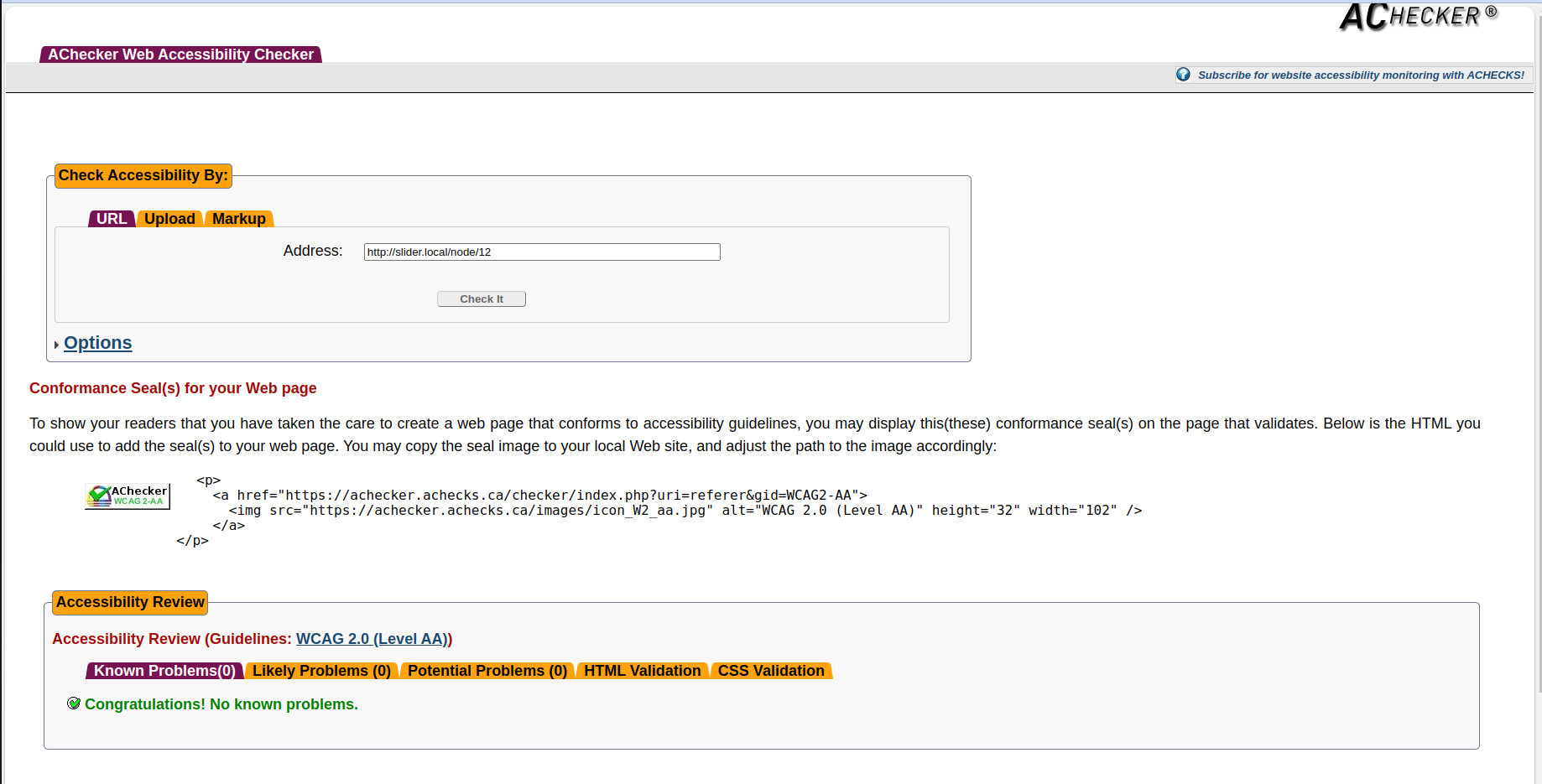
AChecker
This is another online tool that tests only for accessibility.
Wave Accessibility Tool
The most popular accessibility testing tool provides clear information about accessibility issues and also suggestions to improve accessibility.
Axe Browser Extension
This is a paid version browser tool to test accessibility and get some extra features.
How to create accessible web applications?
We can create accessible web applications by following each and every point that we mentioned over here.
Conclusion
Web accessibility is important not only for Legal requirements and Brand reputation, but also for ensuring that all users across the globe have equal access to information and services provided through the web.
This article has been presented at the Drupal meet-up in Bangalore.



Comments