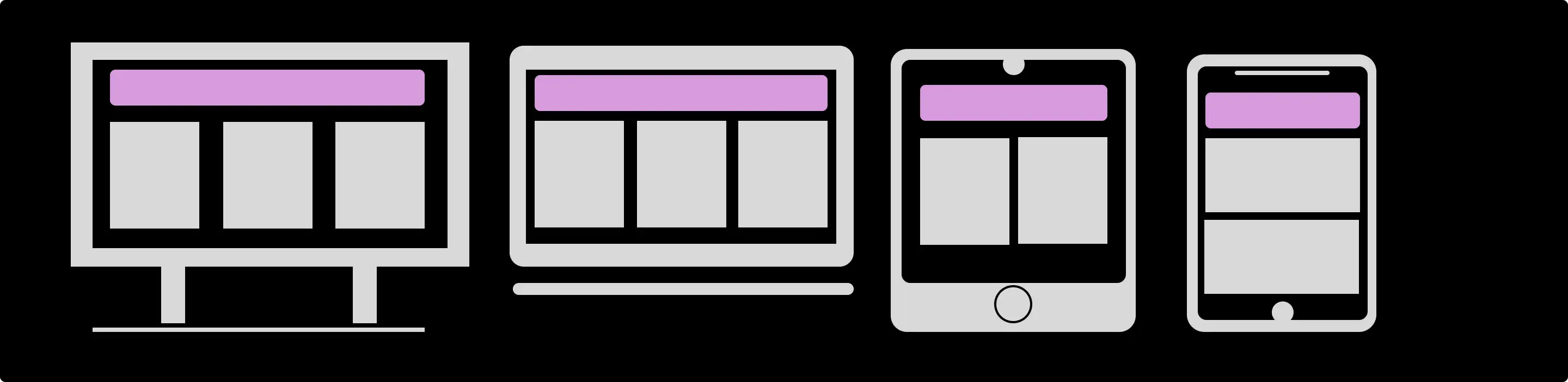
Learn how to create websites that adapt to any screen size with these tips and tricks for mastering responsive design. Achieve seamless responsive design with tips.
What is Responsive Web Design?
Responsive web design is an approach to designing and building websites that can adapt to different screen sizes and devices, including desktops, laptops, tablets, and mobile phones. This is done by using only HTML and CSS.
We can build web pages by using HTML and CSS, and we can build a responsive design using the CSS technique called media queries. Media queries are introduced by CSS3.
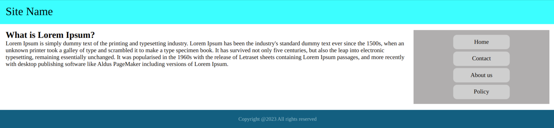
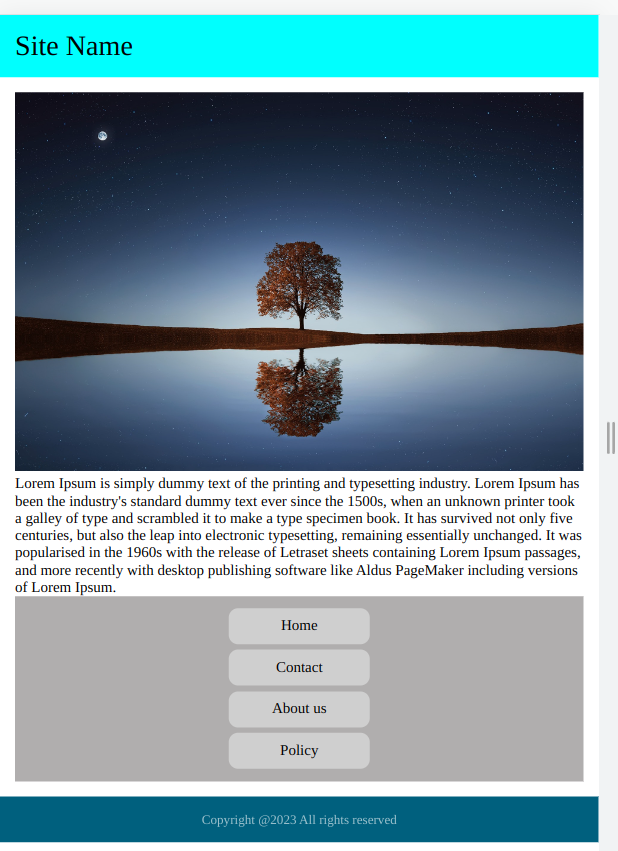
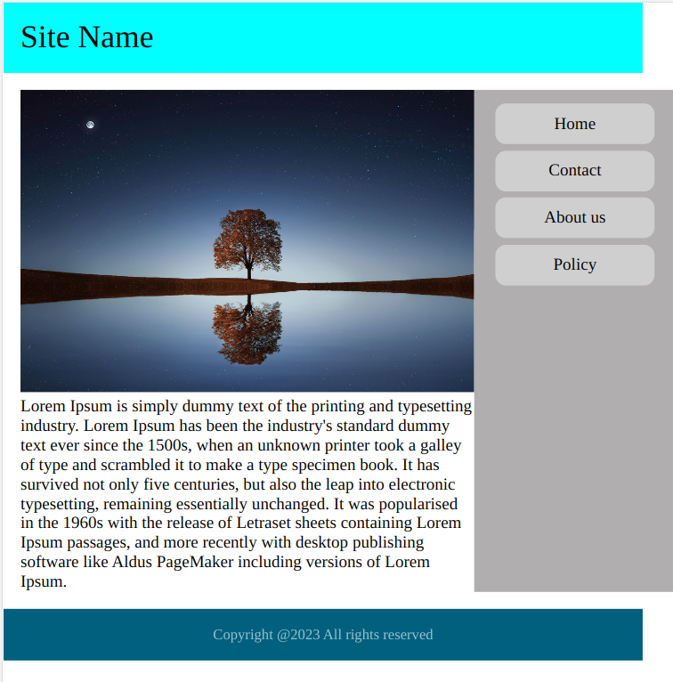
Here is the basic design of the web page.
Here is an example of how to create a layout using HTML and CSS:
HTML:
<!DOCTYPE html>
<html lang="en">
<head>
  <meta charset="UTF-8">
  <meta http-equiv="X-UA-Compatible" content="IE=edge">
  <meta name="viewport" content="width=device-width, initial-scale=1.0">
  <title>Document</title>
</head>

<body>
  <header>
    <div class="logo">
      <p>Site Name</p>
    </div>
  </header>
  <main>
    <section class="main-content">
      <h1>What is Lorem Ipsum?</h1>
      <p> Lorem Ipsum is simply dummy text of the printing and typesetting industry. Lorem Ipsum has been the industry's
        standard dummy text ever since the 1500s, when an unknown printer took a galley of type and scrambled it to make
        a
        type specimen book. It has survived not only five centuries, but also the leap into electronic typesetting,
        remaining essentially unchanged. It was popularised in the 1960s with the release of Letraset sheets containing
        Lorem Ipsum passages, and more recently with desktop publishing software like Aldus PageMaker including versions
        of Lorem Ipsum.</p>
    </section>
    <aside class="aside-bar">
      <nav>
        <ul>
          <li><a href="#">Home</a></li>
          <li><a href="#">Contact</a></li>
          <li><a href="#">About us</a></li>
          <li><a href="#">Policy</a></li>
        </ul>
      </nav>
    </aside>
  </main>
  <footer>
    <p>Copyright @2023 All rights reserved</p>
  </footer>
</body>
</html>
CSS:
* {
      padding: 0;
      margin: 0;
      box-sizing: border-box;
    }

    header {
      background-color: aqua;
      color: black;
      padding: 1rem;
      font-size: 30px;
    }

    main {
      display: flex;
      padding: 1rem;
    }

    section {
      flex: 0 0 75%;
    }

    aside {
      flex: 0 0 25%;
      background-color: #b0aeae;
      padding: 10px 20px;
      text-align: center;
    }

    ul li {
      list-style: none;
      padding: 3px 0;
    }

    ul li a {
      text-align: center;
      width: 150px;
      color: black;
      padding: 10px 0;
      text-decoration: none;
      display: inline-block;
      background: #cfcfcf;
      border-radius: 10px;
    }

    ul li a:hover {
      text-decoration: underline;
    }

    footer {
      background: #005f80;
      padding: 1rem;
      color: #fff;
      text-align: center;
      font-size: 14px;
    }

    footer p {
      opacity: 0.6;
    }
What is The Viewport?
Before we are going to the responsive design we can talk about the viewport. In web development, the viewport is the visible area of a web page that is displayed on a device's screen.
To ensure that a web page displays properly on different devices and screen sizes, web designers and developers can use the meta viewport tag in the HTML head section of the web page. This tag sets the width, scale, and initial zoom level of the viewport, which affects how the page is displayed on different devices.
<meta name="viewport" content="width=device-width, initial-scale=1.0">For example, to set the width of the viewport to the width of the device and disable zooming, you can use the following meta tag:
This tag sets the width of the viewport to the width of the device and sets the initial scale to 1.0, which means that the page is displayed at the default size. It also disables zooming, which ensures that the layout and design of the page remain consistent on different devices.
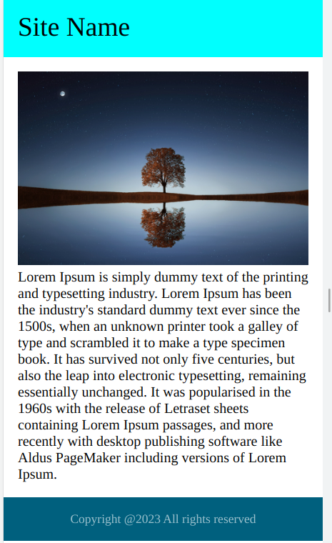
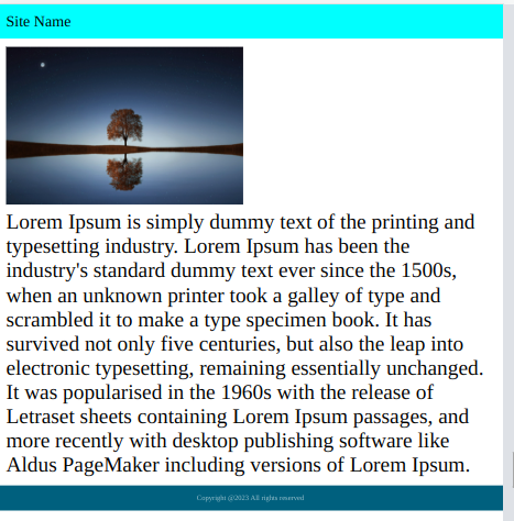
Here are the examples of with and without viewport meta-tag
With viewport meta-tag
Without viewport meta-tag
What are media queries?
Media queries which are CSS techniques introduced by css3. Media queries are used for building a responsive design for all the devices such as desktops, laptops, and mobiles.
Media queries are used to make websites responsive, adapting the layout and design to different screen sizes and devices. They can target specific properties like screen resolution, aspect ratio, orientation, and more. Using media queries, designers can create a single codebase that works across a wide range of devices, from mobile phones to large desktop screens. This helps to improve the user experience, accessibility, and overall performance of a website.
Why do we use media queries?
We use media queries in CSS to create responsive designs that adapt to different devices and screen sizes. By using media queries, we can optimize the layout, typography, and overall user experience for different devices, improving accessibility and performance. Media queries allow us to create a single codebase that works across a wide range of devices, reducing the need for separate designs for each device type and making it easier to maintain the website over time. Overall, media queries are a critical tool for creating modern, user-friendly, and accessible websites.
Media Queries: These are used to apply different CSS styles based on the characteristics of the device, such as screen size or resolution. Sample code:
@media screen and (max-width: 600px) {
  /* styles for devices with screen widths up to 600px */
  body{
   background-color: white;
  }
}
Here is the layout with media query
Here is the layout without media queries
Here is the CSS media query code for the above design
 @media (max-width: 767px) {
      main {
        display: block;
      }
      section {
        flex: 0 0 100%;
      }
      aside {
        flex: 0 0 100%;
      }
    }
The standard order of media queries
Here are the standard examples of the media query. If we want to use a different breakpoint we can use it like if we want to use 600px also fine. Mostly standard breakpoints will work for every design only in some cases we use different breakpoints.
Max-width media queries
@media (max-width: 767px){
 /* styles for devices with screen widths up to 767px  this media query will effect 0 to 767px*/
}

@media (max-width: 1023px){
 /* styles for devices with screen widths up to 1023px  this media query will effect 0 to 1023px*/
}

@media (max-width: 1339px){
 /* styles for devices with screen widths up to 1339px  this media query will effect 0 to 1339px*/
}
Min-width media queries:
@media (min-width: 768px){
 /* styles for devices with screen widths up to 768px this media query will work from 768px to bigger screens */
}

@media (min-width: 1024px){
 /* styles for devices with screen widths up to 1024px this media query will work from 1024px to bigger screens*/
}

@media (min-width: 1440px){
 /* styles for devices with screen widths up to 1440px this media query will work from 1440px to bigger screens*/
}
Mixed media queries this is the best part to restrict the media query between the max and min width
@media (max-width: 767px) and (min-width: 992px){
 /* styles for devices with screen width between 767px tp 992px this media query will work from 767px to 992px*/
}

@media (max-width: 1023) and (min-width: 1200px){
 /* styles for devices with screen width between 1023 tp 1200px this media query will work from 1023 to 1200px */
}

@media (max-width: 1199px) and (min-width: 1440px){
 /* styles for devices with screen width between 1199px tp 1440px this media query will work from 1199px to 1440px*/
}
Conclusion
In this blog, we successfully learned about how to create a layout with HTML and CSS with responsive design. Hope you learn something new from this blog.Thank you for taking the time to read
 21 likes
 Add to read list

Comments