Learn how to create customized checkboxes and radio buttons with pure CSS, that will load in all types of browsers like Google Chrome, Firefox, and Safari.
It is very difficult to change the default styles for checkboxes and radio buttons as they are browser-dependent. Here is a simple solution to create our own custom checkboxes and radio buttons. To achieve the goal of this blog, first, we need to hide the default one and then go for a custom one.
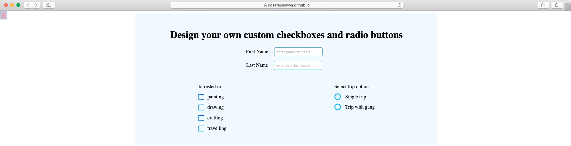
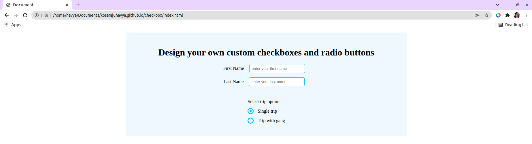
Before going to develop custom checkboxes and radio buttons, we will construct the required HTML with random inputs.
Building required HTML
I have taken a simple form and some random inputs with checkboxes and radio buttons and here is the code.
index.html
<!DOCTYPE html>
<html lang="en">
<head>
<title>Design your own custom checkboxes and radio buttons</title>
<link rel="stylesheet" href="./style.css" />
</head>
<body>
<div class="wrapper">
<h1 class="title">Design your own custom checkboxes and radio buttons</h1>
<form action="#">
<div class="intro">
<div>
<label for="firstname"> First Name</label>
<input type="text" placeholder="enter your first name" />
</div>
<div>
<label for="lastname"> Last Name</label>
<input type="text" placeholder="enter your last name" />
</div>
</div>
<div class="custom-styles">
<div>
<div class="check-box-group">
<div>Intrested in</div>
<div>
<input
class="custom-checkbox"
id="painting"
type="checkbox"
value="painting"
/>
<label for="painting">painting</label>
</div>
<div>
<input
class="custom-checkbox"
id="drawing"
type="checkbox"
value="drawing"
/>
<label for="drawing">drawing</label>
</div>
<div>
<input
class="custom-checkbox"
id="crafting"
type="checkbox"
value="crafting"
/>
<label for="crafting">crafting</label>
</div>
<div>
<input
class="custom-checkbox"
id="travelling"
type="checkbox"
value="travelling"
/>
<label for="travelling">travelling</label>
</div>
</div>
</div>
<div class="form__group">
<div class="form__radio-group">Select trip option</div>
<div class="form__radio-group">
<input
type="radio"
class="form__radio-input"
id="small"
name="size"
/>
<label for="small" class="form__radio-label">
<span class="form__radio-button"></span>
Single trip
</label>
</div>
<div class="form__radio-group">
<input
type="radio"
class="form__radio-input"
id="large"
name="size"
/>
<label for="large" class="form__radio-label">
<span class="form__radio-button"></span>
Trip with gang
</label>
</div>
</div>
</div>
</form>
</div>
</body>
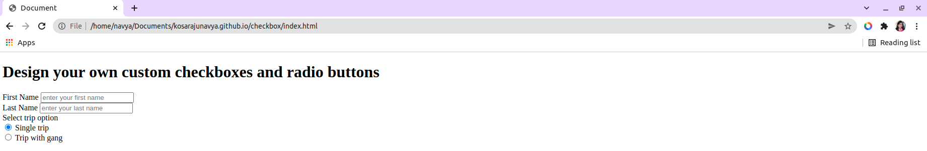
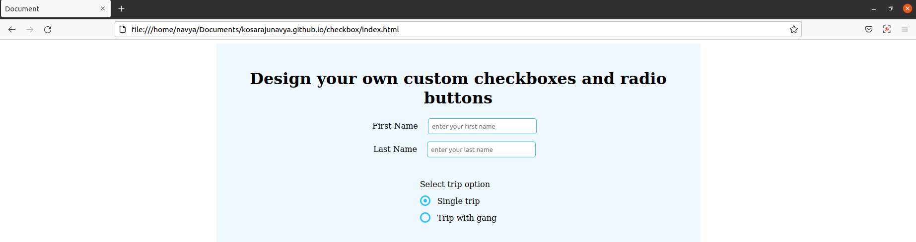
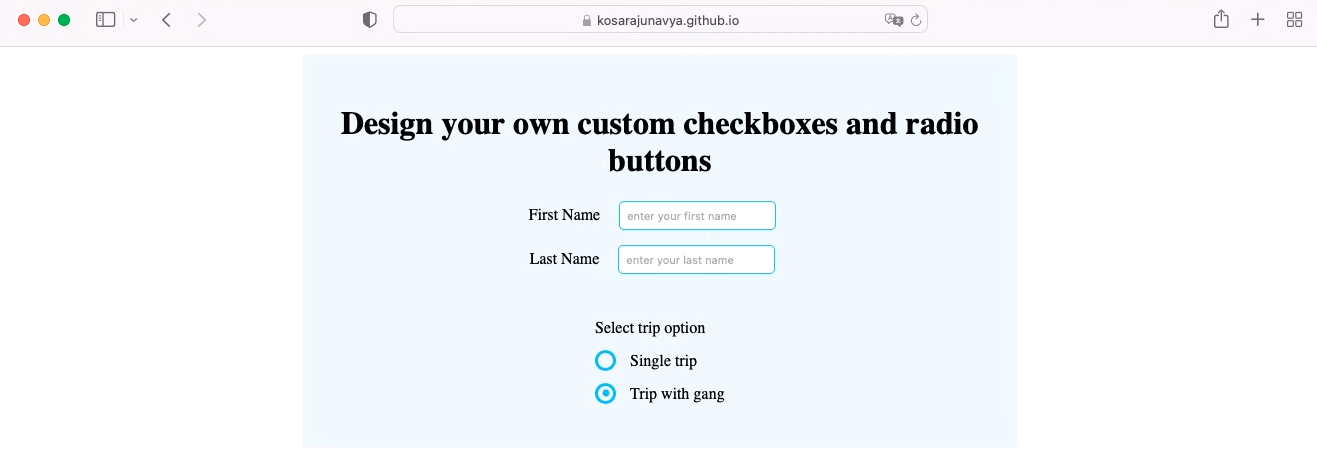
</html>Let us check the output with plain html, here is the screenshot for your reference.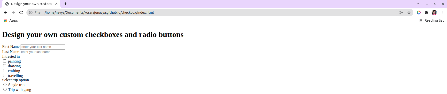
Here is the basic CSS for the document.
style.css
/* this part is only for the background look and feel pupose */
.wrapper {
  max-width: 50%;
  display: block;
  margin: 0 auto;
  padding: 30px;
  background: aliceblue;
}
.custom-styles {
  display: flex;
  justify-content: space-around;
  padding-top: 30px;
}
.intro {
  text-align: center;
}
.intro div {
  padding-bottom: 15px;
}
.check-box-group div {
  padding-bottom: 15px;
}
.intro input {
  padding: 7px;
  border: 1px solid #29c4f3;
  border-radius: 5px;
  margin: 0 15px;
}
.wrapper h1 {
  text-align: center;
}
Now let us move to create the custom checkboxes followed by radio buttons as well.
Creating custom checkboxes
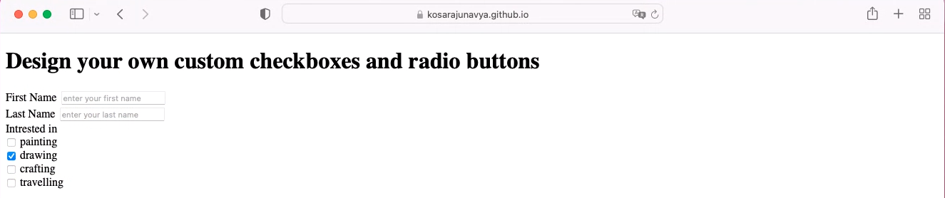
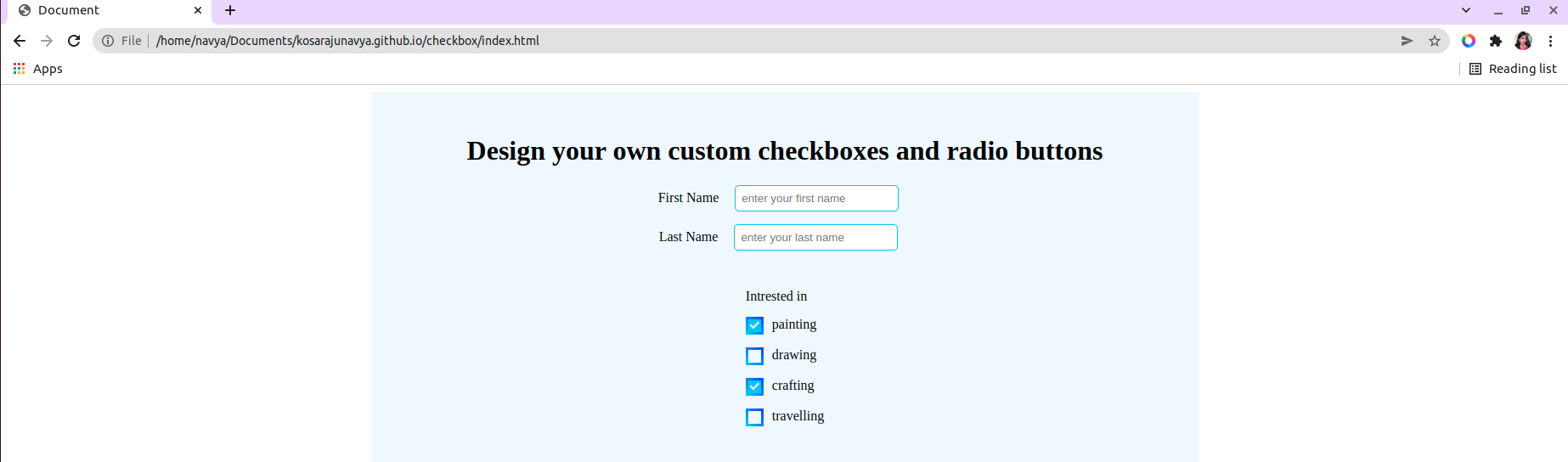
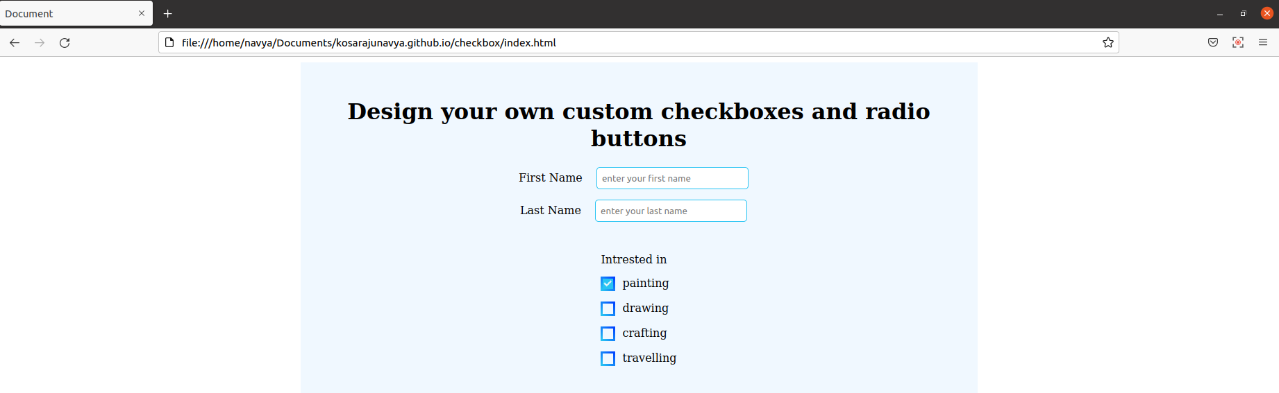
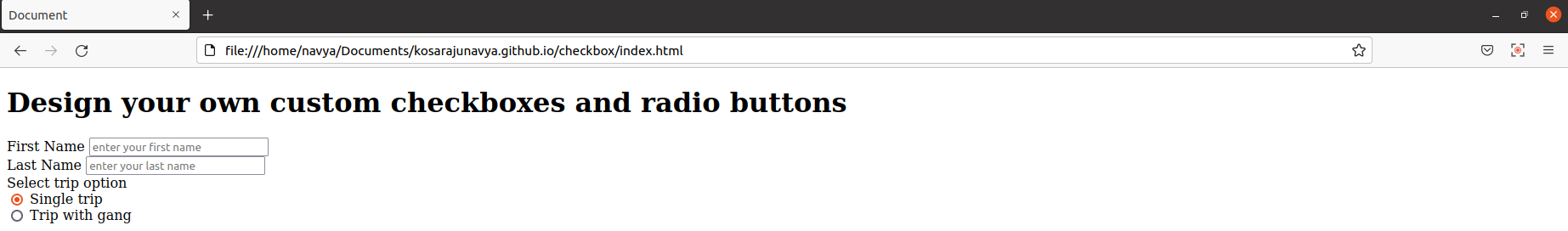
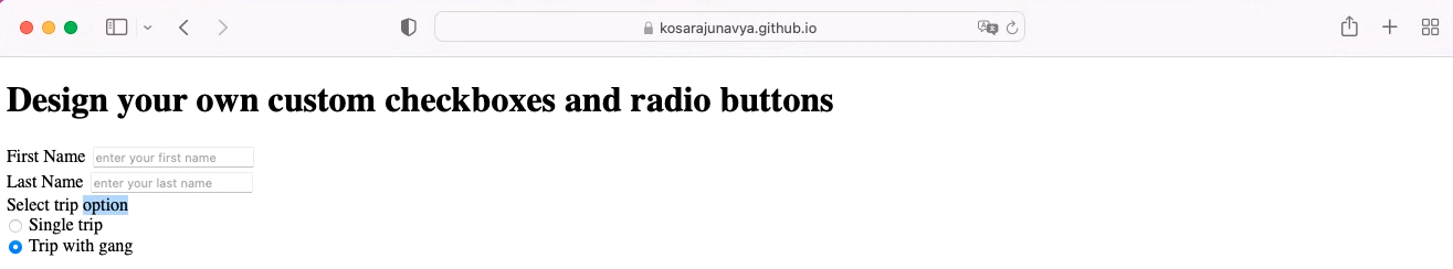
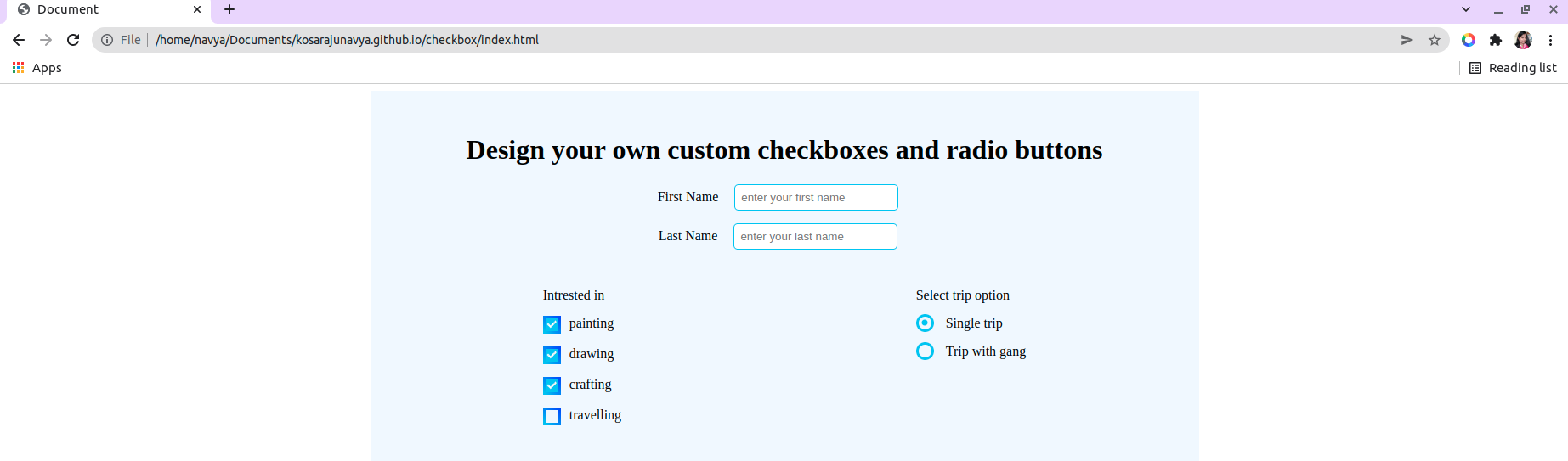
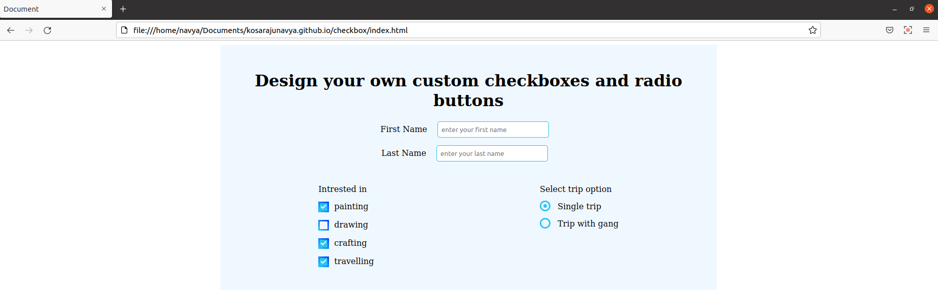
With plain HTML, the checkboxes and radio buttons will look different in various browsers. Here are the screenshots, for your reference.
Checkbox appearance in Google Chrome with plain HTML
Checkbox appearance in Firefox with plain HTML
Checkbox appearance in safari with plain HTML
As we said, default checkbox styles are browser dependent, you can see the difference from the above screenshots. It is very hard and most probably not a good practice of overwriting the browser default as they are unique. So we have to create our own custom checkboxes if needed.
Here is the required CSS for the checkboxes. You can take the index.html file as a reference to be more clear about the selectors.
style.css
/* check-box design */
.custom-checkbox {
position: absolute;
opacity: 0;
}
.custom-checkbox + label {
position: relative;
cursor: pointer;
padding: 0;
}
.custom-checkbox:hover + label:before {
background: #29c4f3 !important;
}
.custom-checkbox:checked + label:before {
background: #29c4f3;
}
.custom-checkbox:checked + label:after {
content: "";
position: absolute;
left: 5px;
top: 9px;
background: white;
width: 2px;
height: 2px;
box-shadow: 2px 0 0 rgb(255, 255, 255), 4px 0 0 rgb(255, 255, 255),
4px -2px 0 rgb(250, 242, 242), 4px -4px 0 white,
4px -6px 0 rgb(247, 243, 243), 4px -8px 0 rgb(253, 246, 246);
transform: rotate(45deg);
border: 0;
}
.custom-checkbox + label:before {
content: "";
margin-right: 10px;
display: inline-block;
vertical-align: text-top;
width: 15px;
height: 15px;
border: 2.5px solid #29c4f3;
border-radius: 4px;
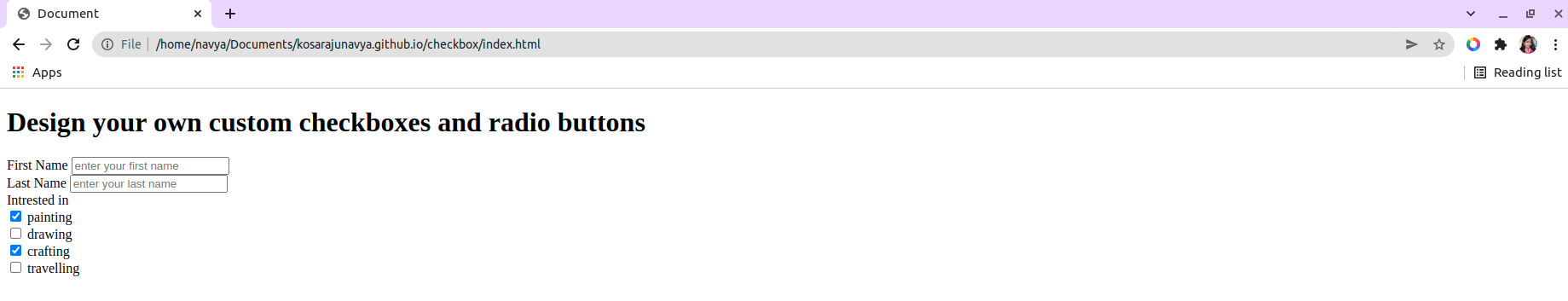
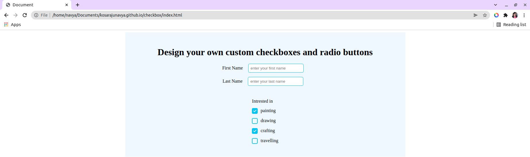
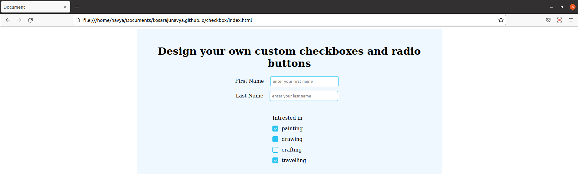
}Now we will again check in all the browsers, after applying the CSS. Here are the screenshots for your reference.
Checkbox appearance in Google Chrome with the new CSS
Checkbox appearance in Firefox with the new CSS
Checkbox appearance in safari with the new CSS
In all modern browsers, our custom CSS is rendered properly. You can also check for other browser versions. If any of the properties is not applied then adding prefixes can solve this issue. You can get the prefixes here https://mycode.blog/navya/prefixes-all-css-properties-wont-render-older-versions-browsers
Creating gradient borders for checkboxes
We can also apply the gradients to the checkbox borders. To do so, we need to apply the gradient property with the required colors for the checkbox. As per my HTML, I need to apply the gradient property for .custom-checkbox + label:before selector. So go to your style.css file and apply the gradient property for the border, here is the code.
style.css
.custom-checkbox + label:before {
border: 3px solid transparent;
border-image: linear-gradient(45deg, #29c4f3, #0043ff);
border-image-slice: 1;
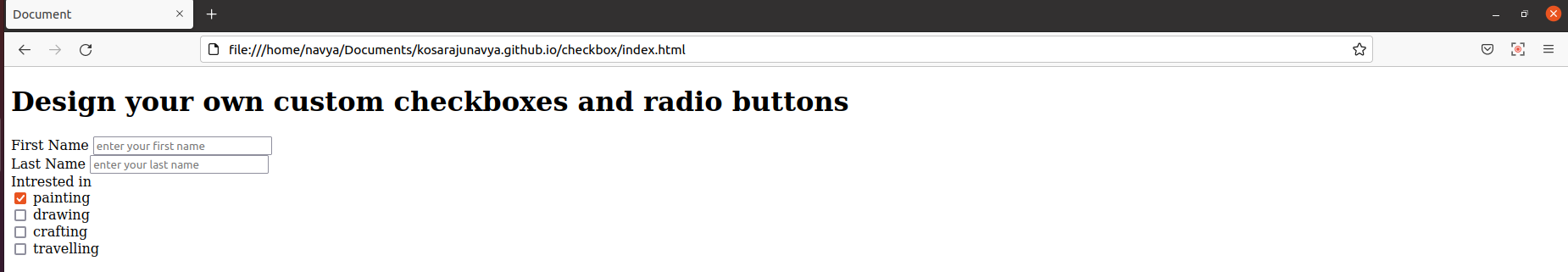
}Let us check the results in different browsers.
Checkbox appearance in Google Chrome with gradient borders
Checkbox appearance in Firefox with gradient borders
Checkbox appearance in Safari with gradient borders
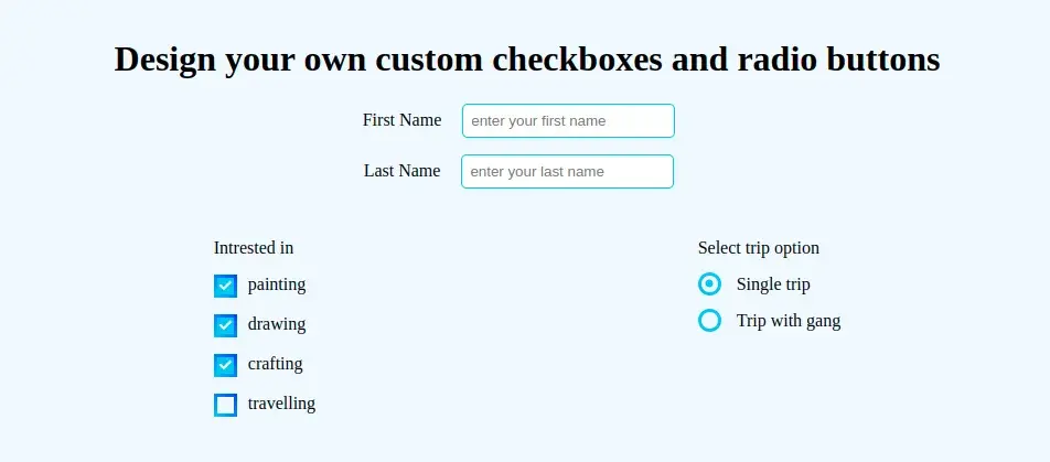
We have created our own custom checkboxes and in all the modern browsers it is rendering properly. Click to get the animated checkbox Now we will go for custom radio buttons.
Creating custom radio buttons
We can also create custom radio buttons with the required properties. Here is the CSS for custom radio buttons with respect to the given HTML in the initial step. You can just add the following code in your style.css file.
First, we will check the appearance of default radio buttons in most popular browsers, and then will move for custom CSS.
Radio button appearance in Google Chrome with plain HTML
Radio button appearance in Firefox with plain HTML
Radio button appearance in safari with plain HTML
Style.css
Just add the below CSS in your style.css file and then analyze the results
.form__radio-group {
  margin-bottom: 15px;
}
.form__radio-input {
  display: none;
}
.form__radio-label {
  font-size: 16px;
  cursor: pointer;
  position: relative;
  padding-left: 35px;
}
.form__radio-button {
  height: 15px;
  width: 15px;
  border: 3px solid #29c4f3;
  border-radius: 50%;
  display: inline-block;
  position: absolute;
  left: 0;
  top: -2px;
}
.form__radio-button::after {
  content: "";
  display: block;
  height: 7px;
  width: 7px;
  border-radius: 50%;
  position: absolute;
  top: 50%;
  left: 50%;
  transform: translate(-50%, -50%);
  background-color: #29c4f3;
  opacity: 0;
  transition: opacity 0.2s;
}
.form__radio-input:checked ~ .form__radio-label .form__radio-button::after {
  opacity: 1;
}
Radio button appearance in Google Chrome with the new CSS
Radio button appearance in Firefox with the new CSS
Radio button appearance in safari with the new CSS
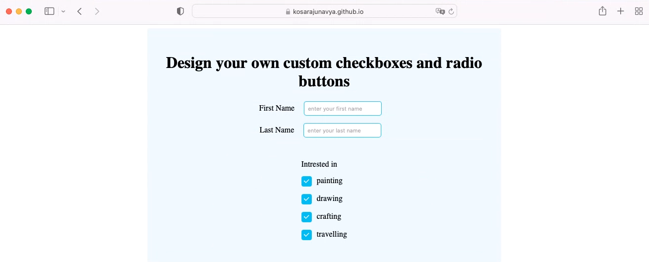
Here is the final result in all browsers.
Results:
The final result in Google Chrome
The final result in Firefox
The final result in Safari

Finally, I want to conclude that we have created custom checkboxes and radio buttons with gradient borders. Hope you got sufficient information as per your requirements. If not please contact us through comments. We will always be there for you to help.
Hope we have achieved our goal, if you want to know how to apply the emojis as like checkboxes along with a progress bar please click here to get(blog on).
 21 likes
 Add to read list

Comments