When ensuring accessibility for visually disabled users, picking the right CSS3 color scheme can be huge. Remember to consider the contrast ratio in your selections.
What are colors with good contrast?
Colors with good contrast are colors that are easily distinguishable from one another and provide clear visibility and readability.
To ensure good contrast for all users, you can use a color contrast checker tool that calculates the contrast ratio between two colors and ensures that it meets accessibility standards. The Web Content Accessibility Guidelines (WCAG) recommend a minimum contrast ratio of 4.5:1 for normal text and 3:1 for large text.
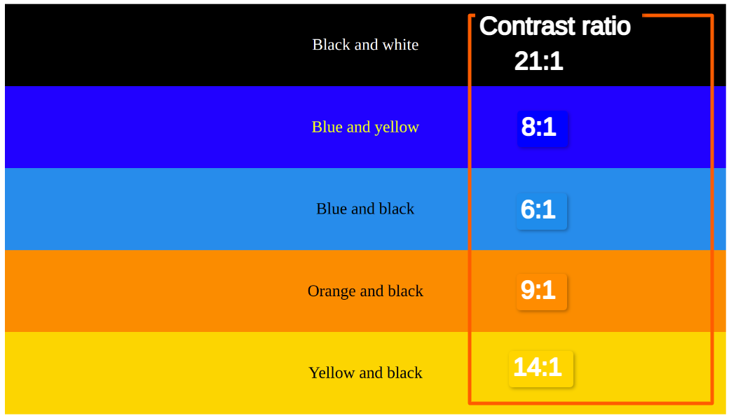
Here are some examples of color combinations that have good contrast:
- Black and white: #000000 and #ffffff (Contrast ratio: 21:1)
- Blue and yellow: #0000ff and #ffff00 (Contrast ratio 8:1)
- Blue and black: #1f8ceb and #000000 (Contrast ratio: 6:1)
- Orange and black: #ff8c00 and #000000 (Contrast ratio: 9:1)
- Yellow and black: #ffd500 and #000000 (Contrast ratio: 14:1)
These color combinations have good contrast because they are on opposite sides of the color wheel and have different brightness levels.
Here's an Output:
You can also use these color combinations in your design software or programming languages by specifying the hexadecimal values for each color.
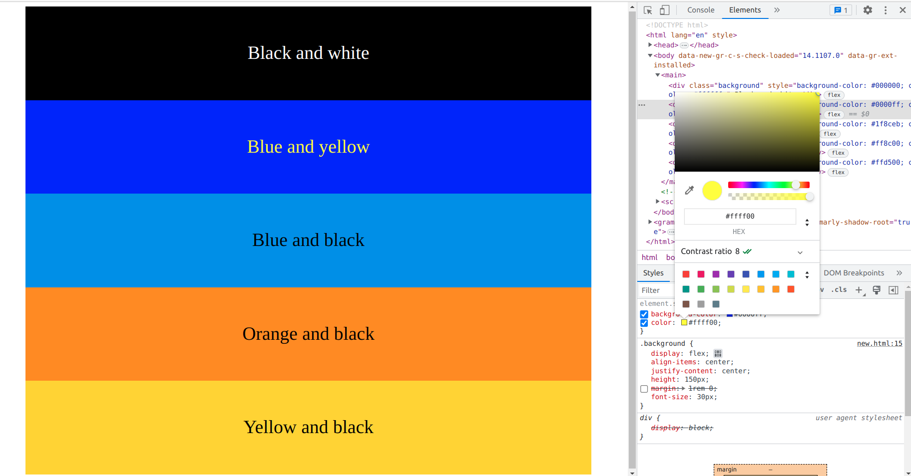
We can check directly in the Chrome developer tool to inspect the page
Here is the output
How we can check these contrast ratios here are some useful websites.
- Webaim.org
- Coolors.co
- siegemedia.com/
Who requires or desires this feature?
The feature of using colors with good contrast is important for anyone involved in designing or developing visual content, including websites, user interfaces, graphics, and documents. Here are some examples of who needs this feature and why:
- Web designers and developers: Good color contrast is essential for creating accessible websites that can be used by people with visual impairments, such as color blindness or low vision. The use of high-contrast colors can improve readability and ensure that all users can access and interact with the content on the website.
- User interface designers: User interface designers need to ensure that the colors used in their designs provide good contrast and are easy to distinguish from each other. This is important to improve the usability and accessibility of the software or application.
- Graphic designers: Graphic designers need to ensure that the colors they use in their designs are aesthetically pleasing, but also have good contrast to ensure that the content is readable and effective.
- Content creators: Content creators, such as writers and marketers, need to ensure that the colors used in their content provide good contrast and are easy to read. This is important to improve the readability of the content and to ensure that the message is conveyed effectively.
What signifies the ratio?
In the context of color contrast, the ratio refers to the difference in brightness between two colors. The contrast ratio is calculated by comparing the relative brightness of the foreground color (text or graphics) to the relative brightness of the background color.
The contrast ratio is expressed as a numerical value, typically ranging from 1:1 (no contrast) to 21:1 (maximum contrast). The higher the contrast ratio, the more identity the foreground and background colors are from each other.
For example, a contrast ratio of 4.5:1 means that the foreground and background colors have a sufficient level of contrast for normal text. This is the minimum contrast ratio recommended by the Web Content Accessibility Guidelines (WCAG) for accessible web content.
A contrast ratio of 3:1 is the minimum recommended for large text, such as headings and subheadings. However, a higher contrast ratio is generally preferred to ensure that all users can easily identify between foreground and background colors, especially those with visual impairments.
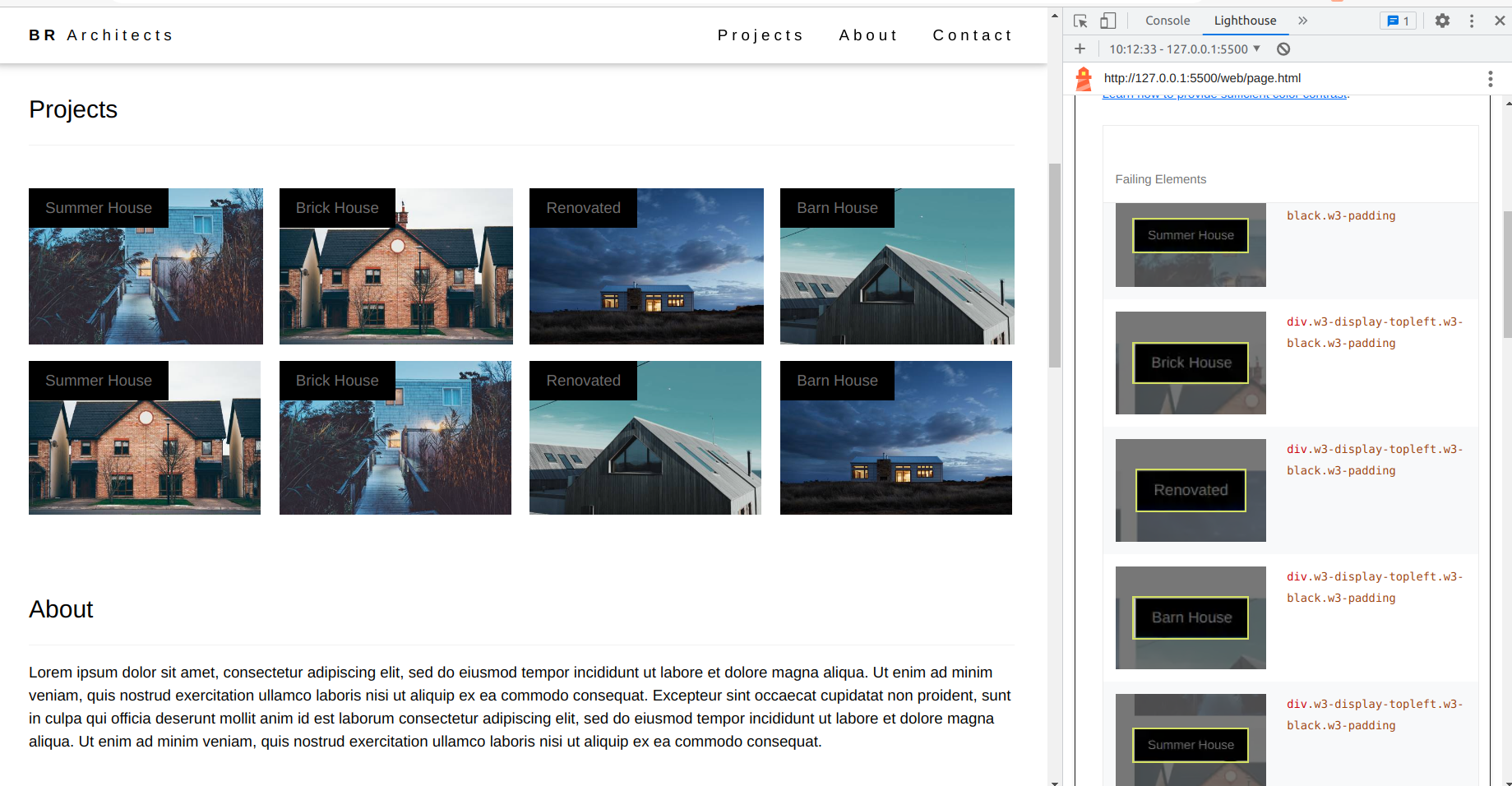
How to identify the issue
The "Lighthouse" Chrome extension tool is an effective resource. By inspecting the page and running the Lighthouse test, the tool can spot the issue and provide color contrast results in the accessibility section. Additionally, the screenshot below offers a visual reference to further understand the issue at hand.
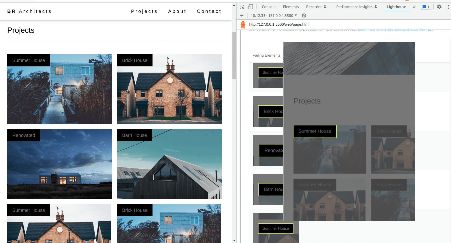
When you click on the issue box located on the right-hand side, a list of problems will appear. By selecting a particular issue, a zoomed-out view will be displayed, providing additional information to help identify the problem area. You can refer to the screenshot below for visual reference.
How to Fix this Issue
To address the issue, navigate to the problem area and examine the color contrast between the foreground and background elements. By inspecting the page and selecting the specific issue from the right-hand side, the styles of that particular element will be displayed, as depicted in the screenshot below.
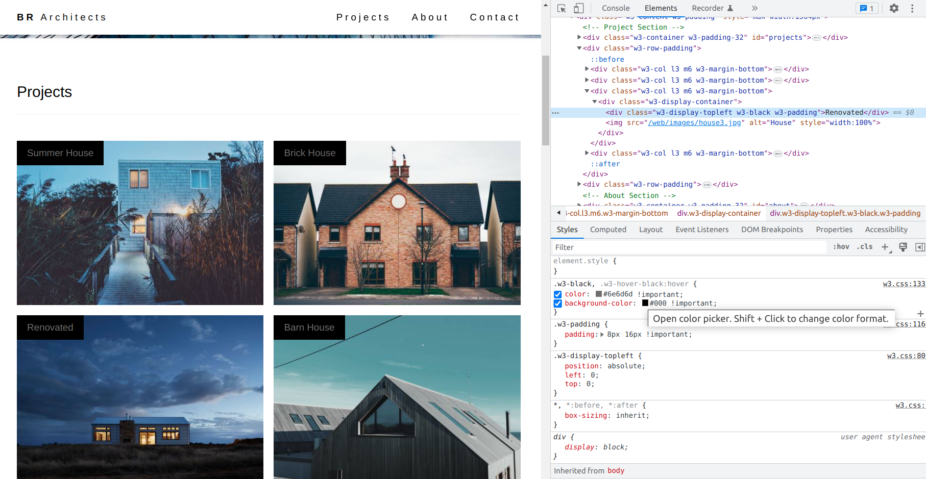
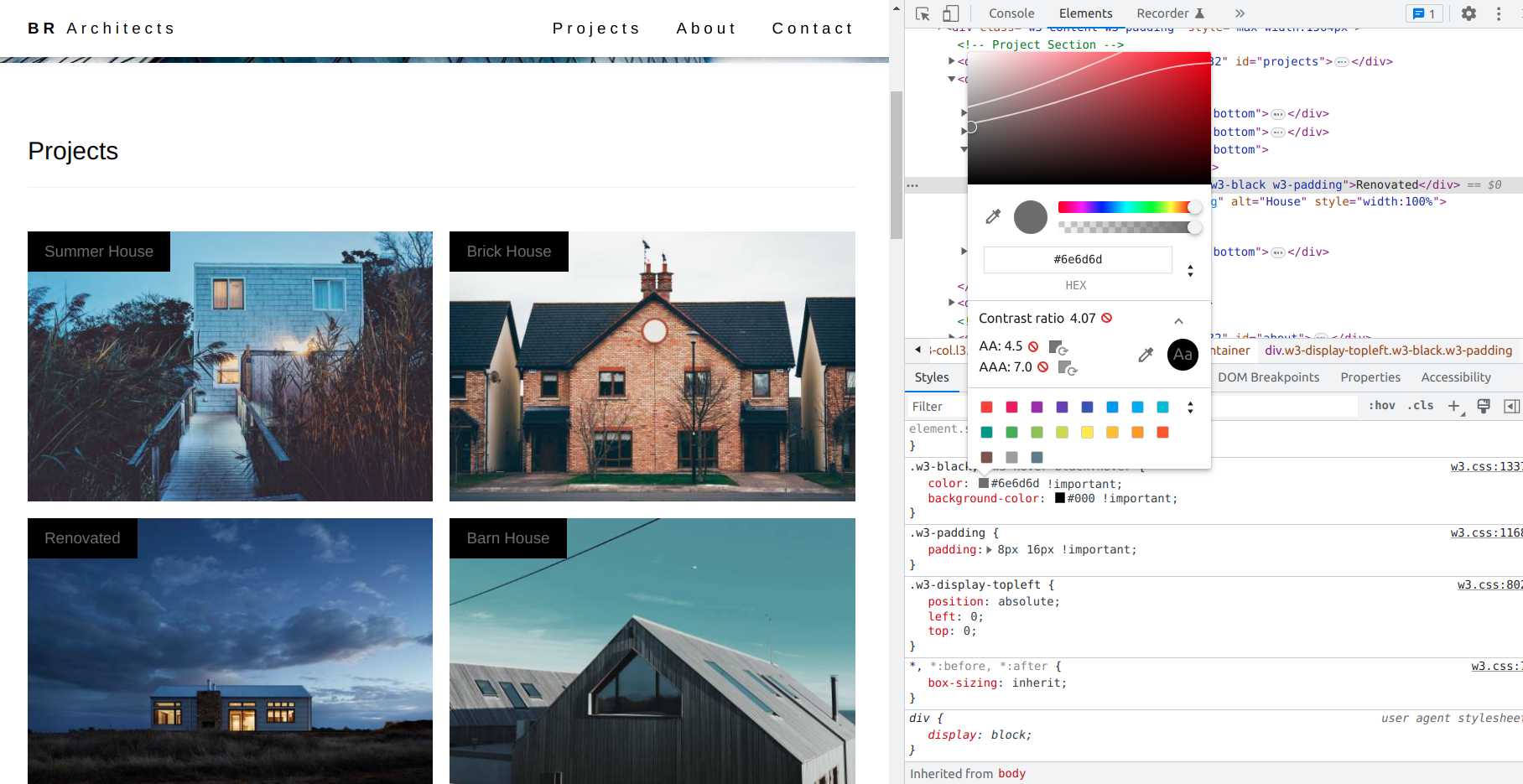
On the right side If you hover on the color box the popup will appear like click to open the color picker or ``Shif + Click`` to change the color format. You can change the color to fix the issue.
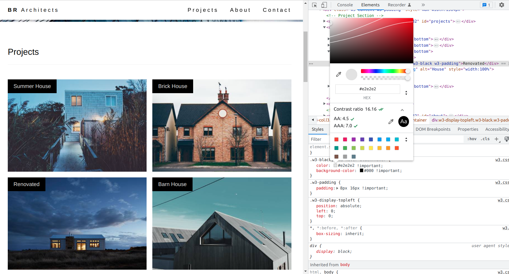
When you open the color picker it allows us to change the color and it also give the contrast ratio between our foreground and background. If the contrast ratio is below 4.5 it is in red color if the background and foreground color with above 4.5 the color picker shows a tick mark with green color
Here you can verify the screenshot of how looks
Once the color contrast issue has been resolved, the color picker will display the updated color and the contrast ratio between the foreground and background elements. A screenshot of the updated color picker can be seen below for reference.
Run the test again
After resolving the color contrast issue, it is recommended to run the test once again to ensure that the changes made have effectively addressed and fixed the problem. By retesting the page, you can verify that the necessary improvements have been made.
We can also use webAIM tools to check the contrast issue to fix it.
CSS tricks and tips to solve the issue
Here are some CSS tricks and tips that can help you solve color contrast issues:
- Use high-contrast colors: Use colors with high contrast to ensure that text is easy to read. Dark text on a light background or vice versa is typically a good choice.
- Check color contrast: Use online tools to check the contrast between two colors, such as the WebAIM contrast checker. This can help ensure that your text is readable.
- Use text shadows: Adding a subtle text shadow can help improve readability by creating a contrast between the text and the background.
- Use transparent overlays: If the background image is interfering with the text, you can add a transparent overlay to the image to make the text more readable.
- Increase font size: If the text is too small and difficult to read, increase the font size to make it easier to read.
- Use bold fonts: If you want to emphasize certain text, use bold fonts rather than increasing the font size, which can affect the layout of the page.
- Use underlines or italics: Underlining or italicizing text can also make it easier to read and distinguish from the background.
- Avoid using color alone: Don't rely on color alone to convey information. Use text or symbols to provide additional information, such as error messages or warnings.
By selecting colors that offer sufficient contrast ratios, you can improve the accessibility of your content and ensure that it can be accessed by a broader audience, including users with visual impairments.
Conclusion
In this blog, we successfully learned about how to solve the color contrast ratio having a strong understanding of CSS3 colors and their respective contrast ratios is an essential aspect of web design and development. Thank you for taking the time to read.

Comments