
Learn how to ensure text legibility against different background colors with these helpful tips and techniques. Enhance your design and user experience.
Introduction
Ensuring text legibility means making sure that the text is easily readable and understandable. This is important especially when the background color changes. To achieve this, appropriate contrast levels between the text and background colors must be maintained. This helps the text to stand out and be easily read. Good legibility improves user experience and accessibility for all readers.
Importance of Text Legibility
- Text legibility refers to the readability and clarity of written text, making it easy for readers to understand and comprehend.
- Legible text is crucial in various settings, including advertising, signage, educational materials, and online content.
- Poor text legibility can lead to difficulties in reading, comprehension, and retention of information. It can also cause eye strain and fatigue, leading to reduced productivity and engagement.
- To ensure text legibility, it is essential to consider factors such as font size, font style, line spacing, contrast, and background color.
- Choosing a legible font, such as Arial, Helvetica, or Times New Roman, and using an appropriate font size between 10-12pt can enhance text legibility.
- Using adequate line spacing and contrasting colors between the text and background can also improve legibility.
- Legible text can enhance communication, increase engagement, and improve the overall user experience. It is, therefore, essential to prioritize text legibility in all forms of written communication.
how background color can affect legibility
The background color can affect legibility in the following ways:
- High contrast between background and text color enhances legibility
- Dark text on light backgrounds is easier to read than light text on dark backgrounds
- Low contrast between the background and text color can reduce legibility
- The use of complementary colors can improve legibility
- The brightness and saturation of the background color can affect legibility.
Choosing the Right Text Color
Choosing the right text color is crucial for legibility and readability, and here are some tips to help you choose the appropriate text color:
- High contrast: The text should have high contrast against the background color to enhance legibility.
- Black and white: Black or dark gray text on a white or light-colored background is the most legible option.
- Color wheel: Choose text colors that are complementary to the background color, such as blue text on an orange background.
- Saturation: Avoid using highly saturated colors for text, as they can be difficult to read. Instead, choose muted colors that are easier on the eyes.
- Font weight: Use bold or semibold fonts for smaller text sizes to improve legibility.
- Accessibility: Consider the accessibility of the text color, especially for people with color vision deficiencies. Use tools like color contrast checkers to ensure the text is legible for everyone.
Examples
Light background with dark text:
If you have a light background, use a dark text color for better legibility.
Index.html
<!DOCTYPE html>
<html lang="en">
<head>
    <link rel="stylesheet" href="./style.css">
    <title>Document</title>
</head>
<body>
   <h1>Light background with dark text</h1>
</body>
</html>
Style.css
body {
   background-color: #ffffff; /* white */
}

h1 {
   color: #000000; /* black */
}
Output

Dark background with light text:
If you have a dark background, use a light text color to improve legibility.
Index.html
<!DOCTYPE html>
<html lang="en">
<head>
    <link rel="stylesheet" href="./style.css">
    <title>Document</title>
</head>
<body>
   <h1>Dark background with light text</h1>
</body>
</html>
Style.css
body {
   background-color: #333333; /* dark gray */
   color: #ffffff; /* white */
}

h1 {
   color: #FFA500; /* bright orange */
}
Output

Semi-transparent background with solid text:
If you have a semi-transparent background, use a solid text color for better legibility.
Index.html
<!DOCTYPE html>
<html lang="en">
<head>
    <link rel="stylesheet" href="./style.css">
    <title>Document</title>
</head>
<body>
   <h1>Semi-transparent background with solid text</h1>
</body>
</html>
Style.css
body {
  background-color: rgba(0, 0, 0, 0.5); /* semi-transparent black */
}

h1 {
  color: #ffffff; /* white */
}
Output

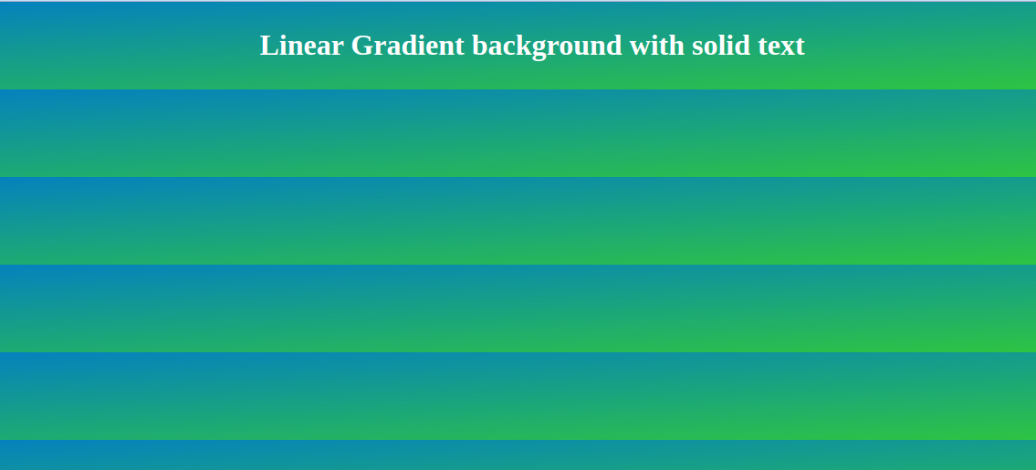
Gradient background with solid text:
If you have a gradient background, use a solid text color for better legibility
Index.html
<!DOCTYPE html>
<html lang="en">
<head>
    <link rel="stylesheet" href="./style.css">
    <title>Document</title>
</head>
<body>
   <h1>Linear Gradient background with solid text</h1>
</body>
</html>
Style.css
body {
  background: linear-gradient(to bottom right, #007acc, #33cc33); /* gradient background */
  display: flex;
  align-items: center;
  justify-content: center;
}

h1 {
  color: #ffffff; /* white */
}
Output
Patterned background with solid text:
If you have a patterned background, use a solid text color for better legibility.
Index.html
<!DOCTYPE html>
<html lang="en">
<head>
    <link rel="stylesheet" href="./style.css">
    <title>Document</title>
</head>
<body>
    <div class="container">
        <h1>Patterned background with solid text</h1>
        <p>Lorem ipsum dolor sit amet, consectetur adipiscing elit. Nullam a tellus vel dolor blandit iaculis eget sed dolor.</p>
      </div>
</body>
</html>
Style.css
body {
  background-image: url('./gallery-10.jpg');
}

.container {
  max-width: 800px;
  margin: 0 auto;
  padding: 50px;
  background-color: rgba(255, 255, 255, 0.8);
  text-align: center;
  margin-top: 5rem;
}

h1 {
  font-size: 48px;
  font-weight: bold;
  color: #000000;
}

p {
  font-size: 24px;
  color: #000000;
  line-height: 1.5;
}
Output

Conclusion
In this blog, The Ensuring text legibility against different background colors is crucial for readability & accessibility. Use high contrast or mixed colors for better legibility. I hope you guys learnt something new from this blog. Thank you.

Comments