Layout designing will definitely include aligning elements side by side. Wanna learn the CSS techniques of alignment methods? this is the right blog for you.
Are you excited to learn the methods! Go with this article, definitely will help you. Let us consider the following mark-up with basic CSS and analyze the methods in detail.
index.html
<!DOCTYPE html>
<html lang="en">
  <head>
    <meta charset="UTF-8" />
    <meta http-equiv="X-UA-Compatible" content="IE=edge" />
    <meta name="viewport" content="width=device-width, initial-scale=1.0" />
    <title>Display elements side by side</title>
    <link rel="stylesheet" href="./style.css" />
  </head>
  <body>
    <div class="wrapper">
      <div class="one"></div>
      <div class="two"></div>
      <div class="three"></div>
      <div class="four"></div>
    </div>
  </body>
</html>
For the related markup let us add some basic CSS in the style.css file to differentiate the parent container and child elements.
style.css
.one,
.two,
.three,
.four {
  width: 100px;
  height: 100px;
  margin: 0 10px;
  background-color: deepskyblue;
  color: black;
  font-weight: bolder;
  padding: 25px;
  font-size: 20px;
}
.wrapper {
  background: black;
  width: 1440px;
  max-width: 50%;
  margin: 0 auto;
  padding: 100px 0;
}
After applying these styles the container will look like this, you can see in the below screenshot.

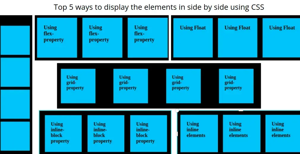
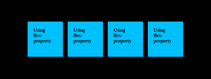
Method:1 Using Flex
One of the most feasible and device-friendly methods to align elements side by side is Flex-box. Flexbox has an excellent property structure that can align the elements as per the screen width.
Now add the following properties to the wrapper class in style.css and see the result.
.wrapper {
  display: flex;
  justify-content: center;
}
Then check the output, the result will be like this, with these properties the child elements will align side by side properly.
Method:2 Using Grid
There is another method to align child elements side by side, that we can do with grid property.
Add the following css properties to the wrapper class in style.css and check the results
.wrapper {
  display: grid;
  grid-template-columns: repeat(4, 1fr);
}
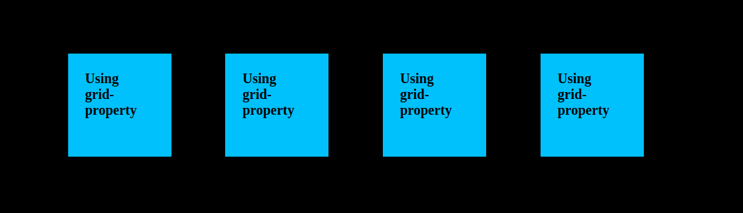
Major developers don’t prefer to use grid for the alignment, as it is popular for the layout design but it is good to have a knowledge about grid system.
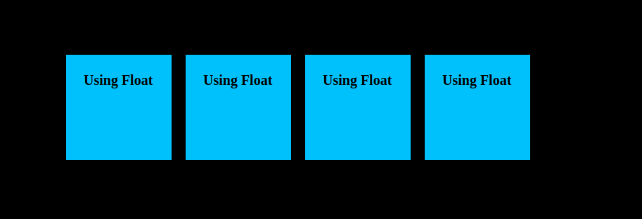
Method:3 Using Float
One of the global methods for side-by-side alignment of any elements, why because some old browsers do not support flex and grid properties and float can render in any type of browser in any type of device.
The only thing that we need to take into consideration is whenever we use float property, we have to add the clearfix property to the related parent HTML elements to avoid overflowing.
Apply the following properties for both parent and child elements in the style.css file and see the results.
.one,
.two,
.three,
.four {
  float: left;
}

.wrapper {
  float: right;
}
Now for this example, we don't have the next section or wrapped content, so that no need for clearfix, If you have other elements either below or above the current parent div, then add the following properties to the clearfix class in style.css file
.clearfix::after {
  content: "";
  clear: both;
  display: table;
}
Now observe the below screenshot, to find the results
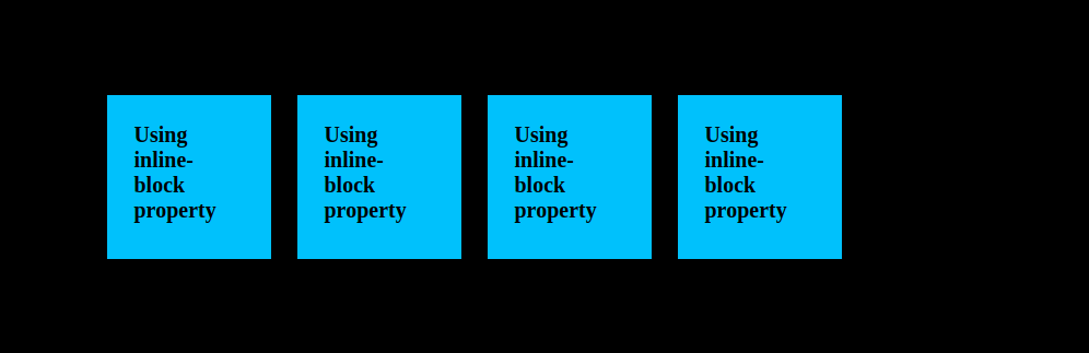
Method:4 Using inline-block property
One of the display properties is to make block-level elements occupy the space according to the size of the text. So we can align all the elements side by side with the help of this inline-block property
Now apply the following properties for all the child elements of the parent in the style.css file and check the results.
.one,
.two,
.three,
.four {
  display: inline-block;
}
Look at the below screenshot to analyze the results.
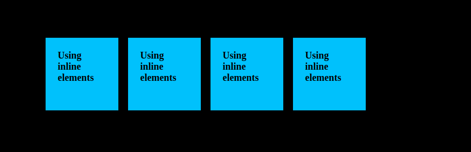
Method:5 Using inline elements in the mark-up itself
There is another simple method, that is in mark-up itself using inline elements like span. Choosing this method is very good option for simple alignment but for complex designs, we have to use block level elements, for that we can do this with using flex concept. Apply the following mark-up and see the results.
Index.html
<!DOCTYPE html>
<html lang="en">
  <head>
    <meta charset="UTF-8" />
    <meta http-equiv="X-UA-Compatible" content="IE=edge" />
    <meta name="viewport" content="width=device-width, initial-scale=1.0" />
    <title>Display elements side by side</title>
    <link rel="stylesheet" href="./style.css" />
  </head>
  <body>
   <div class="wrapper">
      <span class="one">Using inline-elements</span>
      <span class="two">Using inline-elements</span>
      <span class="three">Using inline-elements</span>
      <span class="four">Using inline-elements</span>
    </div>
  </body>
</html>
The above HTML change will result the following
Conclusion:
Depending upon the requirements and use case we have to select the type of method that we want to apply for the elements to align side-by-side. So guys have a clear idea to select the appropriate method for the related requirement.
FAQ:
1. Which is the best method for responsive design?
The Flex-box concept is the best and preferred method for responsive design, we have very great feasible properties to match with the design to different screens. The only drawback is that flex-box properties won’t render in older versions of safari browsers but we can manage with WebKit prefixes.
2. Is there another way to avoid floats other than clearfix?
We can manage with overflow: auto property, but won't apply for all the cases. Beter we can choose another method to struggle with floats.
 21 likes
 Add to read list

Comments