This blog gives the logic to achieve browser compatible sticky sidebar with css as it can be used to highlight page titles, CTA buttons, and in many other nav's.
We can achieve the sticky sidebar for all types of browsers and resolutions with position: sticky property. In this tutorial, you are going to build a webpage with a side sticky navigation of the current page.
Step:1 HTML structure
Here is the required HTML structure that I have followed
Index.html
<!DOCTYPE html>
<html lang="en">
  <head>
    <link rel="stylesheet" href="./sticky.css" />
  </head>
  <body>
    <header>HEADER</header>
    <main>
      <span class="main">MAIN</span>
      <div class="main-container">
        <div class="sticky-container">
          <p>some content</p>
          <a id="link" href="#link-1">link-1</a>
          <a id="link" href="#link-2">link-2</a>
          <a id="link" href="#link-3">link-3</a>
          <a id="link" href="#link-4">link-4</a>
          <a id="link" href="#link-5">link-5</a>
        </div>
        <div class="non-sticky-container">
          <h1>Main page content</h1>
          <h2 id="link-1">LINK-1 RELATED DATA</h2>
          <div>
            some data, added lorem text for test purpose
            <h2 id="link-2">LINK-2 RELATED DATA</h2>
          <div >
            some data, added lorem text for test purpose
          </div>
          <h2 id="link-3">LINK-3 RELATED DATA</h2>
          <div>
            some data, added lorem text for test purpose
          </div>
          <h2 id="link-4">LINK-4 RELATED DATA</h2>
          <div>
            some data, added lorem text for test purpose
          </div>
          <h2 id="link-5">LINK-5 RELATED DATA</h2>
          <div>
            some data, added lorem text for test purpose
        </div>
      </div>
    </main>
    <footer>FOOTER</footer>
  </body>
</html>
Step:2 Basic CSS
Here is the basic CSS for the project. These styles are applied only for look and fee purpose of the page
style.css
body {
padding: 100px 50px;
background: skyblue;
max-width: 50%;
margin: 0 auto;
background: #050d57;
}
header,
footer,
.main {
padding: 50px;
background: #fff;
text-align: center;
font-weight: bolder;
font-size: 20px;
display: block;
}
main {
background: #fff;
margin: 30px 0;
padding: 50px 0;
}
.main-container {
display: flex;
}
.non-sticky-container {
flex: 0 0 45%;
padding: 0 50px;
}
.sticky-container a {
display: block;
padding: 10px;
text-decoration: none;
font-size: 16px;
color: #000;
font-size: 18px;
font-weight: bold;
}
.sticky-container {
width: 300px;
max-width: 30%;
padding: 30px;
background: skyblue;
color: #000;
font-size: 20px;
font-weight: bold;
transition: all 0.5s ease-in-out;
height: max-content;
margin: 0 50px;
}
.scroll {
transition: all 0.5s ease-in-out;
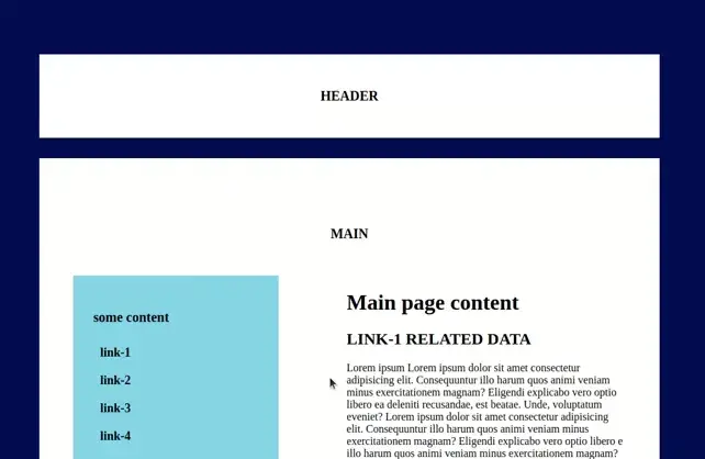
}After applying these styles the page will appear as shown below.

For visibility purposes, I have taken some dummy text, and the choice of content depends on the requirement.
Step:3 Actual logic
Here is the required logic to achieve the functionality. In your style.css file just apply the position: sticky property to the container that you wanted to sit on the same position if the page is scrolled. Now I will apply the sticky position property to the sticky-container class in the style.css file.
style.css
.sticky-container {
  position: sticky;
  top: -0.3em;
}
After applying these styles, now check on your page. The results are as shown below.
Step:4 Final results
In the above gif, you can see that the left sidebar is sticky, and also the sticky functionality will apply till the parent container height and it is not overlapping with the footer.

Step:5 Browser support
One of the important conditions that a UI developer should always need to check is browser support. Once the site is developed should be rendered in all types of browsers along with the available browser versions. So here is the problem with browser support. The CSS position sticky property should not render in the older versions of Safari, IE, and Yandex.
For that, we have a CSS hack to make this work and that is using prefixes
Style.css
.sticky-container {
  position: sticky;
  position: -webkit-sticky;
  top: -0.3em;
}
Note:
The CSS approach to achieve this functionality is very simple but this may not render in IE and Yandex. If the target users of your site won’t use IE11 and Yandex you can proceed with this approach, or else you need to follow the jquery approach and you get the details in the below blog https://mycode.blog/navya/how-make-container-sticky-jquery
Conclusion:
In this article, you have learned about how to make a sticky container with simple CSS and also validated our code in the respective browsers. If the functionality didn’t apply in other browsers, we have provided the solution. Hope you learned something from this article.
FAQ:
1. How can I change the direction of the left side container to right?
You can do it, either way, one is by using one of the flex properties like flex-direction: column, and if you use this property you need to add the web-kit prefixes to get all the prefixes for the CSS properties that don't have browser support check the below snippet - prefixes snippet. Another method is just to change the container position in the html file.
 21 likes
 Add to read list

Comments