In this blog, we are going to learn about the most effective and smooth shadows in CSS.
What is a shadow?
Shadow forms like when light falls on the object. The shadow we see formed around the object is not the same as every time it’s complex. It changes the shadow shape based on the light that falls on the object. For that, we create shadows in CSS by using the property called box-shadow.
We can’t create real shadows why?
If you are trying to create a real shadow using box-shadow property, you can’t.
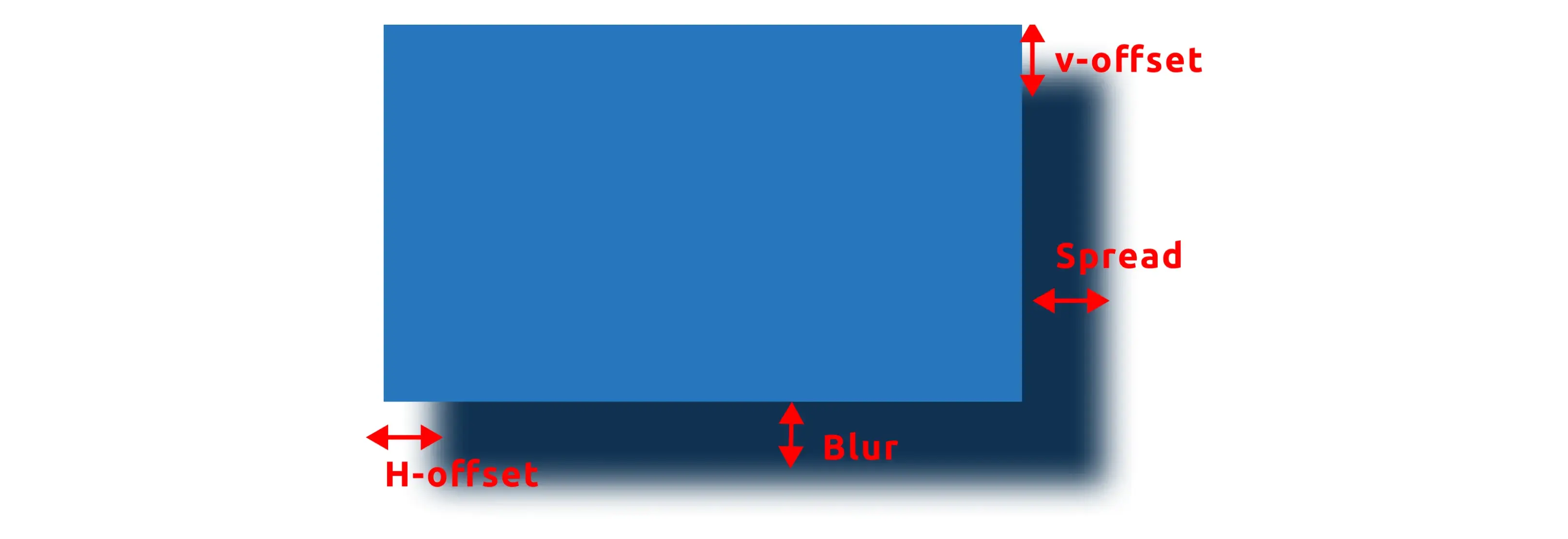
First, you have to understand how box-shadow property works. Box-shadow property simply produces the blurred effect of an object. Using this we change the length, color, spread, and offset nothing more.
But there is a way to control this property it will use only in layered shadow. We create multiple shadows in a simple box-shadow by using commas it increases the range of shadow.
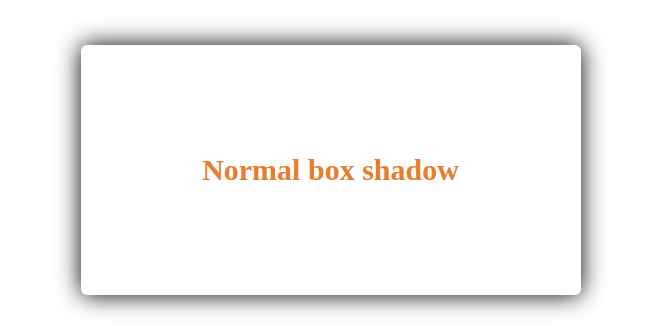
Normal box-shadow
.box{
	box-shadow: 0 0 10px gray;
}
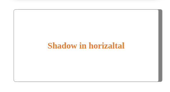
Horizontal box-shadow
.box{
   	box-shadow: 10px 0 1px gray;
}
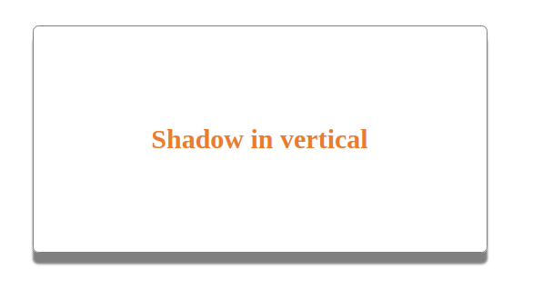
Vertical box-shadow
.box{
	box-shadow: 0 10px 1px gray;
}
Layered box-shadow
.box{
	box-shadow: 3px 3px 5px rgb(206, 45, 45), 6px 6px 5px rgb(16, 206, 16), 9px 9px 5px rgb(37, 37, 182);
}
n this layered shadow, there are different types of shadows. There we can create more different ways in it.
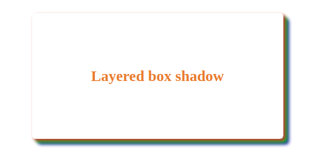
We can create as many shadows by playing the opacity and spread of y-offset and x-offset.
Conclusion
That’s all for now. I hope you learned something new in this lecture. Thank you for reading! Do share and comment below.
 21 likes
 Add to read list

Comments