The majority of the web applications will use the popup to show a piece of very short information, that could be either subscription to the site, site instructions, or anything based on the requirement. So in this blog, we will learn how to create a popup with pure CSS.
Why do we use popups on our Websites?
A very basic requirement of popup is to help our site users to get login/subscription, to experience the hidden features. So here is a very simple solution to achieve this requirement with pure HTML and CSS.
Html Markup
Here is the HTML structure for the project. Initially, we have to make a proper structure and that helps us to achieve the task.
<!DOCTYPE html>
<html lang="en">
<head>
<title>Document</title>
<link rel="stylesheet" href="/style3.css">
</head>
<body>
<div id="Index">
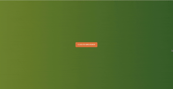
<a href="#popup">Click to open popup</a>
</div>
<div id="popup">
<div>
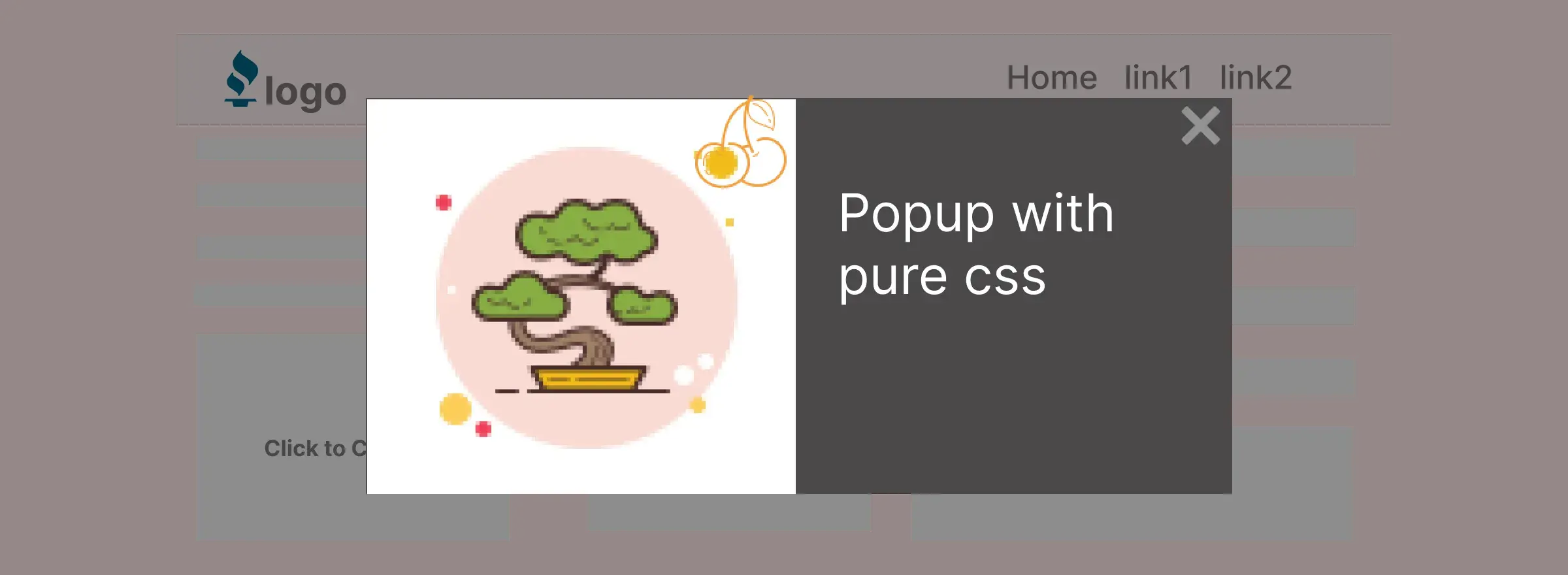
<h2>Hello World...!</h2>
<p>Lorem ipsum dolor sit amet consectetur adipisicing elit. Eveniet nulla quo blanditiis! Asperiores quibusdam ducimus autem exercitationem, voluptas quis provident aut doloremque voluptatibus, similique ut libero iusto consectetur alias dolorum!
</p>
<p>Lorem ipsum dolor sit amet consectetur adipisicing elit. Provident quibusdam ducimus veritatis velit iste. Necessitatibus optio voluptatibus ex iure itaque illo nisi animi? Vel excepturi error atque dolorum laborum voluptas.
</p>
<a href="#index">X</a>
</div>
</div>
</body>
</html>Styles
Analyze the below code step by step and then add this to your style.css file to get the results.
*{
  Margin: 0;
  Padding: 0;
  Box-sizing: border-box;
}
body {
   background-image: linear-gradient(20deg, #6e7e22, #345628);
}

a {
   text-decoration: none;
   display: inline-block;
   width: 200px;
   padding: 1rem;
   text-align: center;
   color: #fff;
   font-weight: bolder;
   text-transform: uppercase;
   border: 1px solid #e67e33;
   background-color: #e67e33;
   border-radius: 8px;
   position: absolute;
   top: 50%;
   left: 50%;
   transform: translate(-50%, -50%);
}

#popup {
   height: 100vh;
   width: 100%;
   position: fixed;
   top: 0;
   left: 0;
   background-color: #333;
   z-index: 9999;
   opacity: 0;
   visibility: hidden;
   transition: all .75s;
   text-align: center;
   color: #fff;
   transform: scale(0.25);
}

#popup:target {
   opacity: 1;
   visibility: visible;
   transform: scale(1);
   transition: all .75s;
}


#popup a {
   position: absolute;
   height: 30px;
   width: 30px;
   border-radius: 100px;
   display: flex;
   align-items: center;
   justify-content: center;
   font-size: 32px;
}
In the above CSS code #popup:target selector is used for targeting the CSS property which property we want to override. It overrides the CSS property to required styles.
Results:
Conclusion
In this blog, we have created a simple popup with pure CSS with this hack you can create different popups with different layouts. I hope you learned something from this article.
Thanks for reading feel free to post your results in the comments section.
 21 likes
 Add to read list

Comments