While it is straightforward to center text using the text-align property, aligning a container element can be more challenging. This can be achievable with this blog.
First, we will construct the base of the project and that is HTML you can get from the below snippet.
Required HTML
index.html
<!DOCTYPE html>
<html lang="en">
  <head>
     <title>Top 5+ ways to make the container in the center with CSS</title>
    <link rel="stylesheet" href="./style.css" />
  </head>
  <body>
    <div class="wrapper">
      <div class="container">
        <h1>Center Container with multiple methods</h1>
        <p>
          Lorem ipsum dolor sit amet consectetur adipisicing elit. Vel, atque
          magni tempore praesentium voluptatum odit doloremque assumenda,
          debitis error autem esse! Dicta rerum doloremque sed tenetur aperiam
          provident, voluptatum consequatur.
        </p>
      </div>
    </div>
  </body>
</html>
Credits to lorem genrator
Let us have a look at the results with pure HTML. 
Now to make the entire container center we have multiple methods, let us learn them one by one.
Center container with margin hack
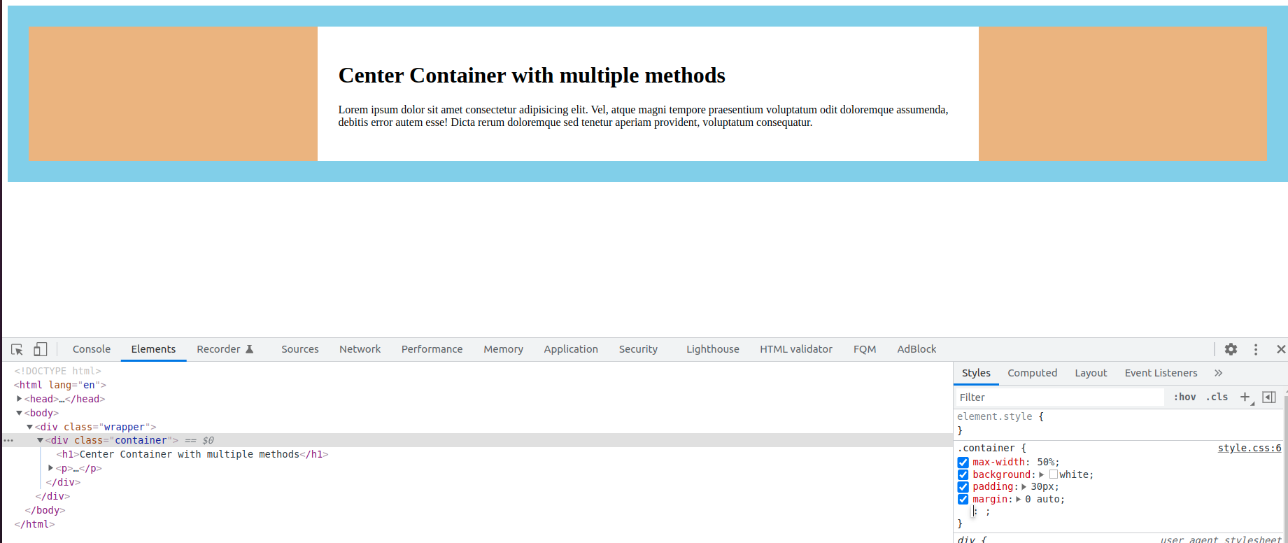
With only two lines of code, we can achieve the goal. To make the entire container center first we should check whether the container element is either an inline element or a block-level element. If the element is a block-level element then no need to give a display: block; property.
If the element is inline we should give this display: block property along with margin.
In your style.css file enter the below code and check for results.
style.css
/* with margin hack */
.wrapper {
  padding: 30px;
  background-color: skyblue;
}

.container {
  display: block;  /* should be given only for inline elements*/
  max-width: 50%;
  margin: 0 auto;
  background: white;
  padding: 30px;
}
Check for results, after the above code. Here is the screenshot for your reference.
Method:2 Using grid property
We can achieve the container center alignment with the help of grid property also. In your style.css file copy the given code and check for results.
style.css
/* with grid */
.wrapper {
  padding: 30px;
  background-color: skyblue;
  display: grid;
}
.container {
  max-width: 50%;
  background: white;
  padding: 30px;
  align-self: center;
  justify-self: center;
}
Here are the results.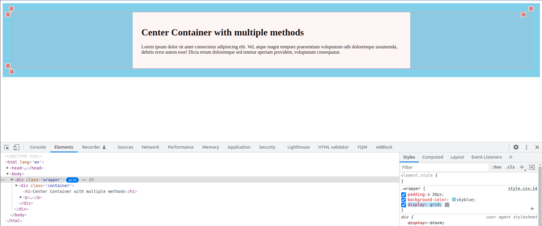
Method:3 Using flex property
Using flex is also another method to align the entire container center, if you are using flex then must and should you have to use prefixes to make them work in older browsers. You can get all the flex-box prefixes here.
style.css
/* with flex */
.wrapper {
  padding: 30px;
  background-color: skyblue;
  display: flex;
  justify-content: center;
}

.container {
  max-width: 50%;
  background: white;
  padding: 30px;
}
Here is the screenshot for your reference.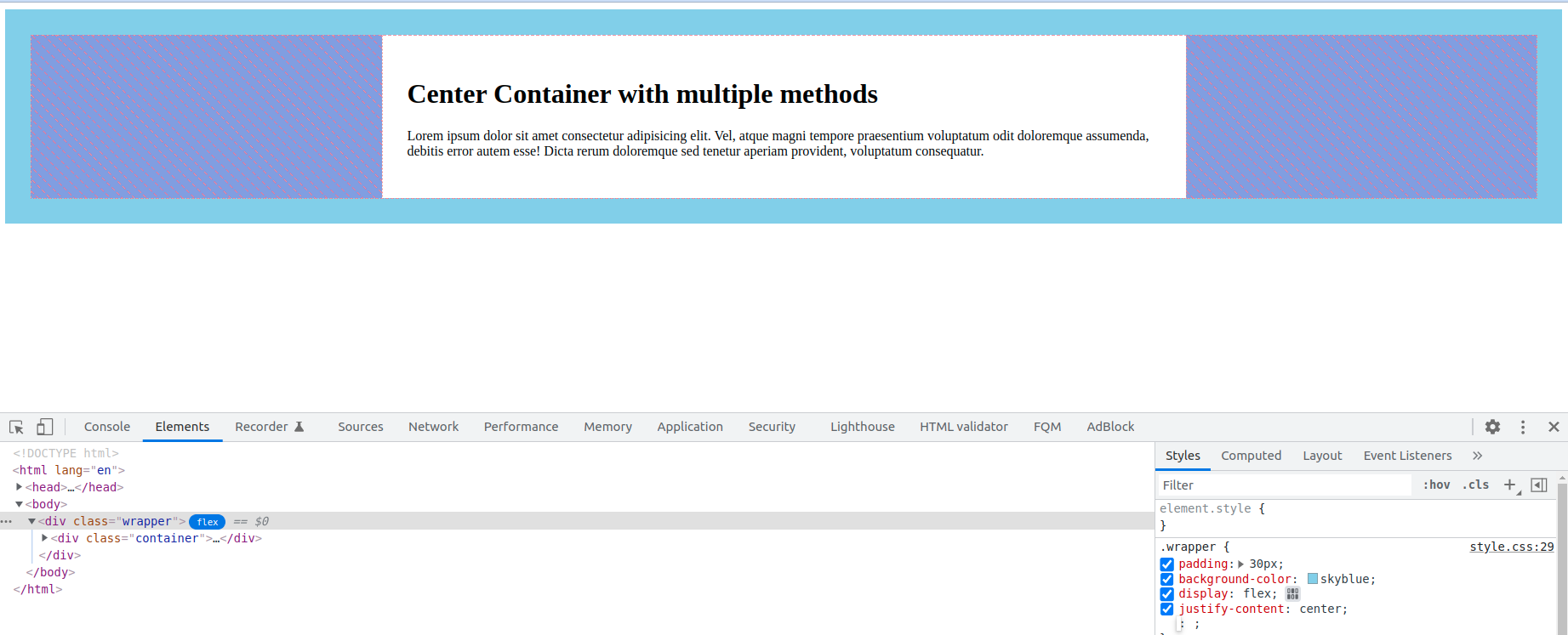
Method:4 Using transform property
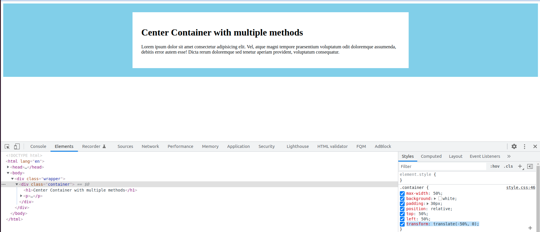
Another method to make the entire container center is using the transform property. So here we are making the entire container center horizontally so we need to give translate horizontal value as -50%, if you want to align the container vertically center you have to give translate values both to -50%.
Here is the code
style.css
/* with transitions */
.wrapper {
  padding: 30px;
  background-color: skyblue;
}
.container {
  max-width: 50%;
  background: white;
  padding: 30px;
  position: relative;
  top: 50%;
  left: 50%;
  transform: translate(-50%, 0);
}
Here are the results.
Method:5 Using padding hack
We can also make the entire container center by giving the equal value of padding in left and right with percentages. Here is the code.
style.css
/* with padding hack */
.wrapper {
  padding: 30px 25%;
  background-color: skyblue;
}
.container {
  background: white;
  padding: 30px;
}
Here are the results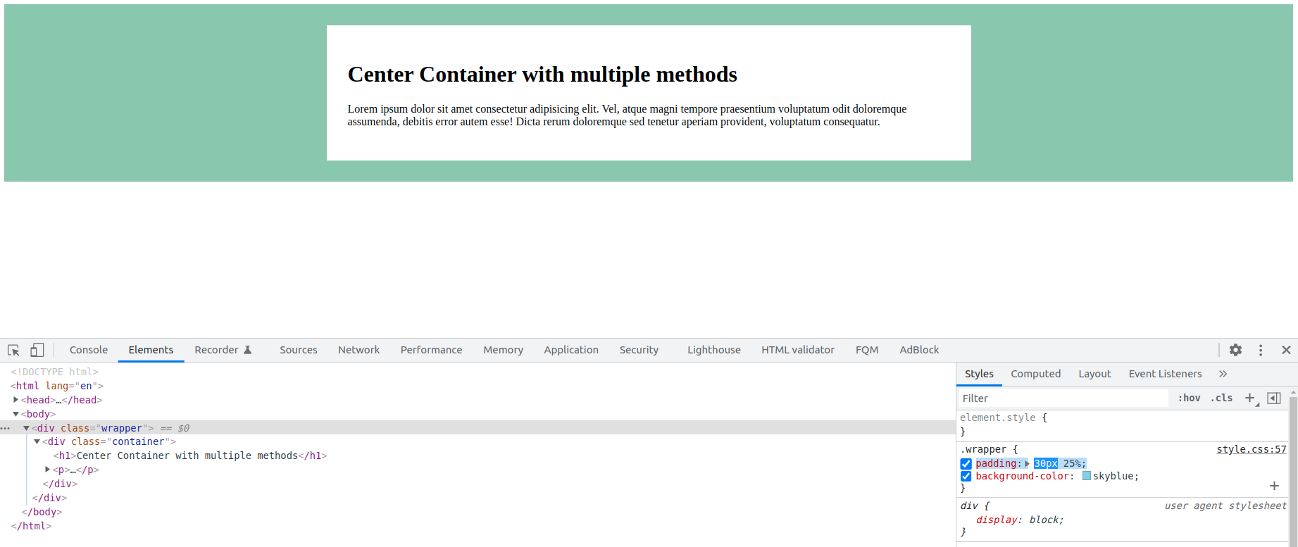
You can find this project in my git repository. Here is the link https://kosarajunavya.github.io/center/index.html
Conclusion
These are the simple properties that do the job of center alignment of the entire container. You can choose any of the methods based on the requirement. Hope you have received the required information. Thanks for reading.


Comments