Text alignment plays a crucial role in increasing readability & UX. Proper alignment helps to avoid confusion and guides the reader's eye through the content.
Here are some topics that can be covered in this area
- Types of text alignment
- Importance of text alignment
- Best practices for text alignment
- Text alignment in different mediums
- Good and bad text alignment
Types of text alignment
CSS text-align: left, right, center, justify. Left-aligns text to the left margin, right-aligns to the right margin, centers text, and justifies text with equal spacing between words.
text-align: left; = Aligns text to the left margin of the container.
text-align: right; = Align text to the container's right margin.
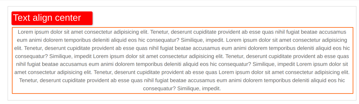
text-align: center; = Centers text horizontally within the container.
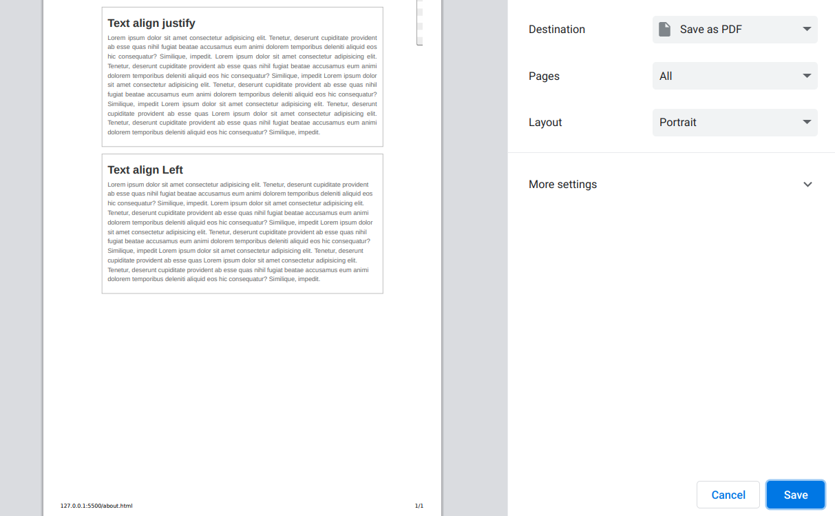
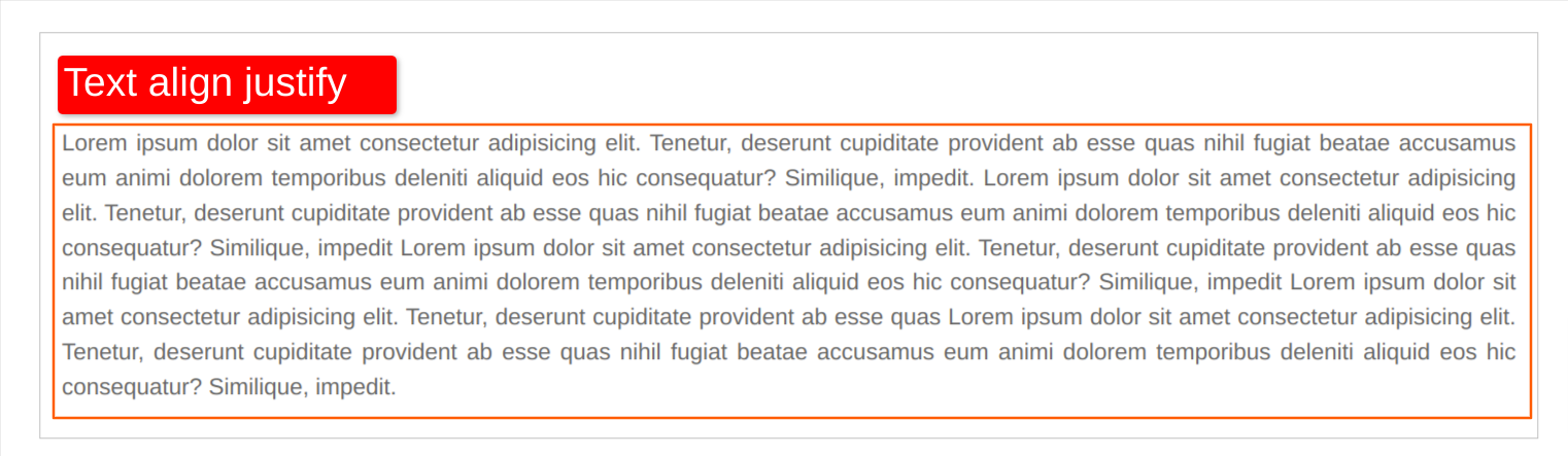
text-align: justify; = Adjusts spacing between words to make the text block's left and right edges line up with the container's left and right edges.
Importance of text alignment
Proper text alignment is crucial for readability and user experience. It reduces confusion, increases knowledge, and guides the reader's eye through the content. Choosing the appropriate alignment impacts how users look on and engage with the text, making it easier to read and understand.
Text-align centered
A long block of centered text can be difficult to read because the reader's eye has to constantly adjust to find the beginning of each line.
Here is the css code:
p {
  font-size: 18px;
  color: #666666;
  line-height: 1.5;
  text-align: center;
}

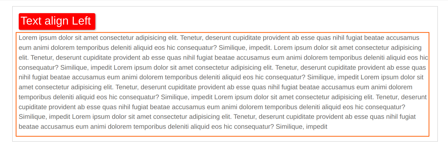
Text align left:
Left-aligned text is often easier to read because the eye can more easily follow the left edge of each line.
Here is the css code:
p {
  font-size: 18px;
  color: #666666;
  line-height: 1.5;
  text-align: left;
}
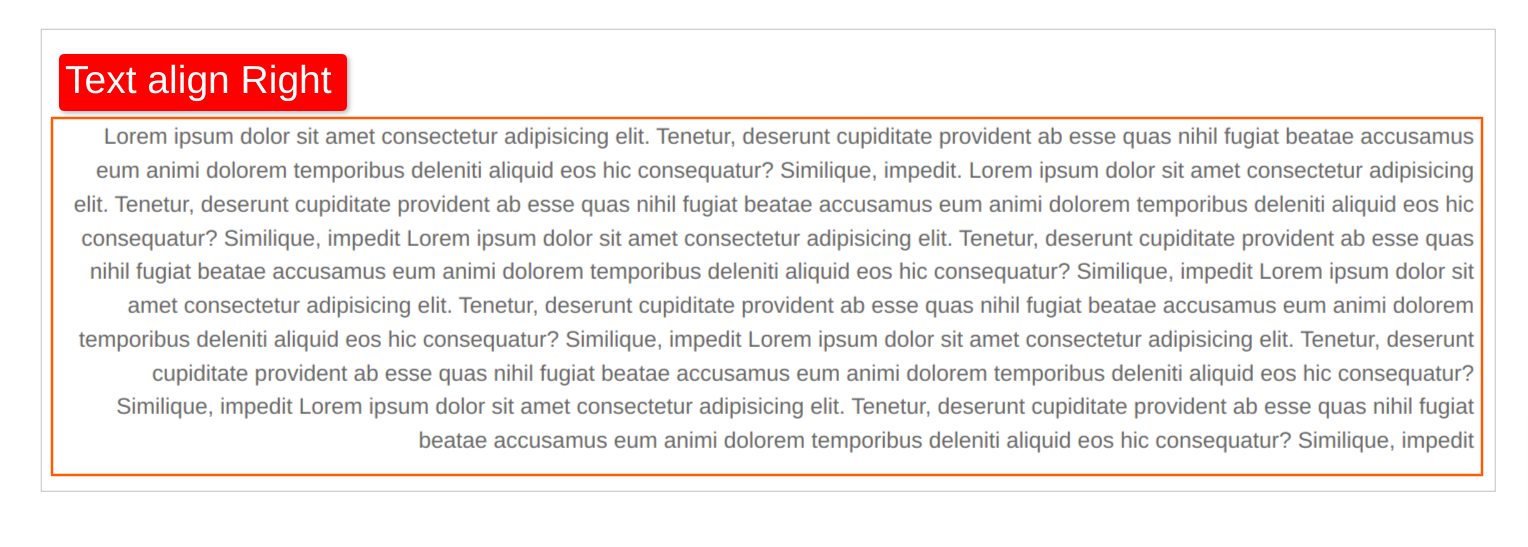
Text align right:
Text that is right-aligned can create "rivers" of whitespace between words, making it harder to read. Left-aligned or justified text can help prevent this.
Here is the css code:
p {
  font-size: 18px;
  color: #666666;
  line-height: 1.5;
  text-align: right;

}
Text at odd with alignment (e.g. some paragraphs are centered, others are left-aligned) can create a irritate reading experience and make the content feel disjointed. Consistent alignment throughout the text can help create a balanced reading experience.
Best practices for text alignment
There are several best practices to follow when aligning text, such as using a consistent alignment throughout a document, avoiding excessive use of centered or justified alignment, and adjusting line spacing and margins to improve readability.
Here are some best practices for text alignment:
- Use left-aligned or justified text for most content, as it is easier to read and provides a more balanced reading experience.
- Center-aligned text can be used for headings or short blocks of text but should be used poorly.
- Avoid right-aligned text, as it can create difficult whitespace and make text harder to read.
- Use consistent alignment throughout a document or website to create a smooth, professional look.
- Consider the context and purpose of the text when choosing alignment. For example, a document with multiple columns may benefit from the center-aligned text in some cases.
- Test the readability of different alignments with sample text and adjust as needed to improve user experience.
- Use line breaks and spacing to increase readability and avoid difficult spacing between words.
By following these best practices, you can create content that is easier to read, more professional-looking, and more effective at engaging your users.
Text alignment in different mediums
Different mediums, such as print, digital, and mobile devices, may require different text alignment techniques to optimize the reading experience. while digital media may use a combination of left, right, center, and justified alignments.
Certainly! Here's an example of how text alignment can be adjusted for different mediums using CSS:
/* For print media, the left-aligned or justified text is typically used */

@media print {
  body {
    text-align: justify;
  }
}
For digital media, a combination of left, right, center, and justified alignments can be used:
.container {
  text-align: center; /* Center-aligned for headings */
}

.left {
  text-align: left; /* Left-aligned for body content */
}

.right {
  text-align: right; /* Right-aligned for pull quotes or other elements */
}
For mobile devices, narrower columns and different alignment choices may be necessary:
@media (max-width: 768px) {
.container {
width: 90%; /* Narrower column for mobile devices */
text-align: center; /* Center-aligned for headings */
}
.left {
text-align: left; /* Left-aligned for body content */
}
.right {
text-align: center; /* Center-aligned for pull quotes or other elements */
}
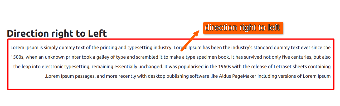
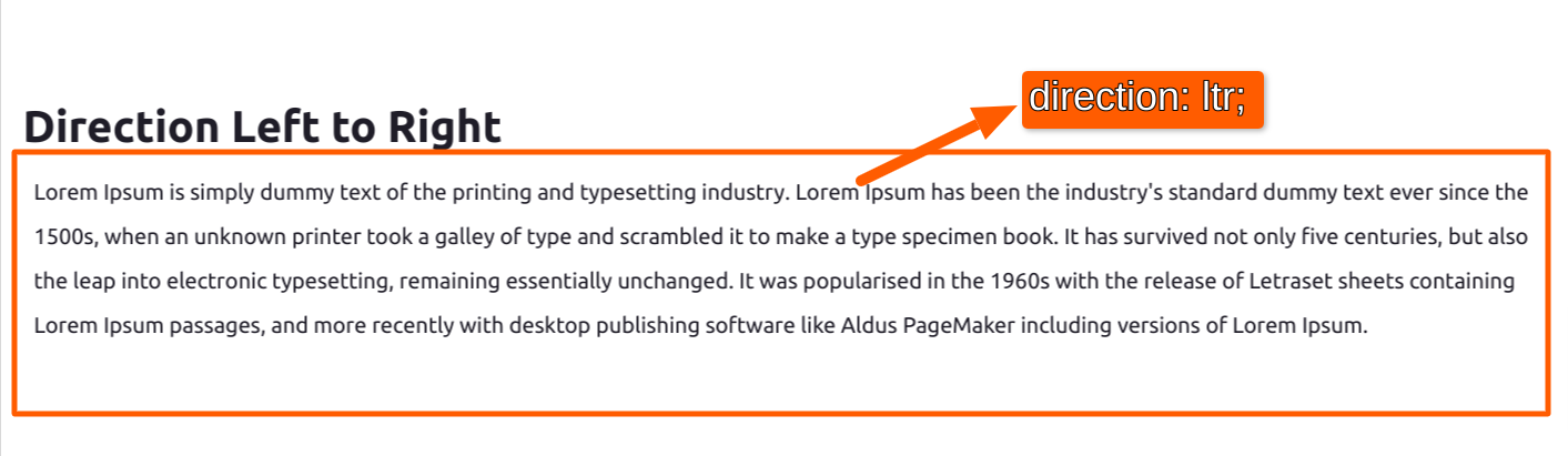
}And for languages that are read from right to left, such as Arabic or Hebrew, the text alignment can be adjusted accordingly:
.container {
  direction: rtl; /* Right-to-left text direction */
  text-align: right; /* Right-aligned for body content */
}
.left {
  direction: ltr; /* Left-to-right text direction */
  text-align: left; /* Left-aligned for headings or other elements */
}
Good and bad text alignment
Examining real-life examples of good and bad text alignment can help illustrate the importance of proper alignment and best practices.
here's an example of good text alignment:
p {
  text-align: justify; /* Use justified text for most content */
  line-height: 1.5; /* Add some spacing between lines for readability */
  margin-bottom: 20px; /* Add some spacing between paragraphs */
}
And here's an example of bad text alignment:
p {
  text-align: center; /* Center-aligned text can be hard to read in long blocks */
  margin-bottom: 10px; /* Not enough spacing between paragraphs */
  font-size: 18px; /* Font size that's too small can also impact readability */
  line-height: 1; /* No spacing between lines can make the text feel cramped */
}
Remember that good text alignment should increase readability and user experience, so focus for clear, consistent, and well-spaced text.
Conclusion
In this blog, we successfully learned about how to manage text alignments to keep your website clean and have clear readability. Hope you learn something new from this blog.Thank you for taking the time to read.

Comments