Learn best practices for choosing and styling fonts with our tips & tricks. Take your design to the next level with our tips & tricks for choosing & styling fonts.
here are some tips for every web developer should follow
- Understanding font families
- Choosing fonts for your audience and purpose
- Prioritizing readability in font selection
- The power of font contrast
- Font size and medium considerations
- Using font formatting options to enhance your text
Here we can discuss every point with detailed examples
Understanding font families
Font families are groups of related fonts that share similar design characteristics such as weight, width, and style. Using a font family can help maintain consistency throughout your content and reinforce your branding.
There are some common font families include serif, sans-serif, Arial, and monospace. Serif fonts have small lines at the ends of the character, while sans-serif fonts don’t. Monospace fonts have the same width for all the characters while Arial fonts have a more following.
To specify a font family for an HTML element, you can use the CSS font-family property. For example, if you want to use the Arial font with a sans-serif backup, you can use the following code:
h1{
  font-family: serif, Arial, sans-serif; /* we can use n number of font-families */
  font-weight: bold;
  line-height: 1.42;
  font-size: 32px;
}

p {
  font-family: Arial, sans-serif; /* we can use n number of font-families */
}
Form the above code tells the browser to first try to use sans for h1 tag if sans are not available then apply the Arial font-family to h1 tag. If the given font-families are not available then the browser will use any default font that is available on the user’s device.
Choosing fonts for your audience and purpose
When choosing fonts for your content, it's important to consider your audience and purpose.
For example, a playful and informal font may be appropriate for children's books, while a professional and classic font may be more suitable for legal documents.
Consider the tone and style of your content, as well as the preferences of your target audience. A font that may be well-received by one group may not be as effective as another.
Additionally, consider the medium and platform on which your content will be displayed. Different fonts may look better or worse depending on the screen or print size, so test your font choices in different contexts to ensure they are legible and visually appealing.
Ultimately, choosing the right fonts for your audience and purpose can help your content stand out and effectively communicate your message.
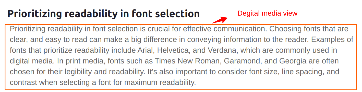
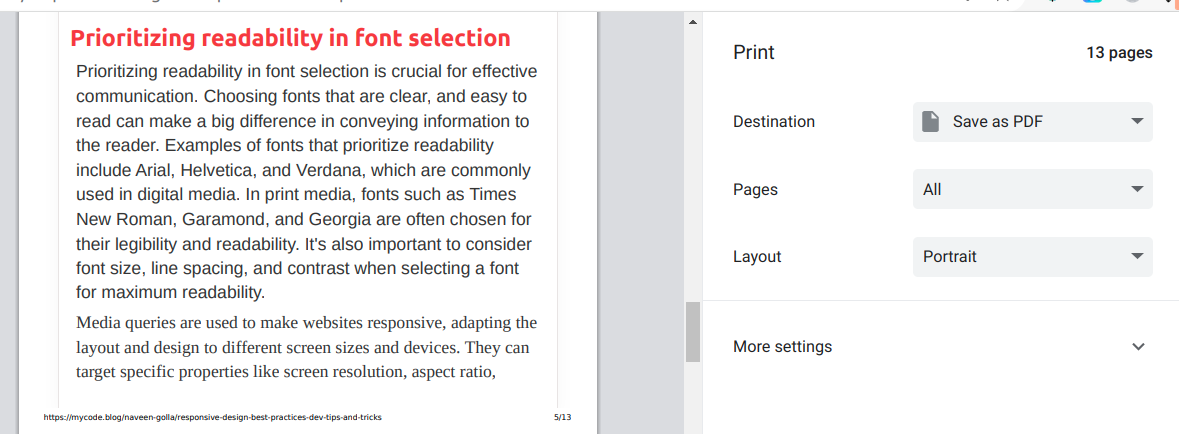
Prioritizing readability in font selection
Prioritizing readability in font selection is crucial for effective communication. Choosing fonts that are clear, and easy to read can make a big difference in conveying information to the reader.
Examples of fonts that prioritize readability include Arial, Helvetica, and Verdana, which are commonly used in digital media. In print media, fonts such as Times New Roman, Garamond, and Georgia are often chosen for their legibility and readability.
It's also important to consider font size, line spacing, and contrast when selecting a font for maximum readability.
This can be achieved with CSS code:
Example code:
.digital-media{
  font-family: Arial, Helvetica, Verdana;
  font-size: 24px;
  line-height: 1.4;
  color: #666666;
}

.print-media{
  font-family: Times New Roman, Garamond, Georgia;
  font-size: 24px;
  line-height: 1.4;
  color: #333333;
}
Digital media view:
Print Media view:
The power of font contrast
Font contrast is important for improving readability and visual appeal. By using different font sizes, weights, and colors, you can create a clear visual hierarchy and make it easier for readers to distinguish between different types of content.
For example, using a bold and larger sans-serif font with a darker color for primary text, and a smaller serif font with a lighter color for secondary text can help create a clear contrast. This can be achieved with CSS code.
Example code:
.primary-text {
  font-family: Arial, sans-serif;
  font-size: 24px;
  font-weight: bold;
  color: #333333;
}

.secondary-text {
  font-family: Georgia, serif;
  font-size: 18px;
  color: #666666;
}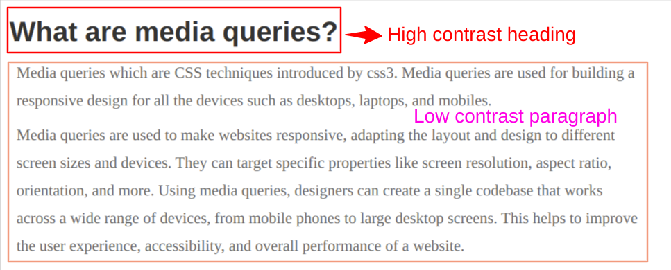
From the above codes, there are two different fonts with varying weights, colors, and sizes. The primary text has a dark color and high contrast and the secondary text has lighter color with low contrast.
This will help to create a difference for the readers will understand that both are different content.
Font size and medium considerations
Choosing the right font size and medium is essential for optimal readability and user experience. In digital media, larger font sizes are generally preferred to accommodate various device sizes and reading distances.
Additionally, the medium, such as screen or print, should also be considered to ensure the font size is appropriate for the context. Here's an example code for font size selection using CSS:
body {
font-family: Arial, sans-serif;
font-size: 18px;
}
h1 {
font-size: 48px;
font-weight: bold;
}
p {
font-size: 24px;
line-height: 1.5;
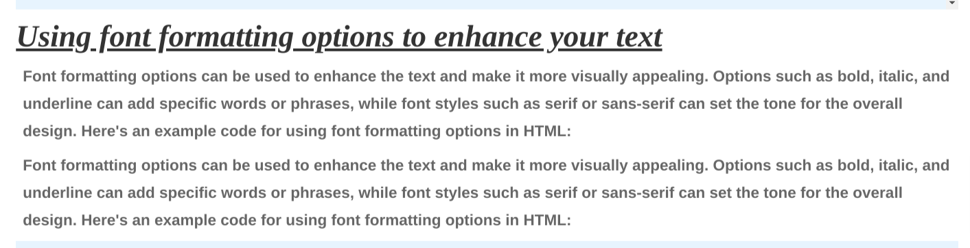
}Using font formatting options to enhance your text
Font formatting options can be used to enhance the text and make it more visually appealing. Options such as bold, italic, and underline can add specific words or phrases, while font styles such as serif or sans-serif can set the tone for the overall design.
Here's an example code for using font formatting options in HTML:
h1 {
  font-family: Georgia, serif;
  font-size: 36px;
  font-style: italic;
  text-decoration: underline;
  color: #333333;
}

 p {
  font-family: Arial, sans-serif;
  font-size: 18px;
  font-weight: bold;
  color: #666666;
}
In this example, the headline uses a serif font with an italic font style and an underline text decoration. The paragraph uses a sans-serif font with a bold font weight.
By using different font styles, sizes, and weights, along with other formatting options, you can create visually engaging text that stands out and draws the reader's attention.
Conclusion
In this blog, we successfully learned about how to choose and style fonts. Hope you learn something new from this blog.Thank you for taking the time to read.

Comments