CSS transparent color can create unique visual effects on web pages. Use "rgba" or "hsla" values to adjust the transparency of colors and layer elements.
Introduction
CSS transparent colors are a feature that allows you to adjust the opacity of an element's background color, border color, or text color. This is achieved using RGBA or HSLA color values, where the alpha channel controls the transparency level.
Properties of transparent colors
Here are some properties that can be used with transparent colors in CSS:
Color Property:
The color property sets the color of text. When used with a transparent value, it makes the text transparent.
Example:
p {
  color: rgba(255, 0, 0, 0.5); /* red color with 50% transparency */
  color: rgba(70, 150, 255, 0.2); /* blue with 20 % transparency */
}
Background-color Property:
The background-color property sets the background color of an element. When used with a transparent value, it makes the background transparent.
Example:
div {
  background-color: rgba(0, 0, 255, 0.3); /* blue color with 30% transparency */
  background-color: rgba(255,0,0,0.3);  /* red with opacity*/
  background-color: rgba(0,255,0,0.3); /* green with opacity */
  background-color: rgba(0,0,255,0.3); /* blue with opacity */
}
Border-color Property:
The border-color property sets the color of an element's border. When used with a transparent value, it makes the border transparent.
Example:
img {
  border: 2px solid rgba(0, 255, 0, 0.5); /* green border with 50% transparency */
  border: 2px solid rgba(230, 26, 26, 0.7); /* red border with 70% transparency */
}
Box-shadow Property:
The box-shadow property creates a shadow effect around an element. When used with a transparent value, it makes the shadow transparent.
Example:
h1 {
  box-shadow: 0 0 10px rgba(255, 255, 0, 0.2); /* yellow shadow with 20% transparency */
  box-shadow: 0 0 10px rgba(0, 119, 255, 0.4); /* blue shadow with 40% transparency */
}
Text-shadow Property:
The text-shadow property creates a shadow effect behind text. When used with a transparent value, it makes the shadow transparent.
Example:
h2 {
  text-shadow: 2px 2px 5px rgba(0, 0, 0, 0.4); /* black text shadow with 40% transparency */
  text-shadow: 2px 2px 5px rgba(255, 255, 255, 0.3); /* gray text shadow with 30% transparency */
}
How does Transparent color works in CSS
In CSS, the "transparent" keyword can be used to specify a color that is completely transparent. This means that any content underneath the element will be visible through it.
Here's an example of how to use transparent color in CSS:
/* Sets the background color of an element to transparent */
background-color: transparent;
In this case, the element will have no background color, making it completely transparent.
The transparent keyword can also be used with other CSS properties that accept color values, such as border-color, text-shadow, and box-shadow.
/* Sets the border color of an element to transparent */
border-color: transparent;

/* Sets the text shadow color to transparent */
text-shadow: 1px 1px 1px transparent;

/* Sets the box shadow color to transparent */
box-shadow: 2px 2px 2px rgba(0, 0, 0, 0.5), 0px 0px 10px transparent;
In all these examples, the transparent keyword makes the specified color completely transparent, allowing content underneath to show through.
Types of CSS transparent color
In CSS, there are different ways to specify transparent colors, including:
Transparent keyword:
This is the most basic type of transparent color in CSS. It completely removes any color from an element, making it fully transparent. This can be used for things like creating a transparent background or border.
Index.html
<!DOCTYPE html>
<html lang="en">
<head>
<link rel="stylesheet" href="./style.css">
<title>Document</title>
</head>
<body>
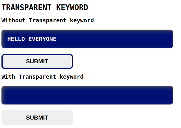
<h1>TRANSPARENT KEYWORD</h1>
<h2>Without Transparent keyword</h2>
<div>
<h3 class="exp1">HELLO EVERYONE</h3>
<button class="button1">SUBMIT</button>
</div>
<h2>With Transparent keyword</h2>
<div>
<h3 class="exp2">HELLO EVERYONE</h3>
<button class="button2">SUBMIT</button>
</div>
</body>
</html>style.css
body{
font-family: monospace;
}
.exp1 {
background-color: #001173;
color: #fff;
padding: 20px;
box-shadow: inset 5px 5px 12px #555, 5px 5px 12px rgb(235 235 235 / 16%);
border-radius: 10px;
font-size: 20px;
width: 30%;
}
.button1{
border: 4px solid #001173;
padding: 10px 80px;
font-size: 20px;
font-weight: 600;
border-radius: 10px;
}
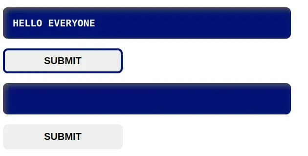
.exp2 {
background-color: #001173;
color: transparent;
padding: 20px;
box-shadow: inset 5px 5px 12px #555, 5px 5px 12px rgb(235 235 235 / 16%);
border-radius: 10px;
font-size: 20px;
width: 30%;
}
.button2{
border: 4px solid transparent;
padding: 10px 80px;
font-size: 20px;
font-weight: 600;
border-radius: 10px;
}Output
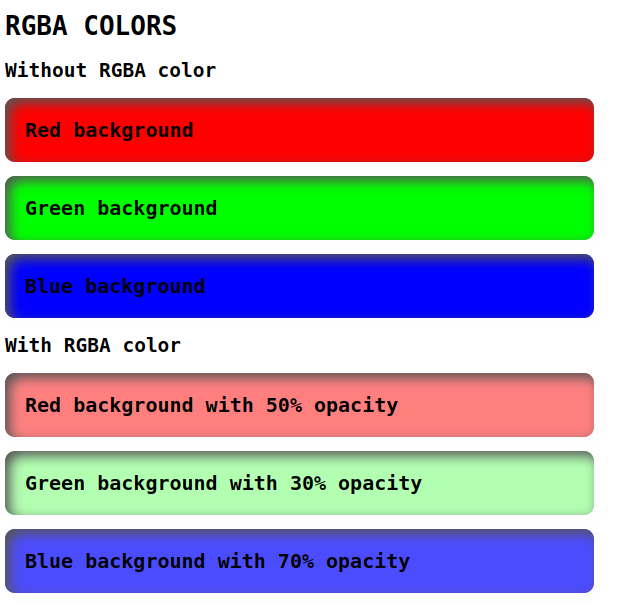
RGBA colors:
RGBA stands for Red, Green, Blue, and Alpha. RGBA colors are specified using the rgba() function, where the first three values represent the red, green, and blue values, and the fourth value represents the alpha or transparency level. The alpha value ranges from 0 (fully transparent) to 1 (fully opaque). Example: rgba(0, 0, 0, 0.5) creates a black color that is 50% transparent.
Index.html
<!DOCTYPE html>
<html lang="en">
<head>
    <link rel="stylesheet" href="./style.css">
    <title>Document</title>
</head>
<body>
    <h1>RGBA COLORS</h1>
    <h2>Without RGBA color</h2>
    <div>
        <div class="exm1">Red background</div>
        <div class="exm2">Green background</div>
        <div class="exm3">Blue background</div>
    </div>

    <h2>With RGBA color</h2>
    <div>
        <div class="exm4">Red background with 50% opacity</div>
        <div class="exm5">Green background with 30% opacity</div>
        <div class="exm6">Blue background with 70% opacity</div>
    </div>
</body>
</html>
Style.css
body{
    font-family: monospace;
}

.exm1, .exm2, .exm3, .exm4, .exm5, .exm6 {
    padding: 20px;
    box-shadow: inset 5px 5px 12px #555, 5px 5px 12px rgb(235 235 235 / 16%);
    border-radius: 10px;
    font-size: 20px;
    width: 30%;
    font-weight: 600;
}

.exm1 {
    background-color: rgb(255, 0, 0);
}

.exm2 {
    background-color: rgb(0, 255, 0);
    margin-top: 14px;
}

.exm3 {
    background-color: rgb(0, 0, 255);
    margin-top: 14px;
}

.exm4 {
    background-color: rgba(255, 0, 0, 0.5);
}

.exm5 {
    background-color: rgba(0, 255, 0, 0.3);
    margin-top: 14px;
}

.exm6{
    background-color: rgba(0, 0, 255, 0.7);
    margin-top: 14px;
}
Output
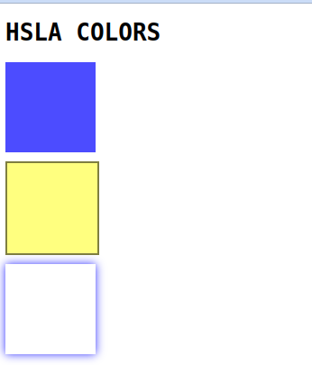
HSLA colors:
HSLA (Hue, Saturation, Lightness, Alpha) is a color format in CSS that allows you to specify colors using hue, saturation, lightness, and an optional alpha value (which controls the opacity of the color).
Index.html
<!DOCTYPE html>
<html lang="en">
<head>
    <link rel="stylesheet" href="./style.css">
    <title>Document</title>
</head>
<body>
    <h1>HSLA COLORS</h1>
    <div class="box1"></div>
    <div class="box2"></div>
    <div class="box3"></div>
</body>
</html>
style.css
body{
    font-family: monospace;
}

.box1 {
  background-color: hsla(240, 100%, 50%, 0.7);
  width: 100px;
  height: 100px;
}

.box2 {
  background-color: hsla(60, 100%, 50%, 0.5);
  width: 100px;
  height: 100px;
  border: 2px solid hsla(0, 0%, 0%, 0.5);
  margin-top: 10px;
}

.box3 {
  background-color: hsla(0, 0%, 100%, 0.8);
  width: 100px;
  height: 100px;
  box-shadow: 0 0 10px hsla(240, 100%, 50%, 0.8);
  margin-top: 10px;
}
Output
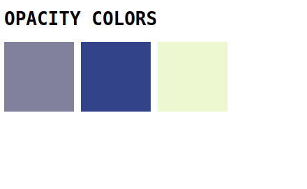
Opacity:
Opacity is a CSS property that affects the transparency of an element, including its content. It is specified as a value between 0 (fully transparent) and 1 (fully opaque). Example: opacity: 0.5 makes an element and its content 50% transparent.
Index.html
<!DOCTYPE html>
<html lang="en">
<head>
    <link rel="stylesheet" href="./style.css">
    <title>Document</title>
</head>
<body>
    <h1>HSLA COLORS</h1>
    <div class="container">
        <div class="box1"></div>
        <div class="box2"></div>
        <div class="box3"></div>
    </div>
</body>
</html>
Style.css
body{
  font-family: monospace;
}

.container{
  display: flex;
  gap: 10px;
}

.box1 {
  background-color: rgb(2, 2, 59);
  width: 100px;
  height: 100px;
  opacity: 0.5;
}

.box2 {
  background-color: rgb(0, 20, 109);
  width: 100px;
  height: 100px;
  opacity: 0.8;
}

.box3 {
  background-color: rgb(167, 218, 26);
  width: 100px;
  height: 100px;
  opacity: 0.2;
}
Output
Importance of css transparent color
CSS transparent colors are important because they:
- Allow you to create layered effects in your designs without fully blocking out the layers beneath.
- Help improve the readability and legibility of text over images or colored backgrounds.
- Make it easier to create subtle visual effects and transitions that enhance the overall look and feel of your website.
- Allow you to create responsive designs that adapt to different screen sizes and device types.
- Enable you to create a consistent visual style and branding across your website or application.
How to use transparent colors in CSS
Here are simple steps to use transparent colors in CSS with examples:
- Choose the color that you want to make transparent. For example, let's choose the color red.
- Add transparency to the color by using the RGBA color model. RGBA stands for Red, Green, Blue, and Alpha.
- The Alpha value determines the transparency of the color and is a number between 0 (fully transparent) and 1 (fully opaque). So, for example, if you want to make the color red 50% transparent. you can see the following code:
color: rgba(255, 0, 0, 0.5);- Apply the transparent color to an HTML element using CSS. For example, let's apply the transparent red color to a heading element:
h1 {
  color: rgba(255, 0, 0, 0.5);
}- You can also use transparent colors for backgrounds. For example, let's make the background of a div element transparent:
div {
  background-color: rgba(0, 0, 255, 0.5);
}- You can combine transparent colors with other CSS properties, such as gradients. For example, let's create a linear gradient that fades from transparent to white:
background: linear-gradient(to bottom, transparent, white);- Finally, remember that not all browsers support transparent colors in the same way. Some older browsers may not support the RGBA color model.
Conclusion
In this blog, The CSS transparent color can be used by setting the opacity property to a value between 0 and 1, or by using the rgba() function to specify a color with an alpha channel. Thank you for reading.
 21 likes
 Add to read list

Comments