CSS hover effects can enhance user experience by adding interactivity. To create one, use the :hover selector and apply CSS properties for effect.
Introduction
Hover effects are visual changes that occur when a user hovers their cursor over a specific element on a website, such as a button or an image. These effects can include changes in color, size, opacity, or even animations.
Hover effects are commonly used to enhance the user experience by providing feedback and making clickable elements more engaging and intuitive. They can also be used to create visual interest and add a sense of interactivity to a website.
How to create hover effects
- Identify the HTML element you want to apply a hover effect to.
- Use CSS to select the element and apply a style for the hover state, for example:
.my-element:hover {
  background-color: red;
  color: white;
}- Choose the specific hover effect you want to create, such as changing the background color, adding a border, or increasing the font size.
- Experiment with different CSS properties to achieve the desired effect, such as background-image, transform, or box-shadow.
- Use the transition property to create a smooth transition between the regular and hover states, for example:
.my-element {
  transition: background-color 0.3s ease;
}- Test the hover effect in different browsers and on different devices to ensure it works correctly and looks good.
Types of hover effects
Hover effects can be created using HTML, CSS, and JavaScript, and you can use many different types of effects to enhance your website's design and functionality.
Color change:
This is one of the most basic hover effects, where the color of the element changes when the mouse is hovered over it.
index.html
<!DOCTYPE html>
<html lang="en">
<head>
    <link rel="stylesheet" href="./style.css">
    <title>Document</title>
</head>
<body>
    <div class="hover-effect">
        <p>Hover over me to see the color change effect!</p>
    </div>
</body>
</html>
style.css
body{
  font-family: monospace;
}

p{
  font-size: 20px;
}

.hover-effect {
  box-shadow: inset 5px 5px 12px #555, 5px 5px 12px rgb(235 235 235 / 16%);
  border-radius: 10px;
  background-color: #333333; /* Set initial background color */
  color: #fff; /* Set initial font color */
  padding: 20px;
  transition: background-color 0.3s ease; /* Add a smooth transition effect to the background color change */
}

.hover-effect:hover {
  background-color: #080f77; /* Change the background color on hover */
}
Results


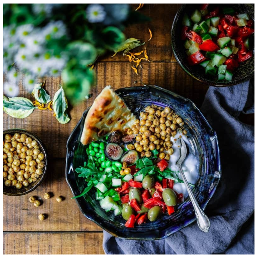
Image swap:
This effect involves changing the image of an element when the mouse is hovered over it.
Index.html
<!DOCTYPE html>
<html lang="en">
<head>
    <link rel="stylesheet" href="./style.css">
    <title>Document</title>
</head>
<body>
    <div class="image-container">
        <img src="./gallery-10.jpg" alt="Image 1" class="default">
        <img src="./gallery-11.jpg" alt="Image 2" class="hover">
      </div>
</body>
</html>
style.css
.image-container {
  position: relative;
  display: inline-block;
}

img{
  width: 500px;
  height: 500px;
}

.image-container img {
  position: absolute;
  top: 0;
  left: 0;
  transition: opacity 0.5s ease;
}

.image-container .hover {
  opacity: 0;
}

.image-container:hover .default {
  opacity: 0;
}

.image-container:hover .hover {
  opacity: 1;
}
Results

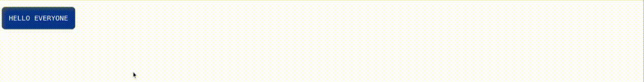
Text change:
With this effect, the text of an element changes when the mouse is hovered over it.
Index.html
<!DOCTYPE html>
<html lang="en">
<head>
    <link rel="stylesheet" href="./style.css">
    <title>Document</title>
</head>
<body>
    <div class="text-container">
        <p class="default">HELLO EVERYONE</p>
        <p class="hover">Lorem ipsum dolor sit amet consectetur adipisicing elit. Saepe nulla fugit voluptate facilis earum quo, perspiciatis possimus aliquid magnam corrupti expedita porro? Harum accusantium inventore excepturi nostrum necessitatibus, quibusdam qui ipsum voluptatum odio. Maxime in aspernatur quasi itaque id corrupti sapiente perferendis expedita tenetur eum, dignissimos commodi nostrum eaque libero voluptatibus corporis omnis, alias sed odit deleniti. Assumenda quibusdam quasi dicta sunt voluptas totam quia, omnis ratione distinctio consequuntur laborum natus cupiditate officiis, voluptatum odio dolorem ab perspiciatis nobis sequi quo alias accusamus vitae nam sed! Dolores magni dolor vitae. Necessitatibus odit praesentium eum hic commodi possimus iure eveniet tempore?</p>
      </div>
</body>
</html>
style.css
body{
  font-family: monospace;
  font-size: 20px;
}

.text-container {
  position: relative;
  display: inline-block;
}

.default{
  box-shadow: inset 5px 5px 12px #555, 5px 5px 12px rgb(235 235 235 / 16%);
  border-radius: 10px;
  background-color: #003496;
  padding: 20px;
  color: #fff;
}

.text-container .hover {
  display: none;
  background-color: #003496;
  padding: 20px;
  color: #fff;
  box-shadow: inset 5px 5px 12px #555, 5px 5px 12px rgb(235 235 235 / 16%);
  border-radius: 10px;
}

.text-container:hover .default {
  display: none;
}

.text-container:hover .hover {
  display: block;
}
Results

Transition effects:
This effect involves adding a smooth transition to an element when it is hovered over, such as fading or sliding.
Index.html
<!DOCTYPE html>
<html lang="en">
<head>
    <link rel="stylesheet" href="./style.css">
    <title>Document</title>
</head>
<body>
    <button class="transition-btn">Click me!</button>
    <button class="transition-btn btn1">Click me!</button>
    <button class="transition-btn btn2">Click me!</button>
    <button class="transition-btn btn3">Click me!</button>
</body>
</html>
style.css
.transition-btn {
  background-color: #4c77af;
  color: white;
  border: none;
  padding: 10px 20px;
  text-align: center;
  text-decoration: none;
  display: inline-block;
  font-size: 16px;
  margin: 4px 2px;
  cursor: pointer;
  transition: background-color 0.3s ease;
}

.transition-btn:hover {
  background-color: #080075;
}

.btn1{
  transition: background-color 0.9s ease-in;
}

.btn2{
  transition: background-color 0.9s ease-in-out;
}

.btn3{
  transition: background-color 0.9s ease-out  ;
}
Results

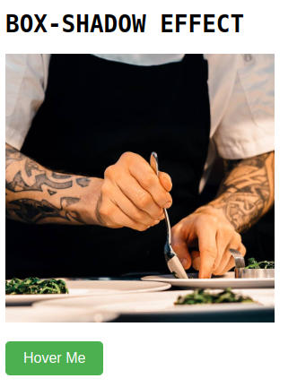
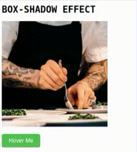
Box-shadow effect:
This effect involves adding a shadow to an element when it is hovered over, which can make it appear more three-dimensional.
Index.html
<!DOCTYPE html>
<html lang="en">
<head>
    <link rel="stylesheet" href="./style.css">
    <title>Document</title>
</head>
<body>
    <h1>BOX-SHADOW EFFECT</h1>
    <div class="image-container">
        <img src="./gallery-10.jpg" alt="example image">
    </div>
      <button class="btn">Hover Me</button>
</body>
</html>
style.css
body{
  font-family: monospace;
}

.image-container img {
  width: 300px;
  height: 300px;
}

.image-container:hover img {
  box-shadow: 0 10px 30px rgba(0, 0, 0, 0.877);
  transition: ease 0.4s;
}

button {
  margin-top: 18px;
}

.btn {
  padding: 10px 20px;
  font-size: 16px;
  background-color: #4CAF50;
  color: #fff;
  border: none;
  border-radius: 5px;
  cursor: pointer;
}

.btn:hover {
  box-shadow: 0 0 15px rgba(0, 0, 0, 0.877);
  transition: ease 0.4s;
}
Results
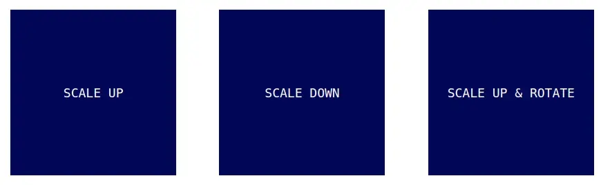
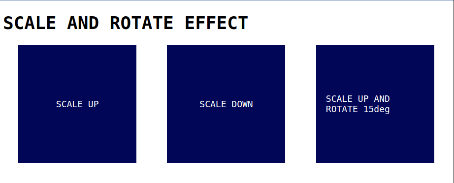
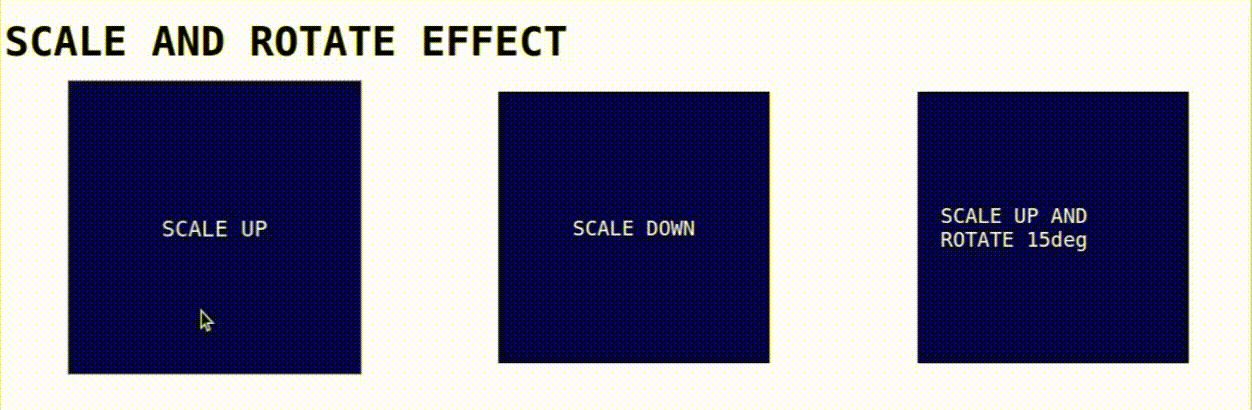
Scale and Rotate effect:
Scale effect involves scaling up or down and rotate effect involves rotating an element to apply a scale and rotate hover effect, you can use CSS animations and transforms. Here is an example code.
Index.html
<!DOCTYPE html>
<html lang="en">
<head>
    <link rel="stylesheet" href="./style.css">
    <title>Document</title>
</head>
<body>
    <h1>SCALE AND ROTATE EFFECT</h1>
    <div class="container">
        <div class="box box1">
            SCALE UP
        </div>
        <div class="box box2">
            SCALE DOWN
        </div>
        <div class="box box3">
            SCALE UP AND ROTATE 15deg
        </div>
    </div>
</body>
</html>
style.css
.container{
  display: flex;
  justify-content: space-around;
}

body{
  font-family: monospace;
  font-size: 18px;
}

.box {
  width: 200px;
  height: 200px;
  background-color: #010657;
  transition: transform 0.2s;
}

.box1, .box2, .box3{
  color: #FFF;
  display: flex;
  align-items: center;
  justify-content: center;
  padding: 20px;
}

.box1:hover {
  transform: scale(1.1);
}

.box2:hover {
  transform: scale(0.9);
}

.box3:hover {
  transform: scale(1.1) rotate(15deg);
}
Results
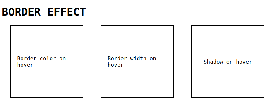
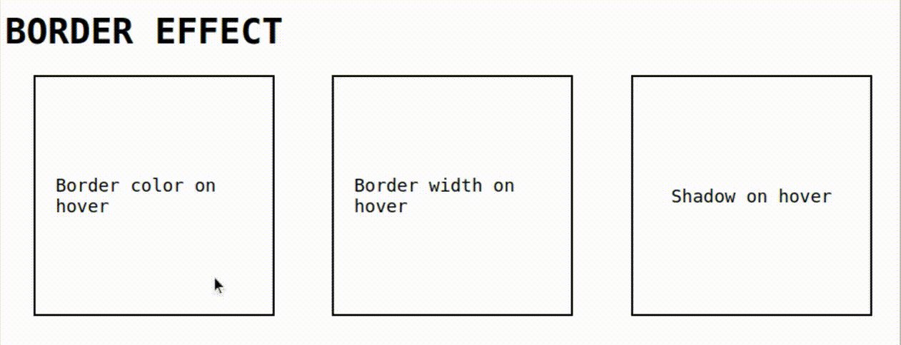
Border effect:
This effect involves adding a border to an element when it is hovered over, which can make it appear more defined or prominent.
Index.html
<!DOCTYPE html>
<html lang="en">
<head>
    <link rel="stylesheet" href="./style.css">
    <title>Document</title>
</head>
<body>
    <h1>BORDER EFFECT</h1>
    <div class="container">
        <div class="box box1">
            Border color on hover
        </div>
        <div class="box box2">
            Border width on hover
        </div>
        <div class="box box3">
            Shadow on hover
        </div>
    </div>
</body>
</html>
style.css
.container{n
  display: flex;
  justify-content: space-around;
}

body{
  font-family: monospace;
  font-size: 18px;
}

.box {
  width: 200px;
  height: 200px;
  border: 2px solid black;
  box-shadow: none;
  transition: box-shadow 0.5s ease;
}

.box1, .box2, .box3{
  display: flex;
  align-items: center;
  justify-content: center;
  padding: 20px;
}

.box1:hover {
  border-color: rgb(255, 0, 0);
  transition: border-color 0.5s ease;
}

.box2:hover {
  border-width: 4px;
  transition: border-width 0.5s ease;
}

.box3:hover {
  box-shadow: 2px 2px 10px #000;
}
Results
Conclusion
In this blog, You've seen how we have added the effects and transitions to HTML elements using CSS hover effects. Hope you guys learnt something new in this blog, Thank you.
 21 likes
 Add to read list

Comments