When it comes to standard font sizes and line heights, there is no one-size-fits-all approach as it can vary depending on the medium and purpose of the text.
Here are some common font sizes and line-hights include:
- For body text on a website or document, a font size of 16 pixels and a line height of 1.5 to 1.8 times the font size is often recommended to improve readability.
- For headings, font sizes of 24 to 36 pixels are common, depending on the hierarchy of the heading.
- In printed materials, a font size of 10 to 12 points is typically used for body text, while headings may range from 14 to 22 points.
Here are some standards basic’s to follow
- Understanding typography basics
- Choosing appropriate font sizes for different types of content
- Using relative units like em and rem for font sizing and line height
- Applying CSS styles to control font and line height
- Considering accessibility guidelines for font sizes and line heights.
Understanding typography basics
Typography basics include font sizes, spacing, line heights, and alignments. For example: Using the Arial font for body text can enhance the readability on a screen.
Here is the CSS code for applying the Arial font to the body text:
body{
font-family: Arial, sans-serif;
}
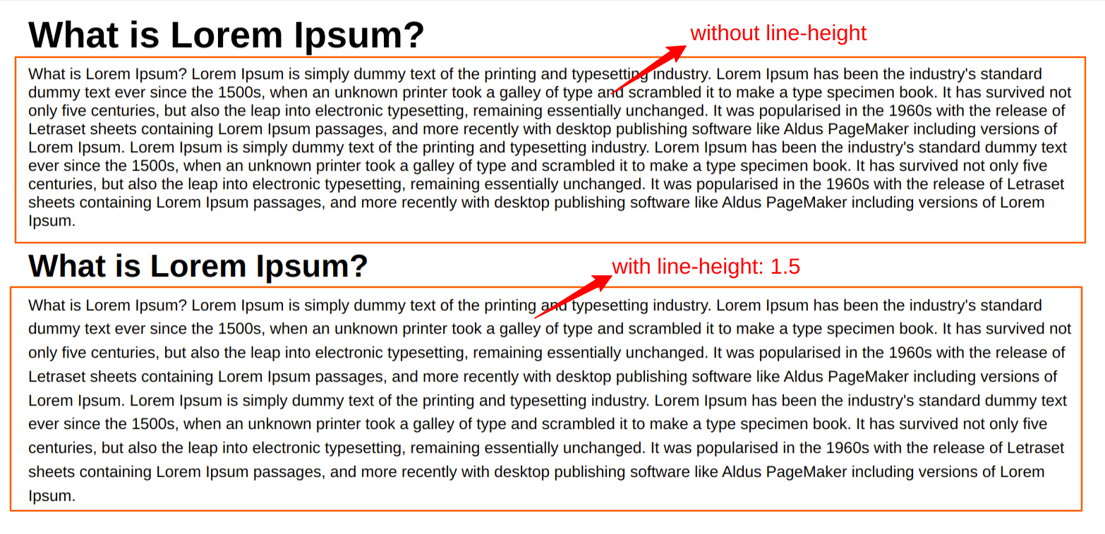
Using any font is not good enough to improve readability, line height also will affect the readability and we can adjust the line height.
p{
font-size: 18px;
line-height: 1.5;
}
Proper alignment and hierarchy can also enhance the visual appeal and readability of text, such as by using larger font sizes for headings and aligning text to a grid. Understanding these basics can help create effective and visually pleasing designs.
Choosing appropriate font sizes for different types of content
Choosing appropriate font sizes for different types of content is crucial to ensure readability and legibility. For body text, a size of 16-18 pixels is commonly used, while larger sizes (24-36 pixels) are appropriate for headings. CSS code for setting font sizes.
body {
font-size: 16px;
}
h1 {
font-size: 36px;
}
h2{
font-size: 32px;
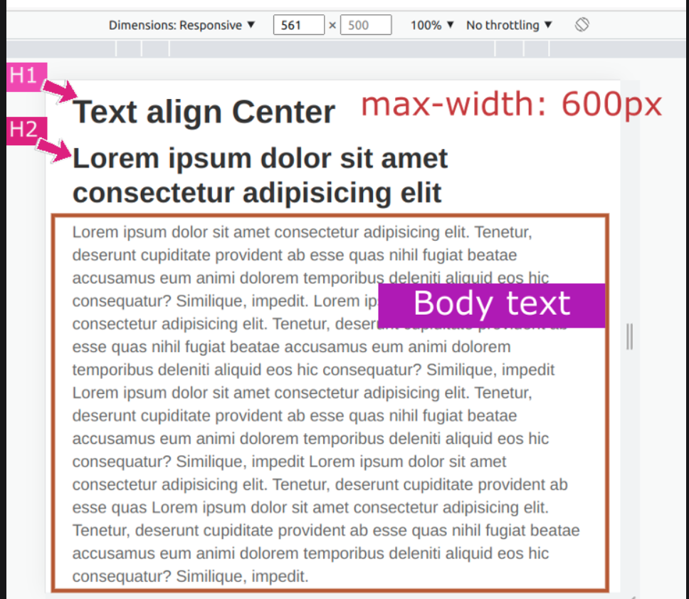
}For longer text blocks, such as articles or blog posts, it's important to consider the line length and adjust the font size accordingly. For example, if the line length is longer, a slightly larger font size may be necessary for optimal readability. CSS code for adjusting font sizes based on screen size.
@media (max-width: 600px) {
body {
font-size: 14px;
 }
 h1 {
 font-size: 32px;
 }
 h2{
 font-size: 28px;
 }
}
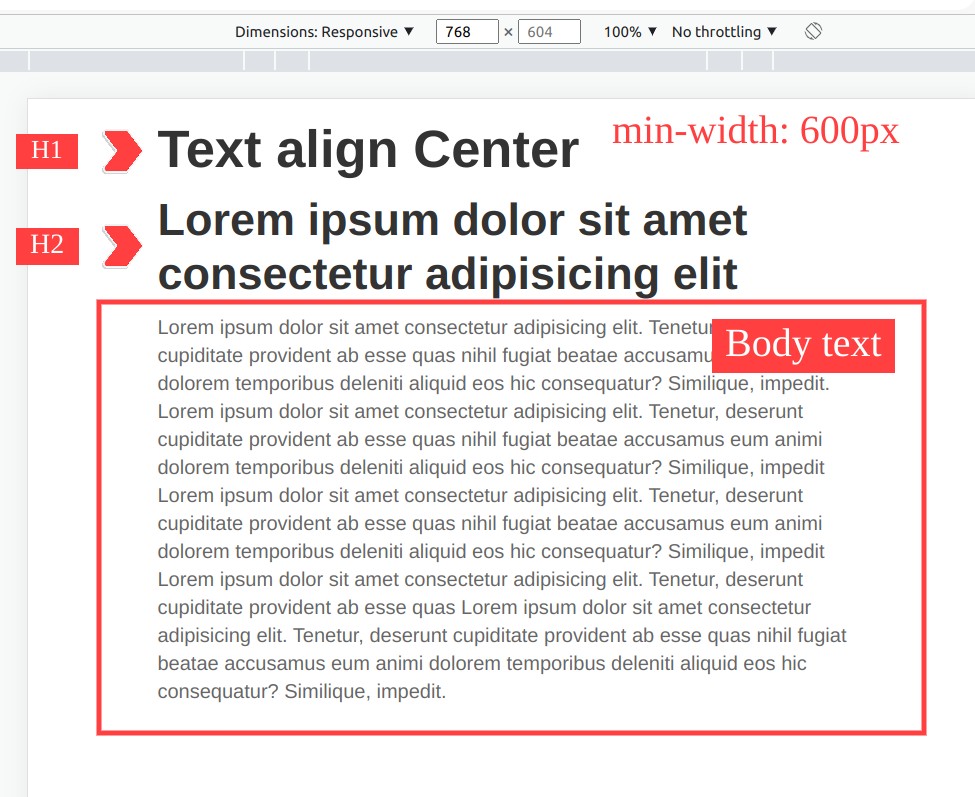
@media (min-width: 600px) {
body {
font-size: 16px;
}
h1 {
font-size: 42px;
}
h2{
font-size: 36px;
}
}
By selecting appropriate font sizes for different types of content, designers can improve the overall user experience and ensure that the content is easily consumed by the intended audience.
Using relative units like em and rem for font sizing and line height
Relative units like em and rem are useful for font sizing and line height as they can scale proportionally to the user's preferences or device settings. The em unit is relative to the font size of the parent element, while the rem unit is relative to the root font size.
For example, to set the font size of a paragraph to 1.2 times the font size of the parent element using em:
p {
font-size: 1.2em; /* 1rem=16px */
}
And to set the line height of the same paragraph to 1.5 times the font size of the root element using rem:
p {
font-size: 1.2em; /* 1rem = 16px*/
line-height: 1.5rem;
}

This allows for easy adjustments to font sizes and line heights across the entire document or website by simply changing the root font size. Additionally, using relative units can improve accessibility by allowing users to adjust font sizes in their browsers or devices without compromising the design or layout.
It's important to note that when using em and rem units, the font size and line height will be relative to the font size of the parent or root element, which may not always be what is intended. Therefore, it's recommended to set a base font size for the root element to ensure consistency across the document or website.
For example, setting a base font size of 16px for the root element:
html {
font-size: 16px;
}

And then using rem units for all other font sizes and line heights:

p {
font-size: 1.2rem;
line-height: 1.5rem;
}
Applying CSS styles to control font and line height
CSS styles can be used to control font and line height, allowing designers to create visually appealing and readable typography. For example, setting the font family, font size, and line height of body text:
body {
  font-family: Arial, sans-serif;
  font-size: 16px;
  line-height: 1.5; /* line-height 1.5 will calculate the 1.5 times the font size*/
}
The "font-family" property specifies the font to be used, while "font-size" sets the size of the font, and "line-height" sets the space between lines of text.
To adjust the font size of a specific element, such as a heading, use the selector for that element and set the font size accordingly:
h1 {
  font-size: 36px;
}
And to adjust line height for specific elements, use the same approach:
h1 {
font-size: 36px;
line-height: 1.2;
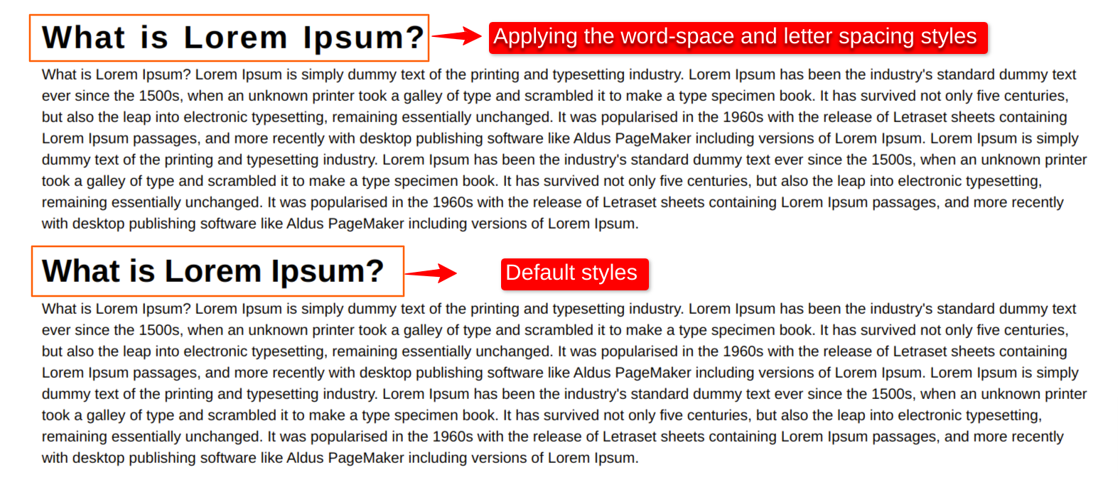
}It's also possible to adjust the spacing between letters and words using the "letter-spacing" and "word-spacing" properties:
h1 {
  font-size: 36px;
  letter-spacing: 0.05em;
  word-spacing: 0.1em;
}
By applying CSS styles to control font and line height, designers can improve the readability and visual appeal of their text, enhancing the overall user experience.
Considering accessibility guidelines for font sizes and line heights.
Accessibility guidelines for font sizes and line heights are important to consider when designing for all users, including those with visual impairments. For example, the Web Content Accessibility Guidelines (WCAG) recommend a minimum font size of 16px and a line height of at least 1.5 for body text.
CSS code for meeting accessibility guidelines:
body {
  font-size: 16px;
  line-height: 1.5;
}
For larger text, such as headings, the font size should be increased proportionally to maintain legibility:
h1 {
  font-size: 36px;
  line-height: 1.2;
}
It's also important to ensure that the text has sufficient contrast against the background for users with low vision or color blindness. WCAG recommends a contrast ratio of at least 4.5:1 for normal text and 3:1 for large text.
CSS code for meeting contrast ratio guidelines:
body {
  color: #333;
  background-color: #fff;
}

@media (min-width: 600px) {

 body {
  color: #333;
  background-color: #f2f2f2;
 }

}
By following accessibility guidelines for font sizes, line heights, and contrast ratios, designers can ensure that their content is easily readable and accessible to all users, regardless of their abilities.
Conclusion
In this blog, we successfully learned about how to set font sizes and line heights. Hope you learn something new from this blog.Thank you for taking the time to read.
 21 likes
 Add to read list

Comments