Learn how to create and animate a browser-compatible custom checkbox with a customized tick icon along with a hover effect using pure CSS and HTML.
We can create custom checkboxes and radio buttons in many methods. Click here to get one of the simple methods to create.
HTML structure
The base of any web-projects is the proper HTML structure and here is mine for the current task.
<!DOCTYPE html>
<html lang="en">
  <head>
    <title>Creating animated checkbox</title>
    <link rel="stylesheet" href="./stylea.css" />
  </head>
  <body>
    <div class="animated-checkbox">
      <h1>Favorite Game</h1>
      <input type="checkbox" id="basket-ball" />
      <label for="basket-ball">
        <span class="name">Basket Ball</span>
        <span class="icon"></span>
      </label>
      <input type="checkbox" id="cricket" />
      <label for="cricket">
        <span class="name">Cricket</span>
        <span class="icon"></span>
      </label>
      <input type="checkbox" id="hide-and-seek" />
      <label for="hide-and-seek">
        <span class="name">Hide And Seek</span>
        <span class="icon"></span>
      </label>
      <input type="checkbox" id="shuttle" />
      <label for="shuttle">
        <span class="name">Shuttle</span>
        <span class="icon"></span>
      </label>
    </div>
  </body>
</html>
Let us check for the results with plain HTML, here is the screenshot for your reference.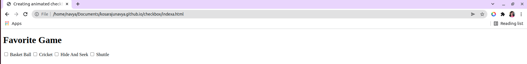
Required CSS
Now we will create the custom checkbox along with the required animation effect.
style.css
* {
box-sizing: border-box;
padding: 0;
margin: 0;
}
.animated-checkbox {
position: absolute;
top: 50%;
left: 50%;
transform: translate(-50%, -50%);
display: flex;
flex-direction: column;
}
.animated-checkbox input {
display: none;
}
.animated-checkbox label {
position: relative;
width: 290px;
height: 50px;
background: #ededed;
margin: 16px 0;
border-radius: 3px;
font-family: "Poppins sans-serif";
display: flex;
align-items: center;
justify-content: space-between;
padding: 0 1.3rem;
overflow: hidden;
cursor: pointer;
}
.animated-checkbox label::after {
content: "";
position: absolute;
top: 0;
left: 0;
width: 320px;
height: 70px;
background: #29c4f3;
transition: 0.4s ease;
clip-path: circle(0px at 2px 2px);
}
.name {
z-index: 1;
transition: 0.5s ease-in-out;
font-size: 20px;
}
.icon::after {
content: "";
position: absolute;
left: auto;
top: 25px;
right: 36px;
background: white;
width: 3px;
height: 4px;
box-shadow: 2px 0 0 rgb(255, 255, 255), 4px 0 0 rgb(255, 255, 255),
4px -2px 0 rgb(250, 242, 242), 4px -4px 0 white,
4px -6px 0 rgb(247, 243, 243), 4px -8px 0 rgb(253, 246, 246);
transform: rotate(45deg);
border: 0;
}
.icon {
display: block;
width: 25px;
height: 25px;
border-radius: 50%;
font-size: 16px;
color: #ededed;
border: 2px solid #dbdbdb;
z-index: 1;
display: grid;
place-items: center;
}
.animated-checkbox input:checked + label::after {
clip-path: circle(100%);
}
.animated-checkbox input:checked + label .name {
color: #fff;
}
.animated-checkbox input:checked + label .icon {
border-color: #fff;
color: #fff;
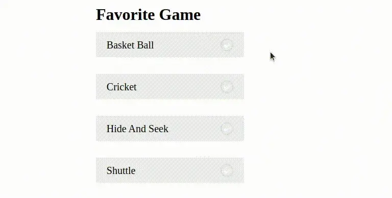
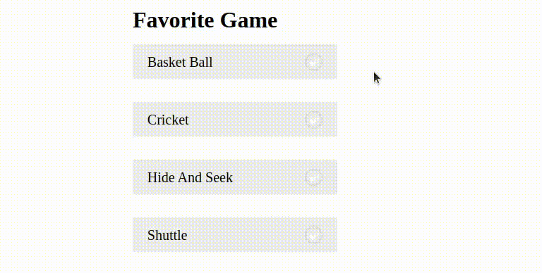
}After applying the above CSS, the checkboxes will appear like this. Here is the screenshot for your reference.
Final Results
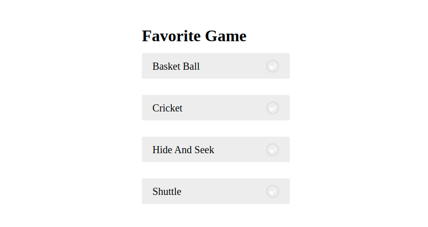
Now to check the animation effect select any one of the checkboxes and observe it. The result will appear as shown below.
If we need to change the direction of animation, then simply change the clip-path function values. To know about all the available CSS functions, you can grab here(functions blog)
Conclusion
Hope we have achieved the goal of this article which is to create an animated checkbox with a custom tick mark icon by providing sufficient details. If not please raise your questions in the comments, we will reach you soon.
 21 likes
 Add to read list

Comments