CSS position property can misalign containers and create white space. Learn how to prevent this issue with effective solutions outlined in this article.
Let us take an example of a certain design requirement, and analyze the solution to avoid the white spaces.

Fig:1 design Requirement
If you want to write CSS for the designs like above, the links container sits exactly at the middle of the header and the main container horizontally. So to make this design we need to use position property.
Now let us have the basic mark-up and styles for the above project and then analyze how to avoid white space caused by the list container.
HTML for the design:
I have written the following mark-up for the above design as given below.
Index.html
<!DOCTYPE html>
<html lang="en">
  <head>
    <meta charset="UTF-8" />
    <meta http-equiv="X-UA-Compatible" content="IE=edge" />
    <meta name="viewport" content="width=device-width, initial-scale=1.0" />
    <title>Avoid white space caused by CSS</title>
    <link rel="stylesheet" href="./style.css" />
  </head>
  <body>
    <header>
      <div class="side-1">
        <h1>
          Lorem ipsum, dolor sit amet consectetur adipisicing elit. Consequatur
        </h1>
        <p>
          Lorem ipsum dolor sit amet consectetur adipisicing elit. Dignissimos
          autem quis eligendi perferendis, consectetur tenetur temporibus vero,
          blanditiis minima officiis amet quod iste dolor error, commodi
          expedita! Numquam, molestiae inventore.
        </p>
      </div>
      <div class="side-2">
        <ul>
          <li>list 1</li>
          <li>list 2</li>
          <li>list 3</li>
          <li>list 4</li>
          <li>list 5</li>
        </ul>
      </div>
    </header>
    <main>
      <p>
        Lorem ipsum dolor, sit amet consectetur adipisicing elit. Nostrum
        dolorem neque ut! Hic ipsum saepe facere repellendus cum obcaecati
        possimus eveniet molestiae, architecto error asperiores eum nobis nisi
        ea earum! Lorem ipsum dolor, sit amet consectetur adipisicing elit.
        Nostrum dolorem neque ut! Hic ipsum saepe facere repellendus cum
        obcaecati possimus eveniet molestiae, architecto error asperiores eum
        nobis nisi ea earum!
      </p>
    </main>
    <footer>
      <p>
        Lorem ipsum dolor sit amet consectetur adipisicing elit. Error rerum,
        dolorum dolor, dolores doloremque deserunt itaque molestiae aliquam at
        cum, beatae odit repellat suscipit amet corporis! Officia sequi totam
        quisquam.
      </p>
    </footer>
  </body>
</html>
The basic styles that I did are:
Style.css
body {
  max-width: 70%;
  margin: 0 auto;
}
header {
  background-color: #050d57;
  color: #fff;
  font-size: 20px;
  padding: 50px;
}
.side-1 {
  flex: 0 0 60%;
}
.side-2 {
  flex: 0 0 20%;
  background: #fff;
  color: #000;
}
header ul li {
  list-style-type: none;
  padding-bottom: 15px;
}
main {
  display: flex;
  padding: 180px 0 50px;
  background: #faf8f8;
}
main p {
  margin: 0 32px;
}
footer {
  background-color: #050d57;
  color: #fff;
  padding: 50px;
}
After applying these styles, the design will appear as shown below.

Fig:2 design implementation
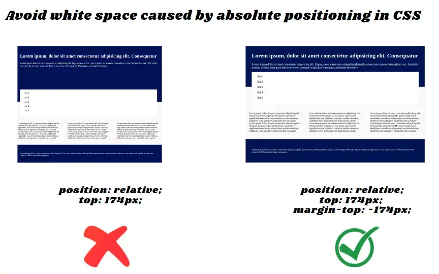
If you observe clearly then we can notice that the link container sits in the header part, now to match with the actual design we have to do some changes in CSS and those are adding position property to the list container in style.css
.side-2{
position: relative;
top: 174px;
}
After adding these two properties to the list container that has a class of side-2 then the design will appear as shown below.

Fig.3: applied position property
There you can see the white space between the header text and link container this cause because of the top value, to avoid this we need to do simple trick here that is adding exact negative value of negative margin in the top direction as we have given top value.
Here is the complete code for this problem, write the below code in your style.css file to avoid the white space
Solution for this issue
.side-2{
 position: relative;
 top: 174px;
/*this negative margin will cover up the weird white space in top direction*/
 margin-top: -174px;
}
After applying this value then the design will exactly match with the original one.
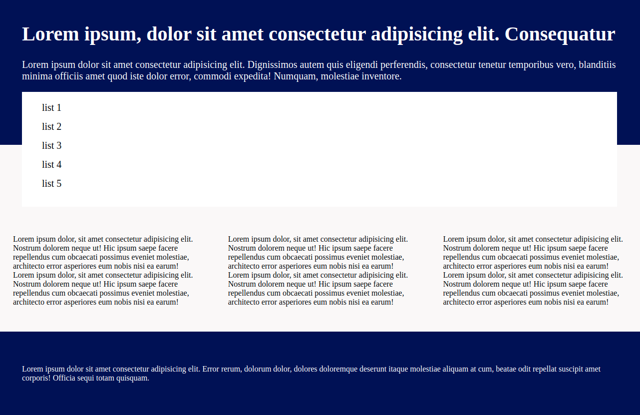
Fig.4: exactly matches with the original design.
It is as simple as possible, now we have a question that what should we do for the left, bottom, and right property values. Cool, the logic is the same whatever may the direction just add the exact negative margin value in the same direction as shown below.
.side-2{
 position: relative;
 bottom: 174px;
/*this negative margin will cover up the weird white space in bottom direction*/
 margin-bottom: -174px;
}

.side-2{
 position: relative;
 left: 174px;
/*this negative margin will cover up the weird white space in left direction*/
 margin-left: -174px;
}

.side-2{
 position: relative;
 right: 174px;
/*this negative margin will cover up the weird white space in right direction*/
 margin-right: -174px;
}
There is another query that may run in your mind that is, what is the solution for negative top values and yes the logic is the same just apply the positive margin value exactly equal to the top value.
.side-2{
 position: relative;
 top: -174px;
/*this negative margin will cover up the weird white space in top direction*/
 margin-top: 174px;
}

.side-2{
 position: relative;
 bottom: -174px;
/*this negative margin will cover up the weird white space in bottom direction*/
 margin-bottom: 174px;
}

.side-2{
 position: relative;
 right: -174px;
/*this negative margin will cover up the weird white space in right direction*/
 margin-right: 174px;
}

.side-2{
 position: relative;
 left: -174px;
/*this negative margin will cover up the weird white space in left direction*/
 margin-left: 174px;
}
Finally, I want to conclude that we can avoid the white spaces with these position properties just by adding the negative margins in the same direction if the top value is positive and vice-versa.
 21 likes
 Add to read list

Comments