
Implement scroll-triggered animations using CSS3 with types such as fade-in, slide-in, rotate, scale-up, and parallax for a dynamic web design experience.
Introduction
Scroll-triggered animations are a great way to add visual interest to your website and enhance the user experience. In this blog post, we'll explain what scroll-triggered animations are and how they can benefit your website.
We'll also provide examples of scroll-triggered animations and tips on how to implement them effectively.
Definition of Scroll-triggered animations
Scroll-triggered animations are triggered when a user scrolls down a webpage. They can include anything from simple text or image transitions to more complex effects like parallax scrolling or interactive elements. The purpose of these animations is to engage the user and create a more dynamic browsing experience.
Benefits of scroll-triggered animations
Here are some steps on the benefits of using scroll-triggered animations:
- Engage users: Scroll-triggered animations can capture and maintain a user's attention, making your content more memorable and engaging.
- Guide users: These animations can help to guide the user's journey through your website, highlighting important information or features.
- Add personality: Scroll-triggered animations can add a touch of personality and uniqueness to your website, setting it apart from others.
- Increase user satisfaction: By providing a more dynamic browsing experience, scroll-triggered animations can increase user satisfaction and lead to repeat visits.
- Improve conversions: Engaging and guiding users through your website can also lead to improved conversions, whether that's more sign-ups, purchases, or other actions.
How to use scroll-triggered animations effectively
- Identify the key content to be animated.
- Choose appropriate animation types and timing.
- Keep the animation simple and relevant to the content.
- Test the animation on different devices and screen sizes.
- Use the animation sparingly to avoid overwhelming the user.
- Ensure that the animation enhances the user experience and does not distract from the content.
- Consider the website's overall design and aesthetic when implementing the animation.
Types of scroll-triggered animations
Here are some examples of different types of scroll-triggered animations that can be implemented using HTML and CSS:
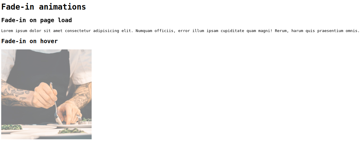
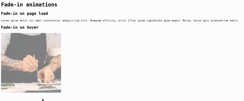
Fade-in animations:
This type of animation gradually fades in content as the user scrolls down the page.
index.html
<!DOCTYPE html>
<html lang="en">
<head>
    <link rel="stylesheet" href="./style.css">
    <title>Document</title>
</head>
<body>
    <h1>Fade-in animations</h1>
    <div class="fade-in">
        <h2>Fade-in on page load</h2>
        <p>Lorem ipsum dolor sit amet consectetur adipisicing elit. Numquam officiis, error illum ipsam cupiditate quam magni! Rerum, harum quis praesentium omnis.</p>
    </div>
    <h2>Fade-in on hover</h2>
    <div class="fade-in-hover">
        <img src="./gallery-10.jpg" alt="Example Image">
    </div>
</body>
</html>
style.css
body{
  font-family: monospace;
}

.fade-in {
  opacity: 0;
  animation-name: fadeIn;
  animation-duration: 2s;
  animation-timing-function: ease-in-out;
  animation-fill-mode: forwards;
}

@keyframes fadeIn {
  0% {
    opacity: 0;
  }
  100% {
    opacity: 1;
  }
}

/* Fade-in on hover */

.fade-in-hover {
  opacity: 0.5;
  transition: opacity 0.5s ease-in-out;

}

img{
  width: 300px;
  height: 300px;
}

.fade-in-hover:hover {
  opacity: 1;
}
Results
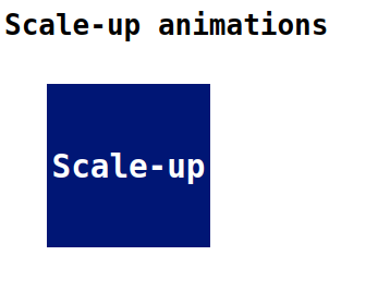
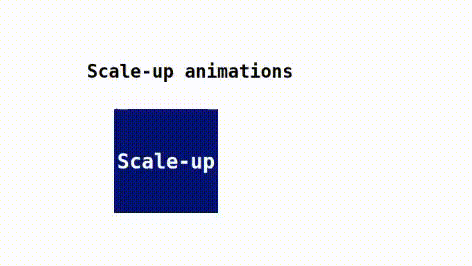
Scale-up animations:
This type of animation increases the size of an element as the user scrolls down the page.
index.html
<!DOCTYPE html>
<html lang="en">
<head>
    <link rel="stylesheet" href="./style.css">
    <title>Document</title>
</head>
<body>
    <h1>Scale-up animations</h1>
    <div class="box">
        <h2>Scale-up</h2>
    </div>
</body>
</html>
style.css
body{
  font-family: monospace;
}

.box {
  width: 100px;
  height: 100px;
  background-color: rgb(0, 22, 117);
  animation-name: scale-up;
  animation-duration: 1s;
  animation-fill-mode: forwards;
  display: flex;
  align-items: center;
  justify-content: center;
  margin: 4rem;
  color: #fff;
}

@keyframes scale-up {
  0% {
    transform: scale(5);
  }
  100% {
    transform: scale(1.5);
  }
}
Results
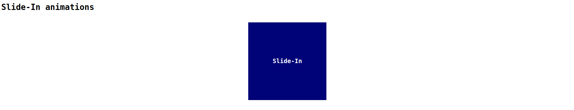
Slide-in animations:
This type of animation slides content into view from the side of the page as the user scrolls down.
index.html
<!DOCTYPE html>
<html lang="en">
<head>
    <link rel="stylesheet" href="./style.css">
    <title>Document</title>
</head>
<body>
    <h1>Slide-In animations</h1>
    <div class="slide-in">
        <h2>Slide-In</h2>
    </div>
</body>
</html>
style.css
body{
  font-family: monospace;
}

.slide-in {
  position: relative;
  left: -100%;
  animation: slide-in 1s forwards;
  display: flex;
  align-items: center;
  justify-content: center;
}

h2{
  width: 250px;
  height: 250px;
  background-color: rgb(0, 2, 119);
  display: flex;
  align-items: center;
  justify-content: center;
  color: #fff;
}

@keyframes slide-in {
  to {
    left: 0;
  }
}
Results
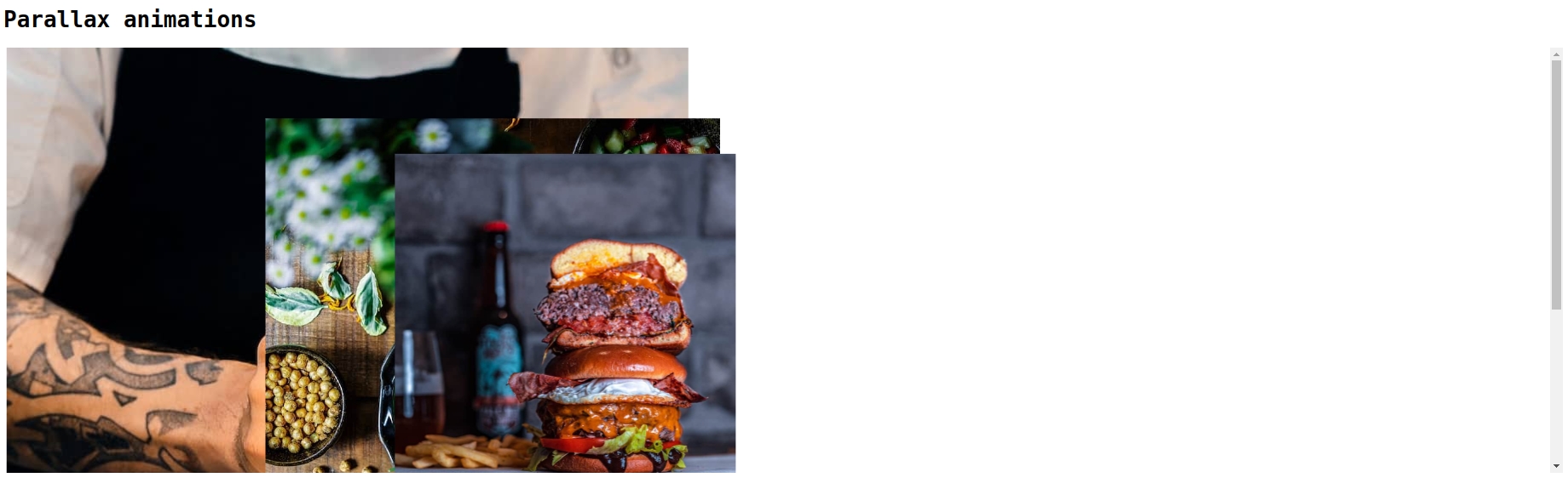
Parallax animations:
This type of animation creates a 3D effect by moving different elements at different speeds as the user scrolls down the page.
index.html
<!DOCTYPE html>
<html lang="en">
<head>
    <link rel="stylesheet" href="./style.css">
    <title>Document</title>
</head>
<body>
    <h1>Parallax animations</h1>
    <div class="parallax-container">
        <div class="parallax-layer layer-1">
          <img src="./gallery-10.jpg" alt="image 1">
        </div>
        <div class="parallax-layer layer-2">
          <img src="./gallery-11.jpg" alt="image 2">
        </div>
        <div class="parallax-layer layer-3">
          <img src="./gallery-12.jpg" alt="image 3">
        </div>
      </div>
</body>
</html>
style.css
body{
  font-family: monospace;
}

.parallax-container {
  height: 500px;
  overflow-x: hidden;
  overflow-y: auto;
  perspective: 1px;
}

.parallax-layer {
  position: absolute;
  top: 0;
  left: 0;
  width: 100%;
  height: 100%;
}

.layer-1 {
  transform: translateZ(-1px) scale(2);
}

.layer-2 {
  transform: translateZ(-2px) scale(2);
}

.layer-3 {
  transform: translateZ(-3px) scale(2);
}
Results
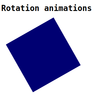
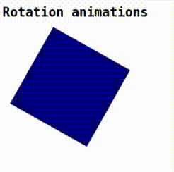
Rotation animations:
This type of animation rotates an element as the user scrolls down the page.
index.html
<!DOCTYPE html>
<html lang="en">
<head>
    <link rel="stylesheet" href="./style.css">
    <title>Document</title>
</head>
<body>
    <h1>Rotation animations</h1>
    <div class="box"></div>
</body>
</html>
style.css
body{
  font-family: monospace;
}

.box {
  width: 180px;
  height: 180px;
  background-color: rgb(0, 0, 114);
  animation: rotate 2s infinite;
  margin: 3rem;
}

@keyframes rotate {
  from {
    transform: rotate(0deg);
  }
  to {
    transform: rotate(360deg);
  }
}
Results
Conclusion
In this blog, Scroll-triggered animations can be easily implemented using CSS3 with the power of CSS transitions and keyframe animations. I hope you guys learnt something new, Thank you.
 21 likes
 Add to read list

Comments