Use CSS transitions to add animation effects when changing properties of elements. By using HTML and CSS, you can create simple but effective transitions.
Introduction
Adding transitions to elements is a technique used in web design to create visual effects that enhance the user experience. Transitions allow elements on a web page to change gradually over time, giving the user a more engaging and interactive experience.
What are transitions
CSS transitions are a way to smoothly animate changes in CSS properties over a specified duration. They allow for more visually appealing and engaging web pages by gradually transitioning between different states rather than sudden changes.
Transitions can be applied to elements such as text, images, and background colors, and can be triggered by user interactions or page load.
Properties of transition
Here are the properties of CSS transitions presented in a tabular format:
| Property | Definition / Syntax | Example | Output |
| transition-property |
The CSS transition-property property or properties to which the transition effect should be applied. Syntax transition-property: none | <single-transition-property>; |
|
 |
| transition-duration |
This property specifies the length of time it takes for a transition effect to complete. Syntax transition-duration: <time>; |
|
 |
| transition-timing-function |
CSS Transition-timing-function property that sets the easing function to control how the transition progresses over time. Syntax transition-timing-function: <easing-function>; |
|
 |
| transition-delay |
Transition-delay property specifies the time delay before the transition effect starts. Syntax transition-delay: <time>; |
|
 |
| transition |
This property combines all of the above properties in a single declaration. Syntax transition: <single-transition>; |
|
 |
Importances of transition properties
Here are the steps for the importance of CSS transition properties:
- CSS transitions allow for more engaging and visually appealing web pages by gradually transitioning between different states of an element.
- Transition properties like transition-duration, transition-timing-function, and transition-delay give you precise control over how the transition effect behaves.
- By using transition-property, you can specify which CSS properties should be transitioned, allowing you to create a wide range of transition effects.
- The transition shorthand property allows you to set all transition properties in a single declaration, making your CSS code more efficient and easier to read.
- Finally, by listening for the transition end event, you can run code after the transition is complete, giving you even more control over the behavior of your web page.
Best practices for using transitions
Here are the steps for the best practices for using transitions:
- Use transitions to show connections between ideas or to signal a change in direction.
- Choose the appropriate transition based on the context and purpose of your writing.
- Use transitions sparingly and avoid overusing them in a single piece of writing.
- Make sure your transitions are clear and easy to understand.
- Use a variety of transitions to keep your writing interesting and engaging.
- Practice using transitions to improve your writing skills.
Examples
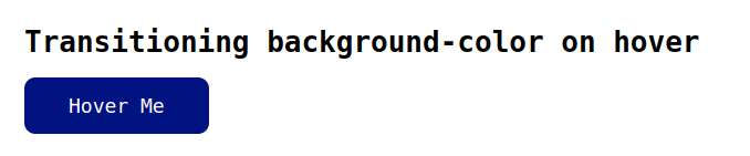
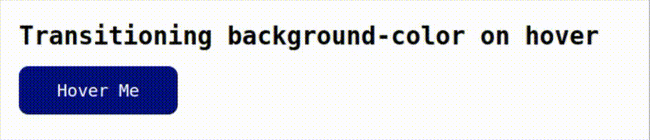
Transitioning background-color on hover
Index.html
<!DOCTYPE html>
<html lang="en">
<head>
    <link rel="stylesheet" href="./style.css">
    <title>Document</title>
</head>
<body>
    <h1>Transitioning background-color on hover</h1>
    <button>Hover Me</button>
</body>
</html>
style.css
body{
  font-family: monospace;
  margin: 40px;
}

button {
  background-color: #001380;
  transition: background-color 0.5s ease;
  color: #fff;
  border-radius: 10px;
  padding: 15px 40px;
  font-size: 18px;
  border: none;
  font-family: monospace;
}

button:hover {
  background-color: #2ecc71;
  color: #000;
  outline: none;
}
Results
GIF Result
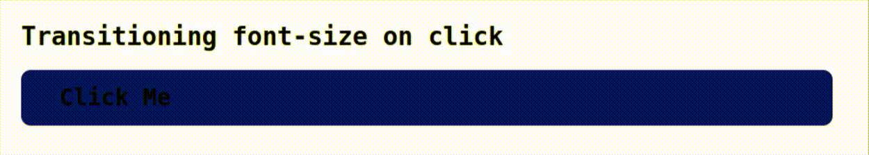
Transitioning font-size on click
Index.html
<html lang="en">
<head>
    <link rel="stylesheet" href="./style.css">
    <title>Document</title>
</head>
<body>
    <h1>Transitioning font-size on click</h1>
    <h2>Click Me</h2>
</body>
</html>
style.css
body{
  font-family: monospace;
  margin: 40px;
}

h2 {
  font-size: 24px;
  transition: font-size 0.5s ease;
  background-color: #001380;
  border-radius: 10px;
  padding: 15px 40px;
  cursor: pointer;
}

h2:active {
  font-size: 32px;
  color: #fff;
}
Results
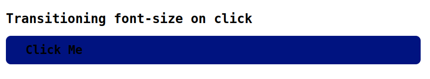
GIF Result
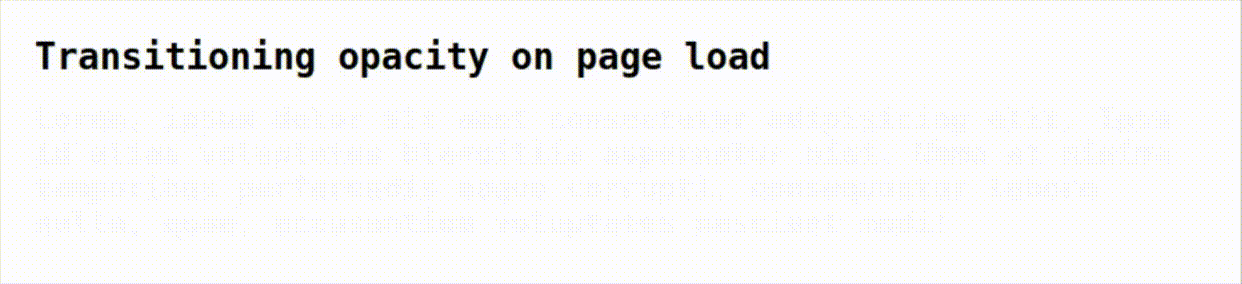
Transitioning opacity on page load
Index.html
<!DOCTYPE html>
<html lang="en">
<head>
    <link rel="stylesheet" href="./style.css">
    <title>Document</title>
</head>
<body>
    <h1>Transitioning opacity on page load</h1>
    <div class="fade-in">Lorem, ipsum dolor sit amet consectetur adipisicing elit. Ipsa id alias voluptates blanditiis aspernatur nisi. Nemo at minima temporibus perferendis eaque corrupti, consequuntur labore nulla, quae, accusantium voluptates nesciunt modi!</div>
</body>
</html>
style.css
body{
  font-family: monospace;
  margin: 40px;
}

.fade-in {
  opacity: 0;
  font-size: 22px;
  font-weight: 600;
  transition: opacity 7s ease;
}

.fade-in.loaded {
  opacity: 1;
}
Results
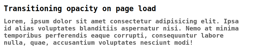
GIF Results
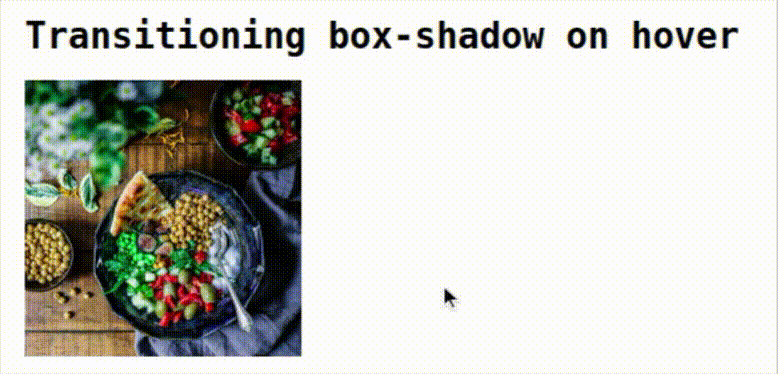
Transitioning box-shadow on hover
Index.html
<!DOCTYPE html>
<html lang="en">
<head>
    <link rel="stylesheet" href="./style.css">
    <title>Document</title>
</head>
<body>
    <h1>Transitioning box-shadow on hover</h1>
    <img src="./gallery-11.jpg" alt="Image">
</body>
</html>
style.css
body{
  font-family: monospace;
  margin: 40px;
}

img {
  box-shadow: 0 0 0 rgba(0, 0, 0, 0);
  width: 200px;
  height: 200px;
  transition: box-shadow 0.5s ease;
}

img:hover {
  box-shadow: 0 0 40px rgba(0, 0, 0, 0.5);
}
Results
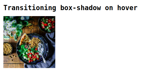
GIF result
Conclusion
In this blog, Adding transitions to elements enhances the user experience by creating smooth and engaging visual effects during state changes. I hope you guys learnt something new, Thank you.
 21 likes
 Add to read list

Comments