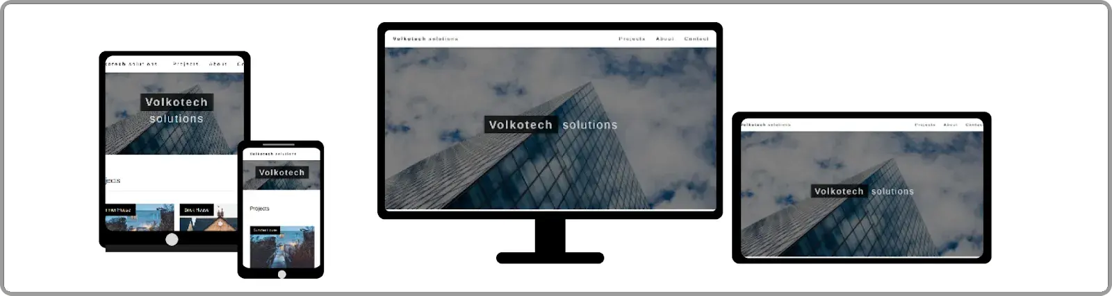
Building Responsive Web Designs with CSS Media Queries
This technique is used in web design to make websites adapt to different devices and screen sizes. CSS media queries are a tool used to achieve this responsiveness.
The Viewport
The viewport is the visible area of the web page in the user's browser window. It can vary depending on the device and its screen size. To create responsive layouts, you need to use the viewport meta tag in your HTML document to control how the web page is displayed on different devices.
Controlling the viewport with the meta tag
The viewport meta tag is used to control how a web page is displayed on different devices. It allows you to set the width and initial scale of the viewport, as well as other properties such as the minimum and maximum scales, and the device pixel ratio.
Here are some examples of using the viewport meta tag to control the display of a web page:
- Setting the Width: This example sets the width of the viewport to the device width:
<meta name="viewport" content="width=device-width"> - Setting the Initial Scale: This example sets the initial scale of the viewport to 1:
<meta name="viewport" content="initial-scale=1"> - Setting the Minimum and Maximum Scales: This example sets the minimum and maximum scales of the viewport to 0.5 and 2, respectively:
<meta name="viewport" content="minimum-scale=0.5, maximum-scale=2"> - Setting the Device Pixel Ratio: This example sets the device pixel ratio of the viewport to 2
<meta name="viewport" content="device-dpi=2">
Breakpoints
Breakpoints are specific points in a website's layout where the design changes to better fit different screen sizes or device types. By defining these breakpoints, web developers and designers can create a responsive web design that adjusts to the size of the screen, it's being viewed on, ensuring that all users have a great user experience and can easily navigate and use the website.
Common breakpoints
Common breakpoints are the most frequently used screen sizes where web developers and designers typically make design changes to optimize a website for different devices. These breakpoints are based on commonly used screen sizes of desktops, laptops, tablets, and mobile devices.
Here are some common breakpoints and the device types they correspond to:
- 320px (Mobile Devices)
- 480px (Small Tablets and Landscape Mobile Devices)
- 768px (Tablets and Small Laptops)
- 1024px (Desktops and Large Laptops)
- 1440px (Large Desktops and High-Resolution Displays)
Here are some common breakpoints and the device types they correspond to:
320px (Mobile Devices)
480px (Small Tablets and Landscape Mobile Devices)
768px (Tablets and Small Laptops)
1024px (Desktops and Large Laptops)
1440px (Large Desktops and High-Resolution Displays)
Min-Width: A minimum width breakpoint specifies the minimum screen width at which the design changes occur. For example, a common minimum width breakpoint is 320px for mobile devices.
Max-Width: A maximum width breakpoint specifies the maximum screen width at which the design changes occur. For example, a common maximum width breakpoint is 768px for tablets and small laptops.
Both: Using both minimum and maximum width breakpoints allows for more precise control over the design changes. For example, a common breakpoint range is between 768px and 1024px for medium-sized devices like larger laptops or desktops.
Here are the examples of common breakpoints using each method:
- Min-Width:
- 320px for mobile devices
- 480px for small tablets and landscape mobile devices
- 768px for tablets and small laptops
- 1024px for desktops and large laptops
- 1440px for large desktops and high-resolution displays
- Max-Width:
- 767px for mobile devices
- 991px for small tablets and landscape mobile devices
- 1023px for tablets and small laptops
- 1439px for desktops and large laptops
- No maximum width is defined for large desktops and high-resolution displays
- Both:
- 768px to 991px for medium-sized devices
- 1024px to 1439px for larger devices
- No minimum or maximum width is defined for mobile devices or high-resolution displays.
Media Queries
Media queries in CSS are essential for creating responsive web designs that look great on all devices. They allow designers to adjust the styling and layout based on screen size, providing a better user experience and saving time and resources.
Criteria for Media Queries
Criteria for media queries include specifying the target device or screen size, defining the layout and design changes based on specific breakpoints, and ensuring that the design remains readable and usable on all devices. Additionally, designers should consider using relative units like percentages and ems for more flexible and responsive designs. Testing on a variety of devices and screen sizes is also important to ensure that the design is functioning as intended.
Here are some examples of criteria for media queries:
Specifying the target device or screen size:
- Mobile devices: screen widths from 320px to 767px
- Tablets: screen widths from 768px to 991px
- Desktops: screen widths from 992px and above
Defining layout and design changes based on specific breakpoints:
- Increase the font size on screens wider than 768px
- Reorganize layout for screens narrower than 480px
Ensuring readability and usability on all devices:
- Use appropriate font sizes and line heights for easy readability
- Avoid overcrowding with too much text or design elements
Using relative units for more flexibility:
- Use percentages for widths and heights to ensure elements scale properly
- Use ems for font sizes to allow for easy scaling and consistent spacing
Testing on a variety of devices and screen sizes:
- Test designs on popular devices like iPhones, iPads, and Android devices
- Test on different screen sizes, resolutions, and aspect ratios to ensure compatibility.
Syntax and Examples
Max-width media query

@media screen and (max-width: 767px) {

  /* CSS rules here apply when the screen is 768px or narrower */

}

Min-width media query

@media screen and (max-width: 768px) {

  /* CSS rules here apply when the screen is 768px or above */

}

Max-width and Min-width media query

@media (min-width: 768px) and (max-width: 991px) {

  /* CSS rules here apply when the screen is 767px between 992px*/

}
Conclusion
In this blog, we successfully learned about how to build responsive web designs with CSS media queries. By using these techniques we can build responsive web pages for any screen. Thank you for taking the time to read.
 21 likes
 Add to read list

Comments